
The right basement paint color depends on one thing most guides skip: what your bulbs do to it after sunset. A warm white like White Dove can read creamy upstairs and flat gray below, while Snowbound’s gray undertone turns faintly blue under cool LEDs. Test a two-foot patch and watch it across a full day, because the chip you liked at the store is not the wall you will live with.
1. White Dove
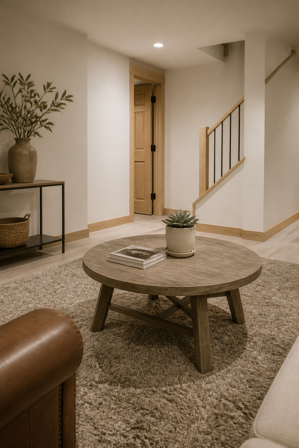
Benjamin Moore White Dove carries just enough grayed-out warmth to keep a basement from feeling like a clinic. The slight yellow undertone stays invisible until the light drops, and then it does the real work: preventing that cold, flat look that pure whites turn in shadow. Six separate recommendations backed this color in the research, more than any other shade on the list.
That warmth matters most when your light comes from small windows or overhead fixtures alone. White Dove reads creamy rather than stark even in a basement with a deck blocking the glass door, and it holds up under artificial light without going yellow.
It also pairs with almost any trim or flooring you already have. Cool accents, warm accents, tone-on-tone neutrals, a deep color for pillows and throws: all of it works. For renters or first-time owners who cannot rip out the existing floors or replace every door casing, that flexibility saves both money and second-guessing.
2. Alabaster

Sherwin-Williams Alabaster reads warmer and creamier than White Dove, with a slight yellow lean that mimics afternoon light in a space that never sees any. That warmth matters in a basement, where cool whites can turn flat or clinical under artificial bulbs. Its LRV of 82 reflects enough light back into the room to keep corners from dropping into shadow, a common problem when you are working with recessed LEDs instead of windows.
The creaminess sits in a useful middle ground: yellow enough to feel cozy, muted enough that it does not read as color. Five sources backed it specifically for basements, and the consistency is worth noting. It works best in a basement finished as living space or a guest room, where you want the walls to feel welcoming rather than stark. If your plan leans more office or utility, a cleaner white might suit the purpose better.
3. Snowbound

Sherwin-Williams Snowbound is a crisper white than most basement favorites, with a gray undertone that keeps it from feeling creamy or dated. That gray base makes it feel modern and clean, but it also carries a risk: under cool LED bulbs, the undertone can shift toward blue and leave your walls looking faintly cold or clinical. Test it under your actual bulbs before you commit, not just in the paint store or by a window.
This color works best in basements that get some natural light or where you have already chosen warm-toned fixtures. In those conditions, Snowbound stays livable and bright without going full stark. If your space is a windowless box lit only by daylight-temperature LEDs, you will likely get a better result from a warmer white.
4. Revere Pewter
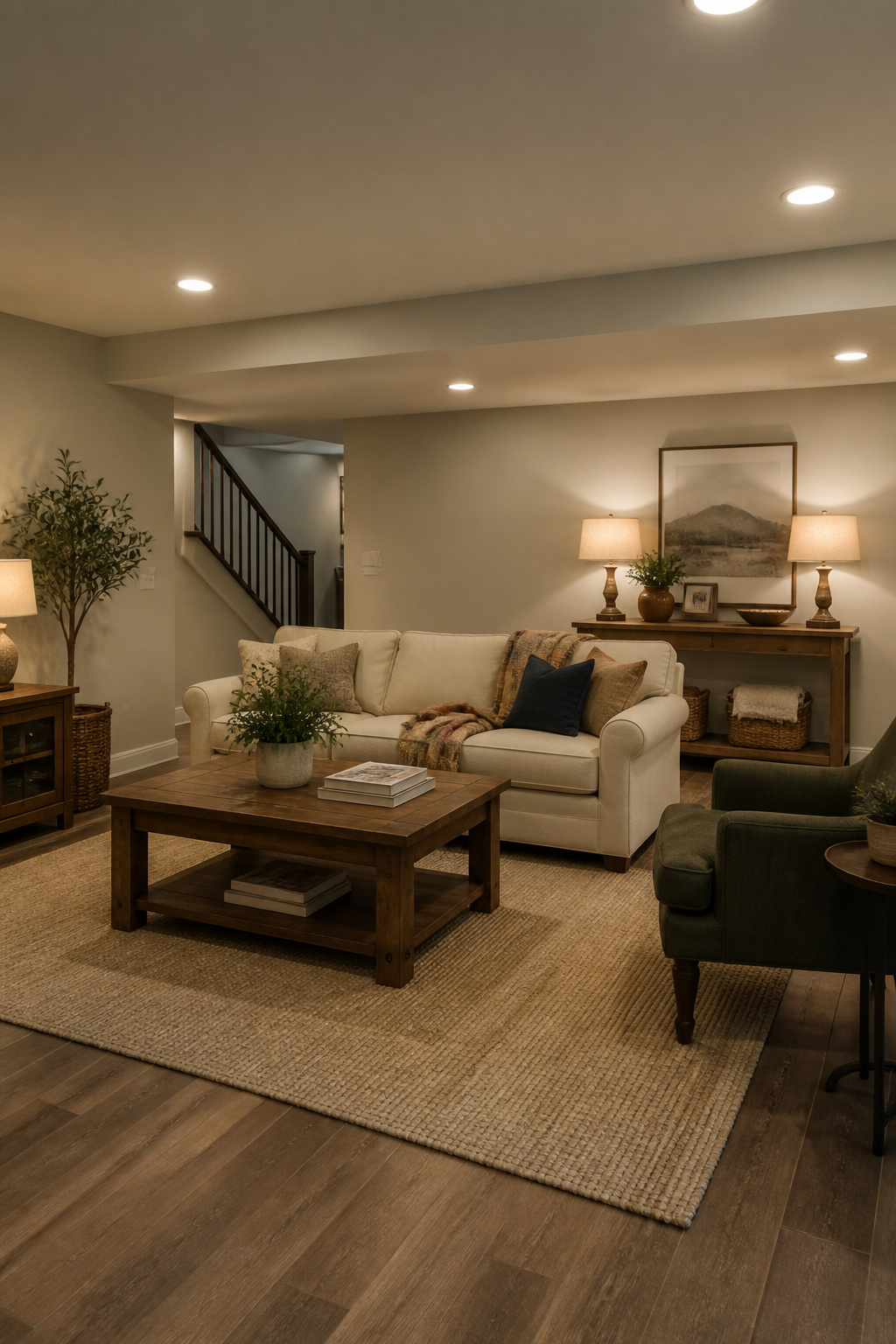
Benjamin Moore Revere Pewter has stayed popular for years because it actually earns its reputation in rooms that fight back. At a mid-tone LRV, it sits in the sweet spot for basements: dark enough to read as a real color in brightened zones, light enough to keep dim corners from going muddy. The greige mix shifts with whatever you set against it, which matters more than it sounds when your basement holds a hand-me-down sofa, a Craigslist desk, and a rug you bought because it was on sale. Revere Pewter ties them together without matching any of them exactly.
The real test is mixed lighting. North-facing basement windows and warm overhead bulbs pull different tones from the same wall, and this color handles both without turning pink or green on you. If you are painting a stairwell that opens into a brighter rec room, you do not need two colors; the single shade reads consistently enough to carry the whole level.
Pair it with warm wood floors or cool tile, modern lines or traditional pieces. It does not force a style, which saves you from repainting when the next phase of furniture arrives.
5. Agreeable Gray
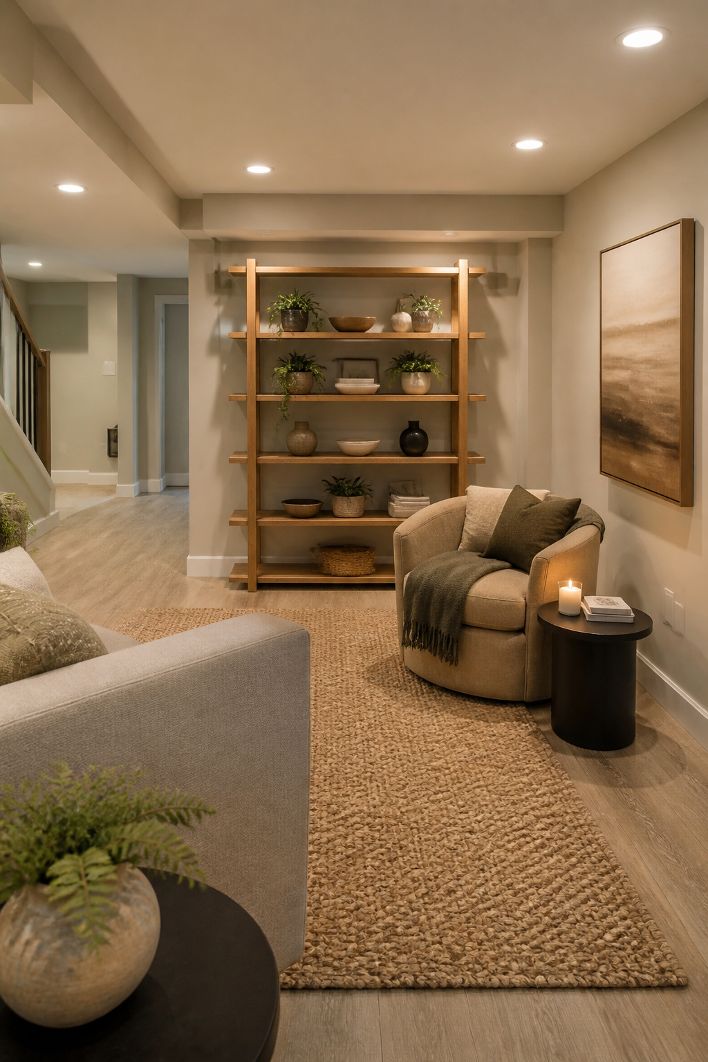
Agreeable Gray by Sherwin-Williams is a warm gray that carries barely-there green undertones, and those undertones are exactly what you need to watch. In some basement lights the color stays a quiet neutral; in others it shifts toward sage, which can surprise you if you were counting on pure gray. The green comes alive under warm bulbs, so pairing it with the right artificial light matters. Use cooler bulbs and you flatten the color into something blander; use warmer ones and the organic side wakes up.
That chameleon quality makes it a solid fit for basements with wood furniture, houseplants, or anything else that reads as natural material. The walls stay in the background instead of competing. If your basement has no windows and you want the space to feel less like a box underground, this is where Agreeable Gray earns its name. It agrees with the room rather than announcing itself. Test it with your actual bulbs before you commit, though, because the undertone that saves the color in one basement can read as too green in another.
6. Sea Salt

Sherwin-Williams Sea Salt is a soft blue-green that reads as a color, not a neutral. It brings the same calm you’d want in a bedroom or reading nook upstairs, and that is exactly where it belongs in a basement too. Use it anywhere you want to lower the energy instead of raising it.
The catch is the light. In a basement with very little natural light, Sea Salt can turn more gray-green than blue, and that shift is not subtle enough to ignore. Some people prefer the muted result; others feel the color went flat on them. If you are set on the blue side, test it on the wall you are actually painting and check it in the evening under your artificial lights, because that is when the change shows. Plan your flooring and furniture around the version you are going to get, not the chip you hope for.
For a space where you want to relax, a guest bed or a corner with a chair and a lamp, Sea Salt works without needing much else. Add wood tones, maybe a plant, and the room stops feeling underground.
7. Naval
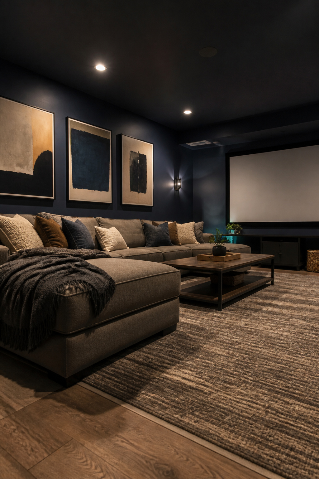
Sherwin-Williams Naval (SW 6244) is the navy that keeps coming up for finished media rooms, and the logic is straightforward once you stop fighting the basement’s natural darkness. Dark paint absorbs light instead of bouncing it back, which is exactly what you want when the goal is screen viewing rather than general living. The color carries an LRV between 4 and 12, low enough to kill projection bounce and sharpen contrast without turning the room into a cave.
The risk is real, though. Naval will make a small basement feel smaller, so use it where the room has a clear purpose and some boundaries. An accent wall behind the screen, a dedicated theater nook, a bar area closed off from the main space. Painting the whole open basement this dark is where people go wrong. The sources that recommend it most insist on pairing it with warm 2700K lighting, blackout window treatments, and a lighter floor or ceiling to keep the walls from pressing in.
One practical note: under LRV 10, you are looking at a tinted gray primer plus three finish coats, roughly 20 percent more paint than a standard repaint. Budget for that film build, and use satin or semi-gloss rather than flat. Dark colors in flat finish show every scuff and fingerprint, and you will be touching up constantly.
8. Forest Green

Benjamin Moore’s moody forest greens read less like a color choice and more like a decision to stay in. Where navy basement walls turn a room formal, almost cinematic, forest green goes the other direction entirely: cocoon-like, residential, the kind of space that happens when you paint on Friday and cancel plans by Saturday afternoon.
The difference matters on a real budget. Navy asks for matching investment; it wants crisp trim, considered lighting, furniture that holds its own. Forest green meets you where you are. Brass thrift-store lamps, a leather chair with surface wear, wood that has not been refinished: these do not compete with the wall, they settle against it. The room reads collected rather than decorated, which is what happens when you are sourcing from estate sales and hand-me-downs over a single weekend.
The undertone shifts with basement light in a way that flatters rather than exposes. Morning reads deep and quiet; artificial light at evening brings out an olive warmth that keeps the walls from going cold. You are not fighting the lack of windows; you are building around it.
For a lounge area or a basement library, this is the direction I would point first. Not because it is safe, but because it forgives the pieces you already own and the light you cannot change.
9. Iron Ore

Iron Ore by Sherwin-Williams is near-black charcoal, not black, and that distinction matters more than you might expect in a basement. Black in low light can read as a flat void; Iron Ore carries enough brown warmth to stay dimensional, reading as very dark gray even when your fixtures are weak.
It works three places down here. On a ceiling, it lowers the visual height of a tall unfinished cavity and stops the room from feeling like a well. On trim against lighter walls, it gives you contrast without the harshness of pure black. Or commit to the full room if your basement is already chopped into small defined spaces, a media room or bar where you want the walls to absorb projection bounce and deepen screen contrast.
Budget for the extra coats. With an LRV around 6, this shade needs a tinted gray primer plus three finish coats, roughly 20 percent more paint than a standard mid-tone job. Pair it with warm 2700K lighting and blackout shades if you are building around a screen. Skip it for open-plan spaces you want to feel larger; the darkness will swallow them whole.
10. Baby Fawn

Baby Fawn is Benjamin Moore’s warm greige that leans hard into beige, the middle ground gray and beige keep fighting over. If your basement still has the beige carpet the previous owner left, or a tan sofa you are not replacing this year, this color ties the room together instead of making those warm neutrals look suddenly wrong.
It is darker than the whites and grays most people default to for basements, so plan for better lighting or keep it to a smaller room where it will feel cozy rather than heavy. In a dim, sprawling space it can go flat and cave-like.
The color has an alternate name, Edgecomb Gray, and the two are identical, so use whichever your store stocks. It carries a faint green undertone that sometimes surfaces in bright sun, though in basement conditions it usually just reads as warm and settled. Pair it with Chantilly Lace on trim if you want the walls to pop cleanly.
11. Muslin

Benjamin Moore Muslin carries a warm beige base with pink undertones that can shift dramatically depending on your light. In a basement with good artificial fixtures or a window well letting in some daylight, that pink registers as living warmth, like skin in candlelight. In dim corners or under cheap cool LEDs, the same undertone turns flat and dated, the color of a 1990s spec home that never quite got renovated.
This is where your basement’s lighting setup becomes the deciding factor. Muslin wants enough brightness that the pink reads as glow rather than blush. If you are working with recessed cans or track lighting you already own, test a sample at the actual wattage you will use, not the afternoon sun streaming through a ground-level window that disappears by 4 p.m.
The color does its best work with traditional furniture and the wood trim common in older homes, oak baseboards and paneled doors that might fight a cooler neutral. Muslin speaks their language. In a basement with original millwork you are not ready to paint, it ties the room to the rest of the house instead of leaving it feeling like an afterthought.
12. Shoji White

Shoji White sits in the narrow gap between a true white and a true greige, which is exactly where many basements need to land. With an LRV of 74, it reads darker than White Dove but lighter than Baby Fawn, carrying a warm greige undertone that keeps walls from feeling sterile without adding the visual weight of a full color. That middle position matters below grade, where cool grays can pick up green tints from fluorescent bulbs and feel clinical against limited natural light.
What convinced me, reading through how finishers actually use this color, is its flexibility with accents. Shoji White pairs cleanly with both warm and cool tones, so you are not locked into a single palette if your furniture mix shifts over time. For a basement where you want more warmth than a white provides but worry that a stronger color will close in the space, this is the shade that splits the difference without forcing the choice.
How Light Changes Color Underground
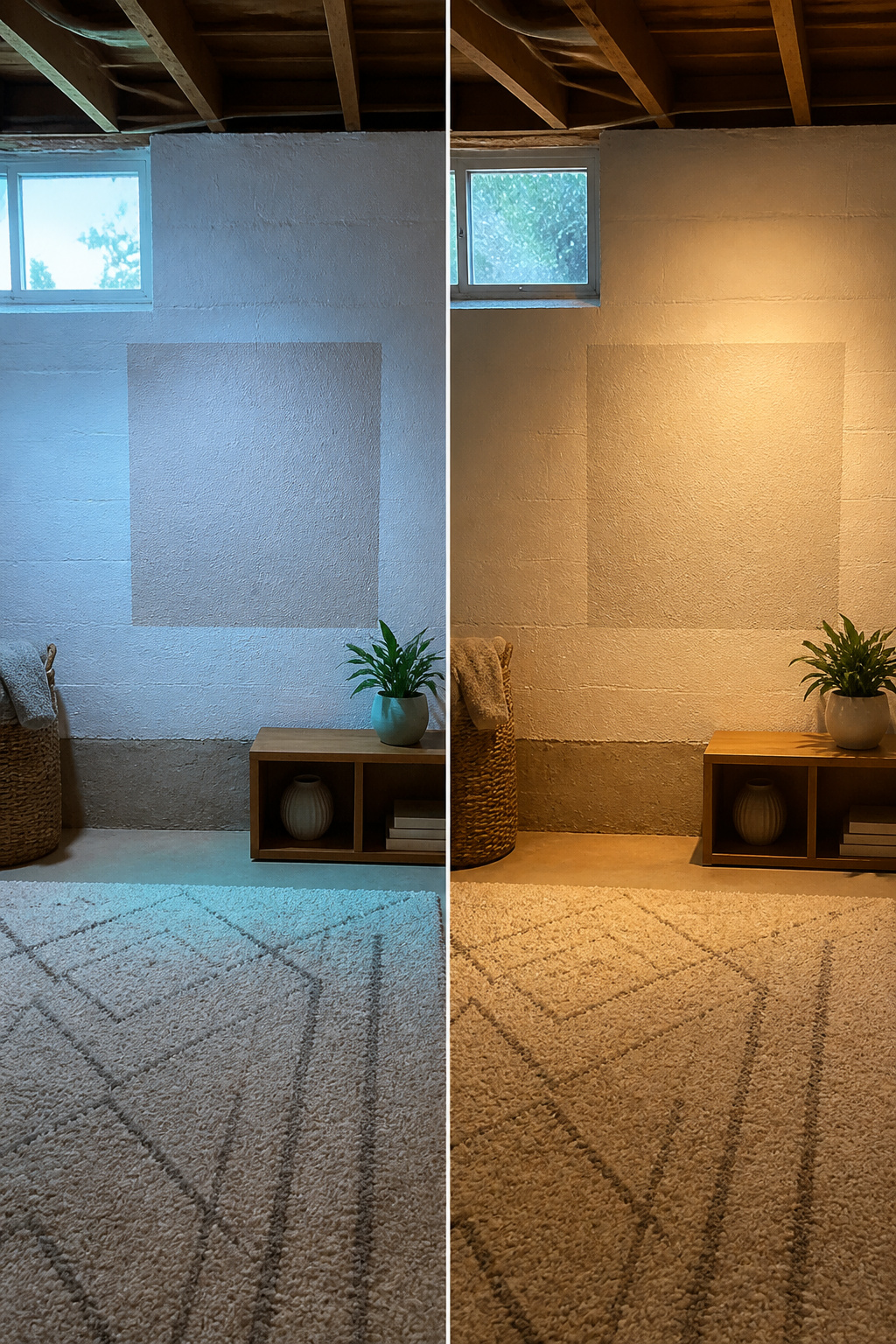
Basements sit below grade, so the light that does reach them is cooler and bluer than what you get upstairs. That shift matters more than most people expect. A warm white that reads creamy on your main floor will land closer to neutral downstairs, while anything already cool will push straight into gray or even blue territory. The bulbs you add only complicate this. Warmer light can pull a white back toward cream; cooler LEDs will send a gray further into slate.
Paint a two-foot square on the wall and watch it across a full day. Morning light, afternoon, evening with your fixtures on. The same patch can look like three different colors, and the one you liked at the store is not guaranteed to be the one you want to live with.
Every paint chip carries an LRV, a number that tells you how much light that color will reflect back into the room. Higher numbers bounce more light around. In a basement, that number is worth checking before you fall in love with a shade.
Match the Color to the Room’s Job

A basement meant for movies, drinks, or late-night games wants containment, not openness. Go dark on the walls in media rooms, bars, and lounges: colors like Naval or Forest Green absorb stray light and cut projection bounce so the screen pops. These shades sit between LRV 4 and 12, heavy enough to swallow glare but still read as intentional, not accidental. Budget about 20 percent extra paint; under LRV 10 you will need a tinted gray primer plus three finish coats, and a satin or semi-gloss sheen to keep fingerprints from becoming a second pattern.
For living spaces, guest rooms, or any basement office where you want the walls to step back and let the room breathe, lighter colors do the opposite work. White Dove and Alabaster both carry warm, grayed-yellow undertones that keep them from flatlining in low light. White Dove holds enough pigment to stay creamy under artificial bulbs and not shadow out in corners. Alabaster does the same, glowing rather than glaring even with small north-facing windows.
If your basement is one open box, you do not have to choose. Paint the TV nook Naval, keep the desk area White Dove, and let color do the zoning walls would have wasted space on. The eye reads the shift as two rooms; your square footage stays intact.
Undertones That Fool You

Undertones shift in low light, and the shift is rarely in your favor. A color that reads warm and complex on the showroom wall can flatten into something cold and withdrawn once it is underground, where daylight barely reaches and your bulbs do the heavy lifting.
That is exactly what happens with Agreeable Gray, which carries a barely-there green undertone that keeps it friendly in artificial light, but only if the bulbs are warm. Snowbound looks like a clean white until its gray undertone emerges and turns the walls flat and institutional. Muslin seems safe until its pink note becomes the only thing you see. Sea Salt is the trickiest of the bunch: it reads green in some moments, blue-gray in others, and the balance depends entirely on whether your fixtures lean warm or cool.
To spot the undertone before you commit, hold the chip against a sheet of white printer paper. The base color fades and the hidden note separates out. Green, pink, blue, gray, whatever is lurking becomes visible in about two seconds.
The real risk is the color that looks neutral in the store and reads cold underground. Cool undertones do not just read cool in a basement. They make the space feel like a cave, and no amount of furniture warmth fixes it. Warm bulbs help, but they cannot neutralize a fundamentally cold color. Start with the undertone, not with the name on the swatch.
Paint That Handles Basement Air

You can spend weeks choosing between White Dove and Shoji White, but no paint color survives a damp wall. Basements sit below grade where water vapor pushes through concrete, and ordinary latex will bubble and peel within a year or two on untreated masonry. That is the gap most color guides leave open: they show you swatches, not what goes underneath them.
The distinction that matters is between interior latex with mildew resistance and true waterproofing paint. The first is for finished drywall; the second, for bare block or poured concrete. Waterproofing paint like Drylok Extreme or Zinsser Watertite is a masonry product, not a wall paint, and it needs two coats with a stiff brush before any color goes on top. Rollers leave pinholes that let moisture through.
For drywall that is already dry but humidity-prone, a satin or eggshell finish wipes clean and reflects what little light a basement gets. Flat paint absorbs that light and holds stains. Semi-gloss belongs on trim and doors that take kicks and scuffs.
One thing the sources agree on: paint is cosmetic, not a fix. If you see active seepage or efflorescence, or humidity stays above 60%, a dehumidifier and possibly a French drain come before the primer. As painting expert Carr Lanphier told Family Handyman, paint on concrete can trap moisture and erode the wall over time; concrete stain may be the safer choice for bare masonry.
"Most basements are going to deal with moisture coming through these types of walls; and paint can trap moisture in your walls, which will erode the concrete over time."
If your walls are concrete, stain them and sleep easier. If they are framed and dry, prime with a mold-resistant blocker, then paint in a finish you can wipe down.
Frequently Asked Questions
What are good basement paint colors for a room with very little natural light?
Soft warm whites and light greiges work best in low-light basements because they reflect artificial light back into the room instead of letting it disappear. White Dove and Alabaster both carry warm, grayed-yellow undertones that keep them from turning cold or flat under bulbs alone. Shoji White splits the difference between white and greige if you want more warmth without the visual weight of a full color. Avoid cool-toned grays or pure whites in windowless spaces; they tend to push blue or green in basement conditions.
Should basement walls be painted light or dark?
Light shades make a basement feel larger and brighter, which is the right choice for living spaces, guest rooms, or home offices. Dark colors like Naval or Forest Green belong only in dedicated media rooms, bars, or lounges where you want to absorb stray light and sharpen screen contrast. If your basement is one open space, you can zone it with color instead of walls; paint the TV nook dark and keep the desk area light.
How much does it cost to paint a basement?
Professional basement painting runs $1.50 to $2.75 per square foot for walls only, and $2.25 to $3.75 per square foot if you include ceiling and trim. A typical 800 square foot basement project costs $1,800 to $5,500 depending on scope. DIY materials for the same space range from $300 to $850, though you should expect to spend three to five weekends on the work. Budget about 20 percent extra paint for any color with an LRV under 10, since you will need a tinted gray primer plus three finish coats.