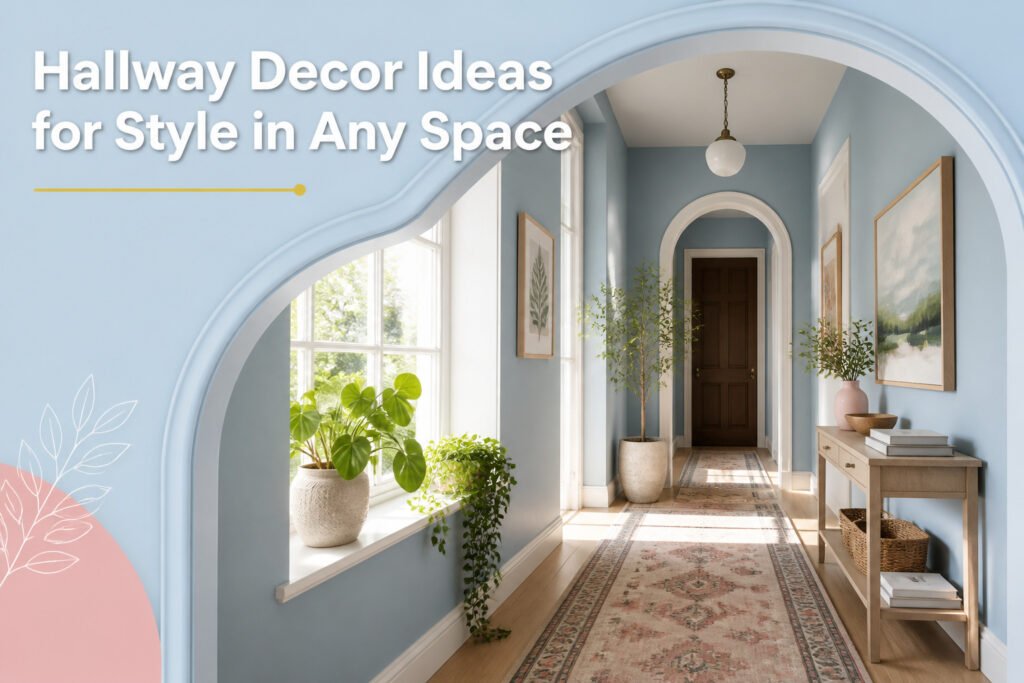
The right hallway decor idea depends on whether your space has natural light or not. A windowless hall turns moody paint into a feature rather than a flaw; Sherwin Williams Best Bronze, used wall-to-wall in one Hollywood Hills bungalow, makes the passage feel intentional instead of gloomy. Light hallways need the opposite approach, and the same paint rule applies in reverse.
1. Bold Paint Colors
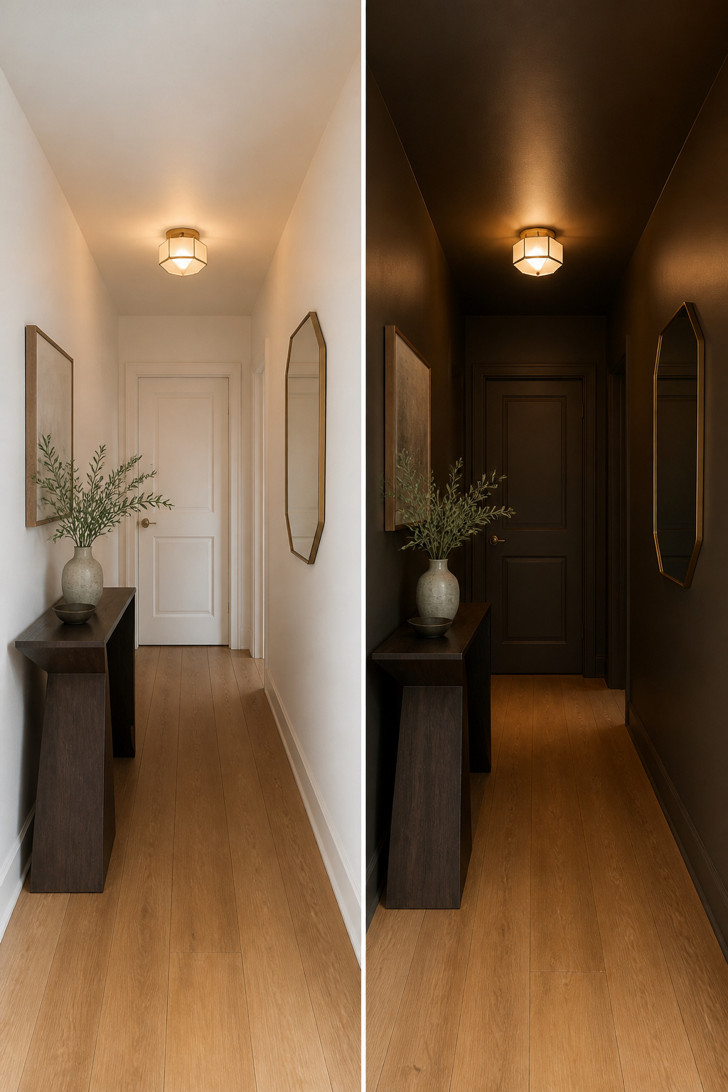
A hallway with no windows is the place to stop fighting the dark and start using it. Paint every surface, ceiling included, in one moody color and the space turns into something you actually pause in. The white you might reach for first has nothing to bounce off of in a lightless passage, so it can read gloomy rather than bright. Playing into the darkness makes it feel cozy instead.
Sherwin Williams Best Bronze is one color that commits fully to the idea. In a windowless Hollywood Hills bungalow, a designer pair used it wall-to-wall and added an angular table and a shield mirror in a Gio Ponti style that catches you at every step toward the bedroom.
The duo drenched the windowless space in Sherwin Williams’s Best Bronze.
That deep tone also sets up the rooms it leads to. The contrast makes them read lighter and larger once you step through the door.
For hallways that do get some light, the same principle works in reverse. Sherwin Williams Accessible Beige and Extra White are tested options that hold their own when there is something to reflect. Use dark when the hall is sunless, light when it is not, and either way paint it as a choice rather than a default.
2. Mirrors for Light and Space
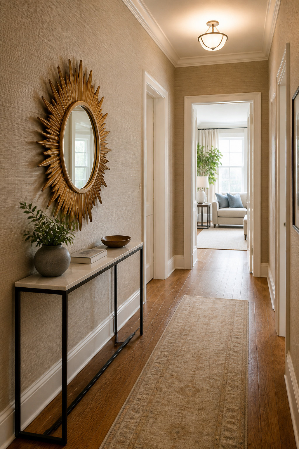
A mirror hung opposite a window will pull daylight the full length of a narrow hall, but the effect disappears if you mount it too high. Keep the center of the mirror at standing eye level, roughly 57 to 65 inches from the floor, so the glass catches the light stream rather than reflecting the ceiling. A mirror placed at the end of a short hallway does the same trick with depth, doubling the visual length of the space.
The common mistake is going too small. In a typical 36-inch-wide hall, a mirror under 24 inches across gets visually swallowed by the walls. A 30-inch-wide piece or larger holds its own. For frames, a vintage sunburst or an ornate thrift-store find adds personality without requiring a custom budget. A full-length antique mirror leans well here too, reflecting both light and any art you hang nearby, though you will want to secure the top to the wall if the hall sees traffic.
3. Gallery Walls

A gallery wall only works when the frames talk to each other. Pick one finish, brushed gold or black or natural wood, and let the art inside supply the variety. Public domain archives give you museum pieces at zero cost; download a high-resolution file and print it at any big-box store for under ten dollars. The frames are where you spend.
Family photos work the same way if you commit: print everything black-and-white, use vintage frames in the same metal family, and keep the gap between frames under two inches. Spread them thin and the hallway looks like a dentist’s office waiting room. Stack them floor to ceiling in one tight rectangle, or run a chronological line down a long hall, and the eye reads it as one intentional shape instead of clutter.
The mistake is mixing finishes and hoping the art saves you. It will not.
4. Runner Rugs
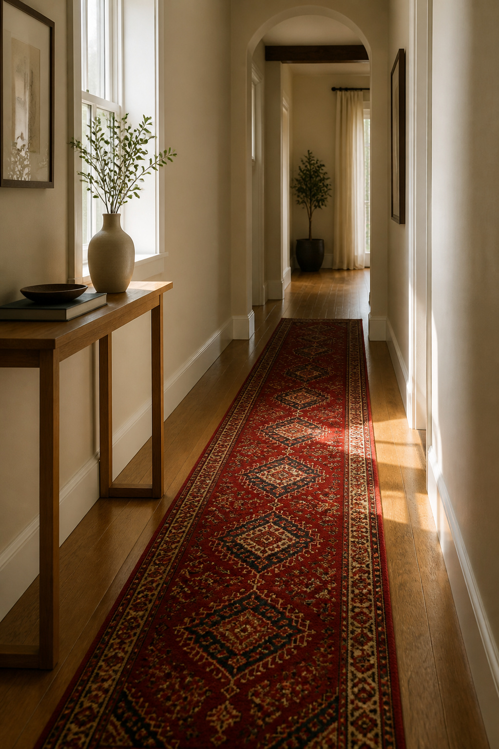
A runner rug is the fastest way to stop a hallway from feeling like a pass-through zone. If your walls are quiet, a patterned runner carries the whole room. A red oriental style runner works especially well here: the color wakes the space up without requiring anything else to change.
The catch is length. Standard runners rarely match your hallway exactly, and a rug that stops short looks like a mistake. One option is to piece two runners end-to-end for a custom fit. Place the seam under a console or in a low-traffic spot, and it disappears.
Leave about 8 inches of bare floor on each side so the runner reads as intentional, not squeezed in. Too wide and you trip on the edges; too narrow and the hall feels smaller. If you want more visual weight, two vintage runners with related palettes but different patterns will do it. The variation keeps your eye moving without the clash of competing colors.
5. Layered Lighting
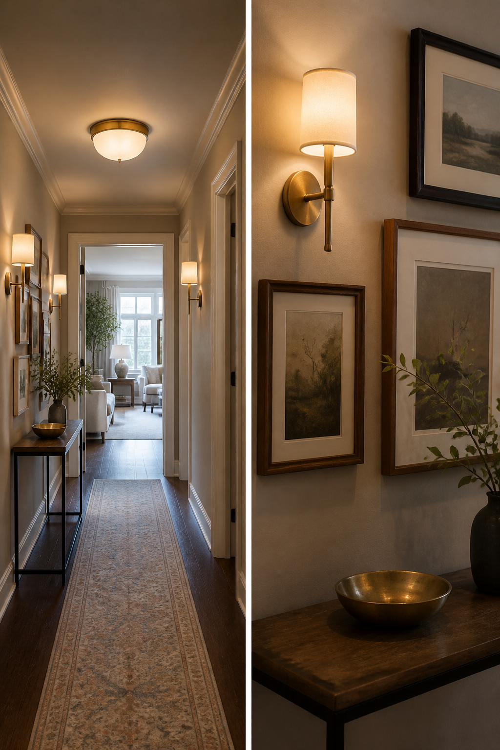
A single ceiling fixture leaves a hallway flat and shadowed, especially in the evening when you need the light most. You want two layers: something overhead for general brightness, then lower light to break up the tunnel effect.
For the ceiling, Allen + Roth makes a brushed-gold flush mount that sits low enough to clear headroom in an 8-foot ceiling and runs under $90 each. The low profile matters more than it looks; a pendant that hangs even 12 inches becomes an obstacle in a 36-inch-wide passage.
Sconces handle the second layer better than pendants in tight spaces. They repeat down the wall, give you that candle-like ambient glow, and leave the center of the hall open. Recessed cans alone feel institutional; a pair of vintage-style scones casting downward light balances the flush mount above without competing for space.
6. Benches and Ottomans
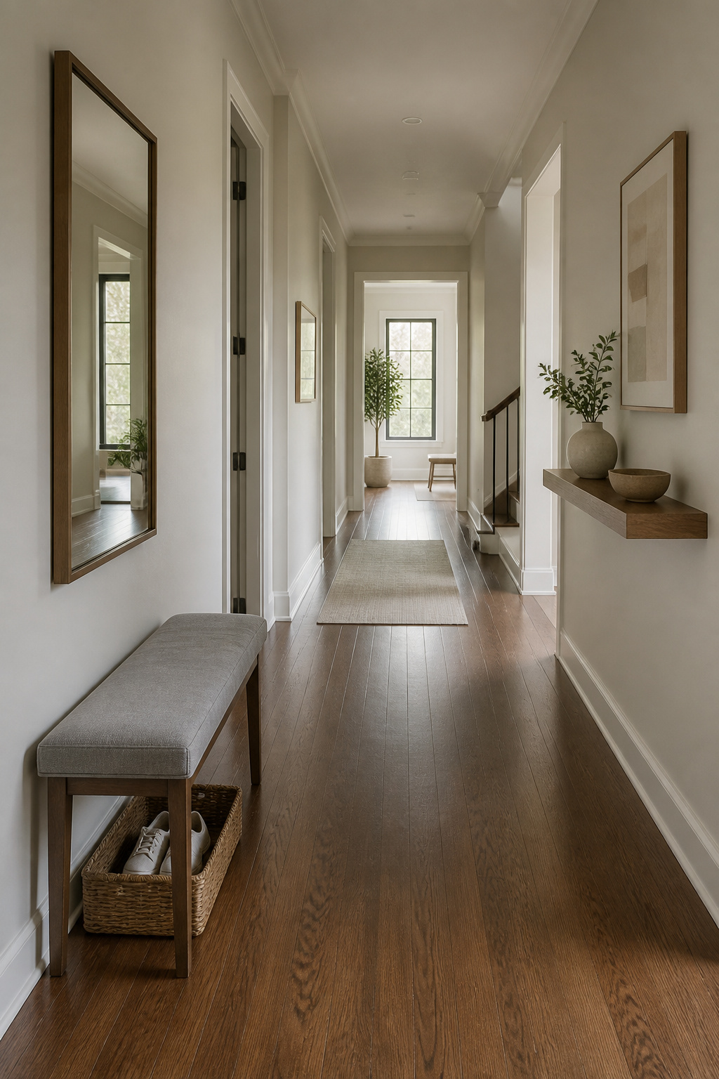
A bench in a hallway only works if you can still walk past it. Keep the depth to 14 inches or less and the seat stays out of the traffic line. Anything deeper turns a corridor into an obstacle course, especially when someone sits down and their knees add another six inches into the path.
The other common mistake is buying a bench longer than the wall it faces. A three-foot seat on a four-foot stretch of wall looks stranded; a six-footer on a five-foot wall blocks the door swing or crowds the corner. Measure the usable wall first, then shop.
For a wide hallway, a pair of low ottomans with a narrow console behind them gives you a place to drop shoes without pinching the walkway. In a typical narrow space, a single bench at the far end works better. Add a mirror or a small shelf above it and a basket underneath for the shoes, and the hallway stops feeling like a dead-end you rush through.
7. Wallpaper
Wallpaper in a hallway is a bet on your ceiling height and your patience with seams. In a narrow passage with standard eight-foot ceilings, a busy pattern can close the walls in on you; the stripe or repeat reads as clutter when you have no place to step back. Where it pays off is the ceiling itself, or a single wall at the end that acts as a destination rather than a surround. Designer James Carter used a classic yellow stripe in exactly this way, letting it unify the space without swallowing it.
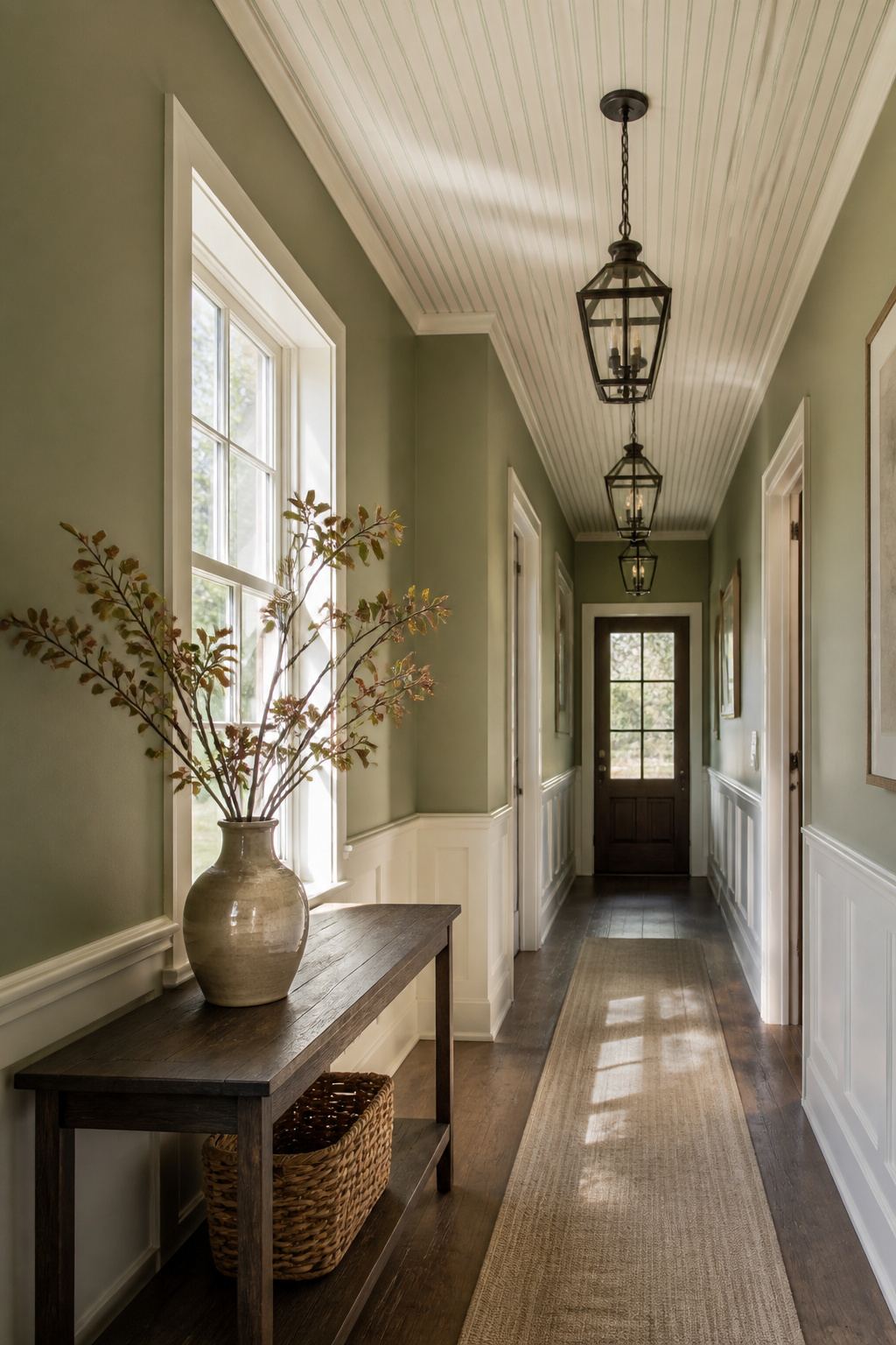
If the walls feel too tight for paper, treat the ceiling instead. Allen + Roth shiplap run across a hallway ceiling adds texture without pattern fatigue, and the lines draw the eye lengthwise so the space reads longer than it is. One homeowner spent under $300 planking a textured ceiling this way, then painted the trim and wainscoting below in HGTV Home by Sherwin-Williams Willowleaf, a soft olive that stays calm against white walls. The contrast does the visual work wallpaper might have done, and you will not fight a single seam in a corner.
8. Plants
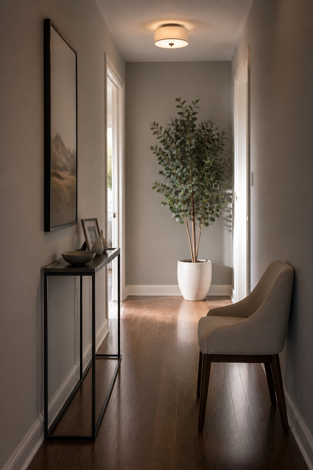
A hallway is where houseplants go to die. The light is wrong, the temperature swings every time a door opens, and you walk past without remembering to water. If you have already killed something green in that corridor, skip the guilt and go straight to a faux eucalyptus tree in a clean white planter. It reads as sculptural, not apologetic, and it does not need the sunlight that your hallway probably lacks.
For the stubborn, the surviving options are the ones that tolerate neglect by nature. Snake plants, spider plants, philodendron, parlor palm, and aloe vera all handle low light and irregular watering. Air plants work too, tucked into small vessels on a shelf where they at least remind you they exist. Succulents on a bench or a narrow surface add the same hit of green without the drama of a statement tree.
The honest call is this: a real plant in a hallway is a project, not a decoration. If you are already running a weekend project elsewhere in the house, the faux eucalyptus is the smarter budget move. It stays alive, it fills the corner, and you spend your Saturday on something that actually needs your hands.
9. Decorative Shelving
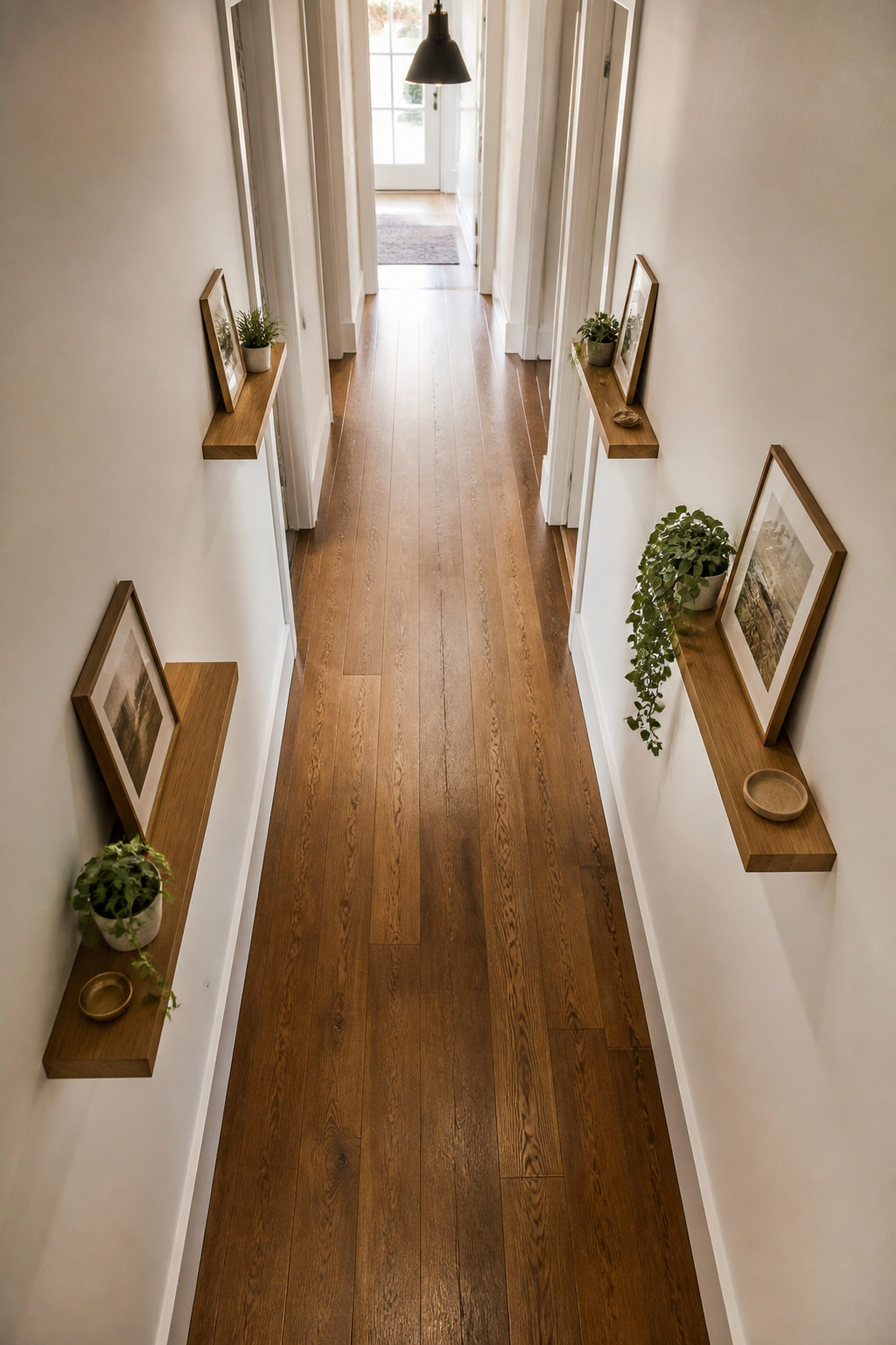
Floating shelves can add storage to a hallway without turning it into a closet, but the depth makes or breaks the walkability. Keep shelves at 12 inches deep or less and you keep the passage functional for anyone carrying a bag or a laundry basket. Go deeper and you are constantly brushing against whatever sits on the ledge.
Load them with books and you will notice the problem within a week. The weight and visual bulk eat into the corridor, and the spines catch sleeves as you pass. Stick to lighter objects: a small dish for keys, a single framed photo, a trailing plant. Designer Breegan Jane notes that floating shelves work best in wider hallways where they add depth without stealing floor space, and the one-hour install time makes this a genuine weekend project. If you are set on a library look, floor-to-ceiling shelving demands real width, like the white oak–clad hall in David Kleinberg’s Connecticut lake home. For most rentals and first homes, the floating route at 12 inches keeps the hallway a hallway.
10. Character Flooring
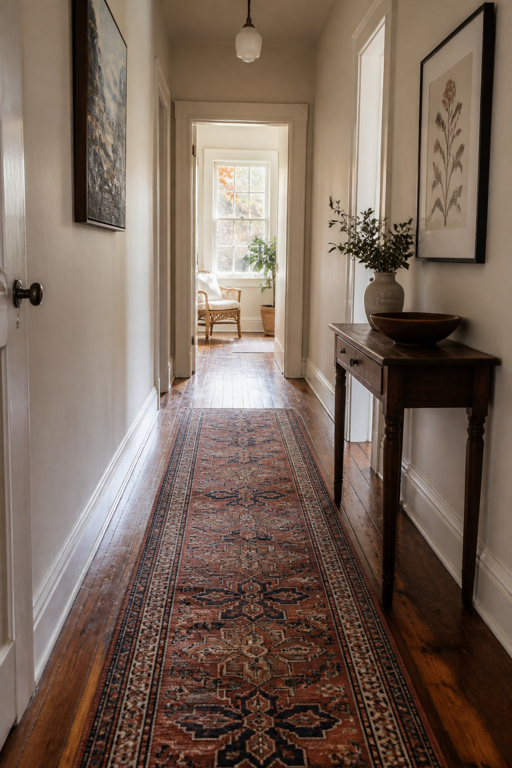
A hallway floor takes more punishment per square foot than any other surface in the house, so replace it only when the damage goes through the wear layer or when the subfloor itself is compromised. A good runner on sound flooring costs a fraction of full replacement and buys you five to ten years.
If you do pull the trigger, sheet vinyl and luxury vinyl plank survive traffic and water better than laminate or solid hardwood. Tile holds up but feels cold and loud in a narrow passage; engineered hardwood strikes a balance if you want wood grain and can accept refinishing limits. Carpet, even commercial grade, traps grit and shows the path within two years in a busy household.
Cost breaks down simply. A quality runner sized for a standard hall runs under a few hundred dollars. Even budget-friendly full flooring with labor starts near ten times that, and mid-range materials push higher. For renters, the math is obvious. For owners planning to stay, flooring pays back if the existing surface is truly spent, not just tired.
Accent Walls That Frame

Wrapping a color or paper around every wall in a hallway usually flattens the space instead of giving it shape. One strong wall does the framing work for you: it creates a visual endpoint and makes the rooms opening off the hall feel lighter and larger by contrast.
Choose the wall you face when you enter, not the one at the far end. That back wall is the common mistake. It seems logical to "end with a bang," but in a narrow hall you are usually walking toward a door, not a viewing distance. The impact gets swallowed before you reach it. The entry-facing wall, by contrast, hits you immediately and sets the tone for the whole passage.
Color blocking keeps this cheap and reversible. Paint one wall, or pair neutral wainscoting with a bold shade above it. No construction mess, and if you hate the color in six months you are repainting twelve square feet, not stripping a corridor. Test it in morning and evening light first; hallways shift more than you expect.
Seasonal Refresh
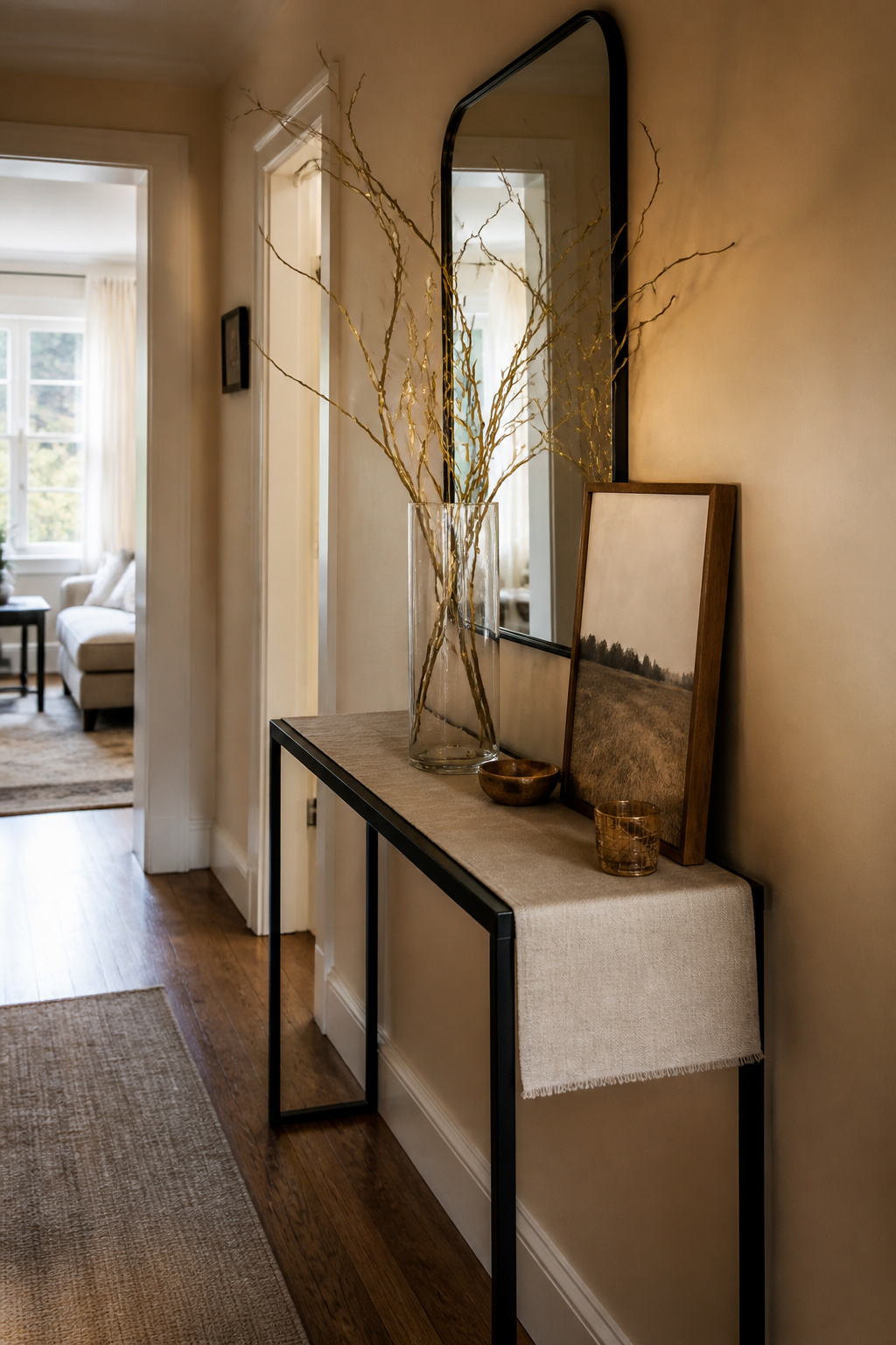
The parts of a hallway that actually shift with the seasons are smaller than you might expect. A console table or shelf can hold sculptural branches and battery-operated string lights through winter, then dried wheat or nothing at all once spring light fills the space. Swap a single piece of wall art if you have storage for the off-season pieces. The paint color, the mirror, the runner: those stay. Do not turn the hall into a craft store explosion by changing every surface at once. One or two swapped elements read as intentional; six read as clutter you will trip over on the way to the kitchen. If your hallway runs narrow, keep the seasonal additions vertical: a tall branch in a slim vase draws the eye up without stealing floor space. The rest of the year, that same spot holds nothing, and the hall feels larger for it.
Color and Light for Narrow Halls
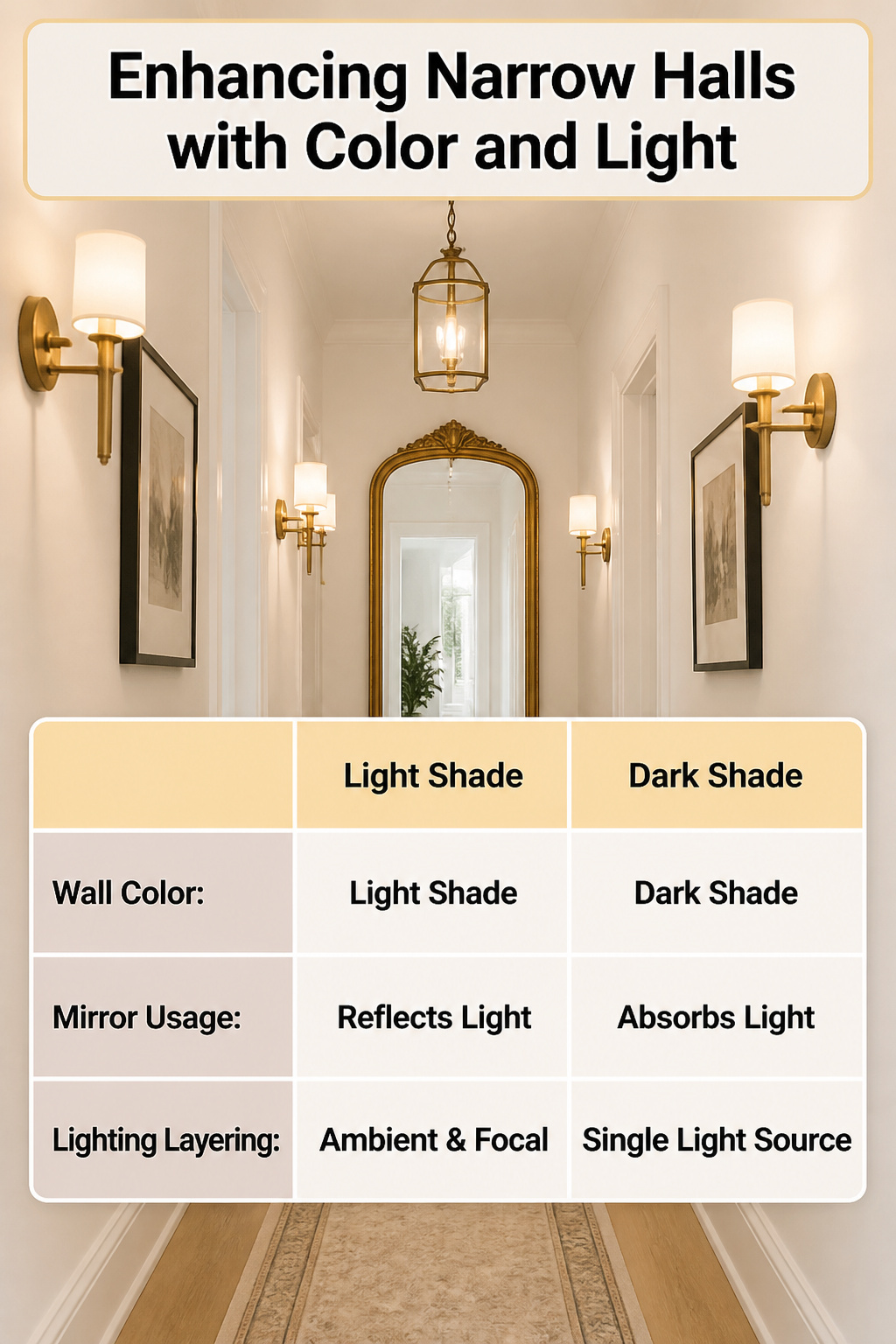
You have probably asked both questions about the same hallway. A narrow space feels dark because light has nowhere to spread, and it feels small because your eye stops at the first solid surface. The same three fixes answer each complaint at once.
Start with the wall color. A light shade bounces whatever light you have, whether it is a window at the stair landing or just the glow from the rooms you leave open. One homeowner spent eight years in a hall she compared to a hamster tunnel before she changed the paint; the difference, she said, was stopping to admire it on the way to the laundry.
Add a mirror at the end or across from the brightest spot. A floor-length antique mirror reflects both light and whatever art you hang, so the space reads as twice its length. It also gives you a spot to check yourself before you head downstairs, which means the wall earns its keep.
Finish with layered light. A single flush mount leaves corners dim and flat. Sconces repeated down the wall give you ambient light that behaves more like candles than recessed cans, and a small pendant or lantern where headroom allows adds a focal point that draws the eye forward. The stacked geometric fixture one renter chose gave guests a preview of the Art Deco tone through the rest of the apartment.
Light color plus mirror plus layered light beats any one trick because each layer corrects what the others miss. Paint brightens but does not reach into corners. A mirror doubles but does not create. Fixtures add warmth but cannot widen walls. Used together, they turn a corridor you rush through into one you pause in.
What to Avoid
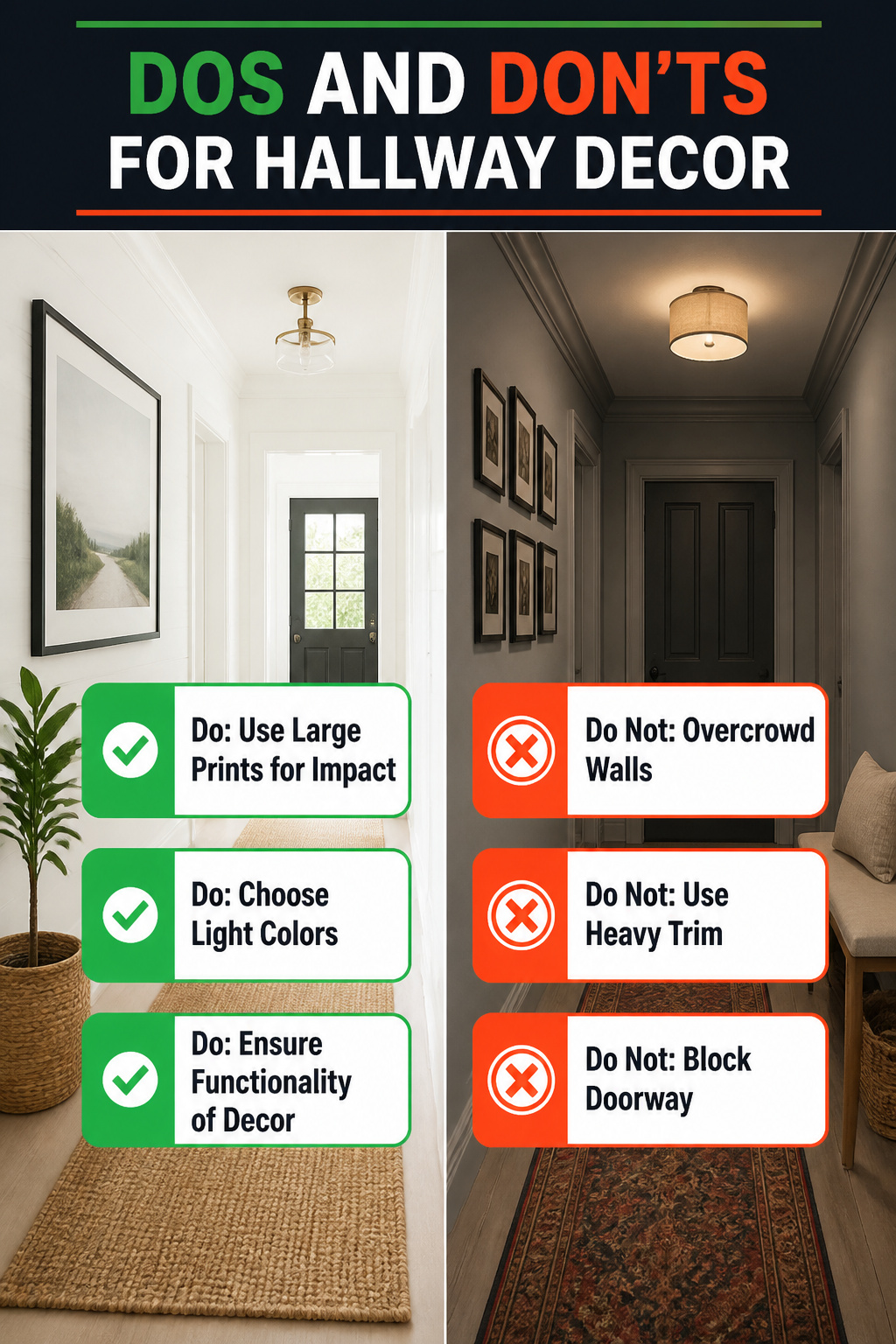
A hallway can swallow decor that looked perfect in the living room. The most common mistake is overcrowding the walls. A narrow corridor needs breathing room; three large prints in a row reads as intentional, but a dozen small frames turns the space into a storage wall you walk past twice a day.
Scale matters just as much. Board and batten can make a hallway feel wider, but heavy trim in a tight space does the opposite. The same treatment that opened up one corridor has been torn out by homeowners who found it closed in the room once the farmhouse trend passed.
Dark paint is the choice that divides. Some designers argue a windowless hallway should go moody, deep blue with white trim and orange pendants to punctuate the darkness. Others have lived with the result and regretted it. White in a lightless space can read gloomy, but dark colors with nothing to bounce off can feel like a tunnel if your lighting is not deliberate. The risk is higher than the magazine spread suggests.
Function loses to looks when a bench blocks the door swing or a runner trips you at 6 a.m. If you cannot walk through with a laundry basket, the decor has failed.
Frequently Asked Questions
What are some hallway decor ideas for narrow spaces?
Light paint colors bounce whatever light you have, whether from a window or the glow from open rooms. Add a mirror at the end or across from the brightest spot to double the visual length. Finish with layered lighting: sconces down the wall for ambient glow, plus a flush mount overhead so corners do not go dim.
How can I make my hallway look bigger?
A mirror hung opposite a window pulls daylight the full length of the hall, or place one at the end to double visual depth. Keep the center at standing eye level, roughly 57 to 65 inches from the floor, and go at least 30 inches wide in a standard 36-inch hall so the glass does not get swallowed by the walls. Light wall colors and minimal decor help too; spread frames thin and the hallway looks like a waiting room.
What type of lighting is best for hallways?
Layered lighting beats a single fixture. Use something overhead for general brightness, then sconces repeated down the wall for ambient glow that behaves like candles. Recessed cans alone feel institutional. A low-profile flush mount clears headroom in an 8-foot ceiling; avoid pendants that hang even 12 inches in a 36-inch-wide passage, where they become obstacles.