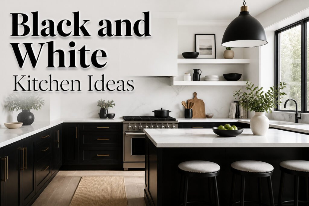
The black and white kitchen ideas below run from a weekend paint job on lower cabinets to full marble and custom lacquer builds, and the deciding factor is almost always whether you rent or own. Renters get the most forgiving entry point: white uppers left alone, black lowers swapped or painted for a few hundred dollars, with scuffs hidden better at the bottom where shoes and vacuum bumps land. That split, white overhead and black below, anchors the room without closing it in, and it is the combination that shows up most often across every source we checked.
1. Classic Two-Tone Cabinets
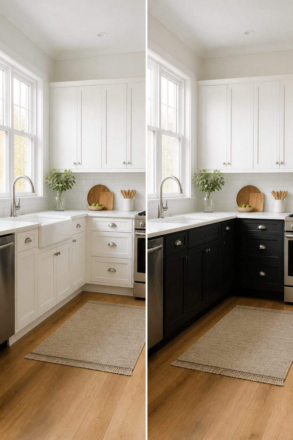
White uppers and black lowers split the kitchen in a way that feels intentional, not like you ran out of paint. The white cabinets catch light and keep the room from closing in overhead, while the black base cabinets anchor everything below counter height so the space does not feel top-heavy. This is the combination that shows up most often across the sources, and for renters it is the most forgiving entry point into the look.
You do not need to touch the uppers at all if they are already white or a close enough off-white. The work lives below: swap the lower cabinet doors if the landlord allows, or paint the existing frames and doors in a black that matches your hardware budget. A weekend project running a few hundred to a thousand dollars typically covers paint and supplies for lowers, or replacement doors for a small galley run. The heavier visual mass at the bottom also hides scuffs from shoes, pets, and vacuum bumps better than white would.
If you want to flip the script, black uppers with white below is the rarer move and it works best when you have art or open wall space you actually want to frame. For most kitchens, though, white on top, black on bottom is the safer starting point and the one that needs the fewest excuses.
2. Black Kitchen Island with White Cabinets
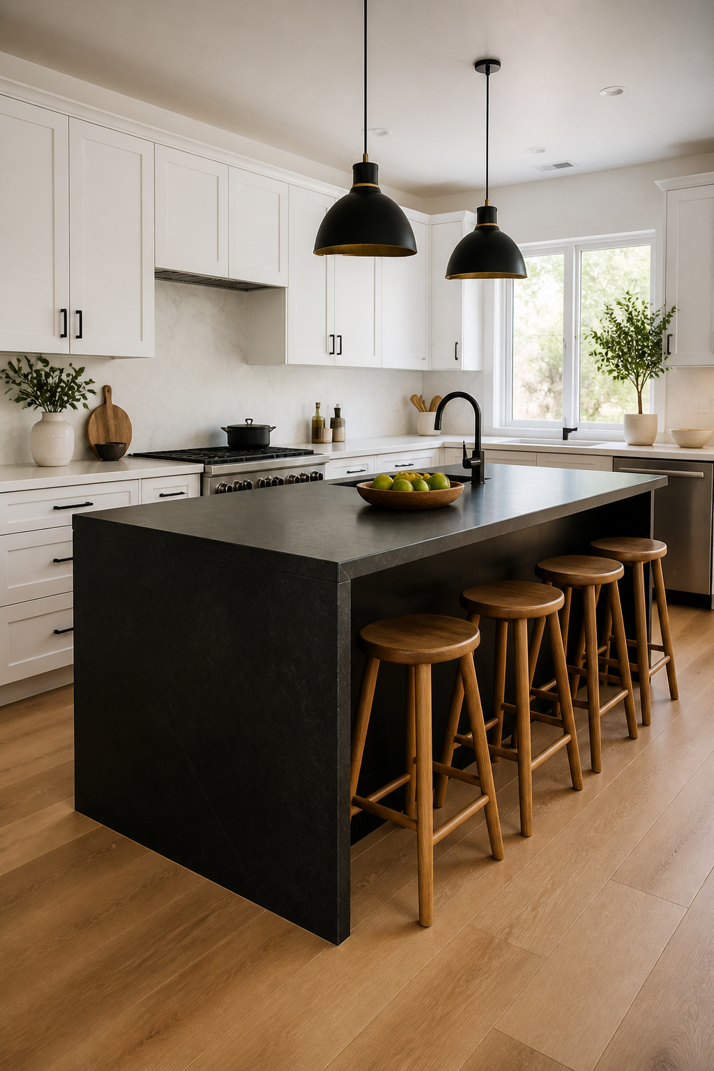
A black kitchen island gives you the drama without the risk of dark perimeter cabinets closing in the room. The island becomes the anchor, and the white cabinets around the edges keep the walls bright and the space feeling larger, especially when your countertops stay light.
If you already have an island, painting it is the cheaper path. For a factory-grade finish that holds up to scuffs and water rings, look to cabinet-specific paints in satin or semi-gloss rather than wall paint with a bold label. You will spend a weekend on prep and two or three thin coats, but you skip the cost of new cabinetry entirely.
In an open plan where the island faces the living area, this move reads as intentional furniture rather than kitchen bulk. The black side presents a finished face to the sofa, and the white perimeter keeps sightlines open to the rest of the space. Materials like carbon oak veneer or flamed granite on the island add depth against white lacquer without introducing new colors that fight your living room palette. The higher ceilings and extra natural light typical of open plans mean you can handle the darker hue where a closed kitchen might feel sunk in shadow.
Keep the island base matte or low-sheen if the living side is what guests see; glossy black reads modern but catches every fingerprint from the cooking side and the TV-watching side alike.
3. Minimalist Black and White Design
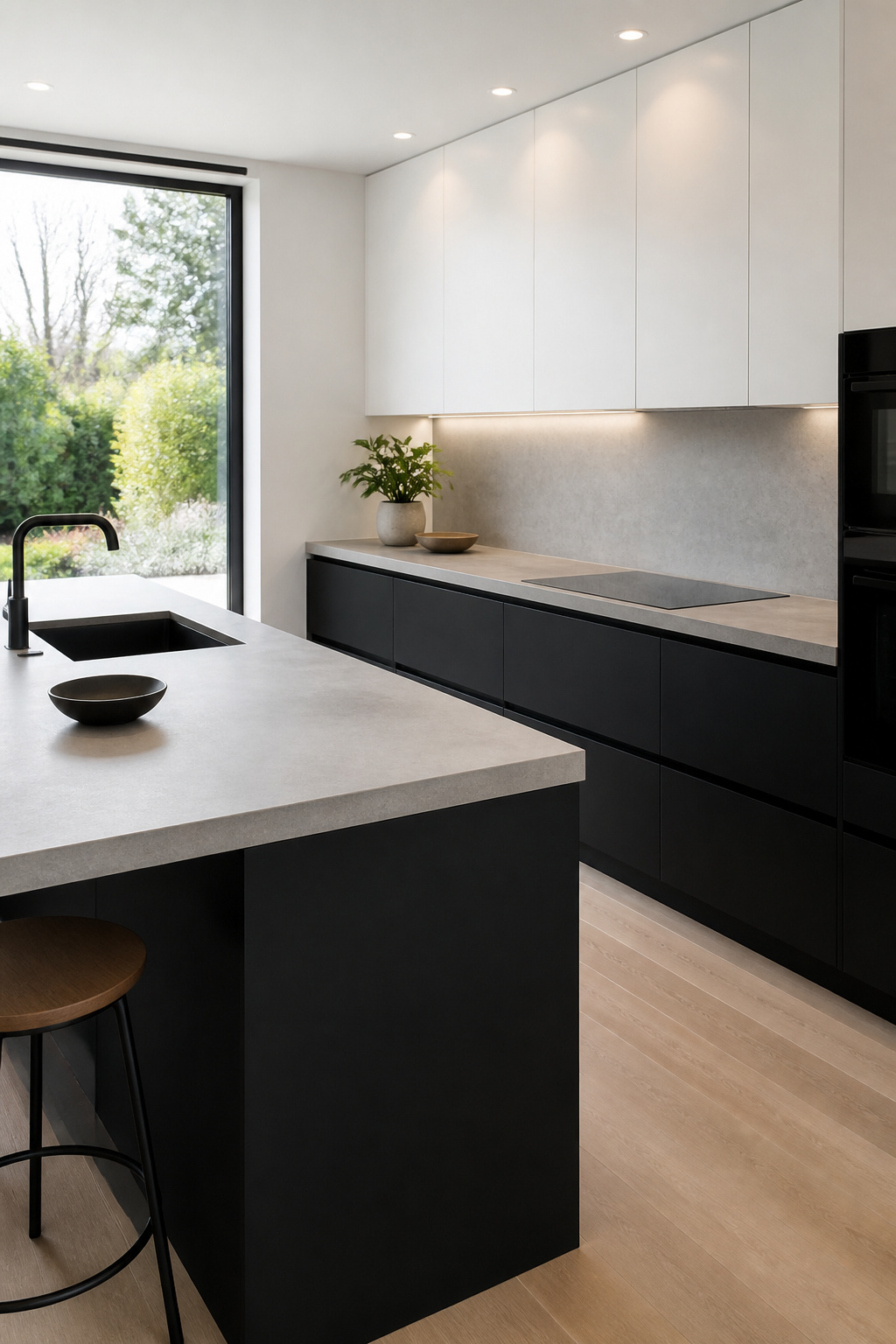
The stripped-back look starts with what you take away. Flat-panel cabinets with no raised edges, hardware tucked into finger-pull grooves or mounted inside the frame, and not a single decorative corbel or turned leg in sight. Six leading roundups on black and white kitchens flagged this as the direction for 2026, and it is easy to see why it keeps showing up: the less ornament you specify, the less you pay per cabinet. A slab door costs less to manufacture than a routed Shaker profile, and skipping pulls and knobs saves another thirty to fifty dollars per opening.
The palette does the visual work instead. Black lower cabinets against white uppers, or the reverse, gives you the contrast without needing tile patterns or open shelves full of props. Recessed lighting and appliances built into tall units keep the sightlines clean. Concrete countertops surface well here because they read as a single plane; glossy backsplashes work too, though they demand stricter cleaning.
The risk is sterility. One roundup showed a kitchen that solved it with a single large black island in an otherwise white room, another with a piece of wall art scaled big enough to hold its own against the blank surfaces. You need one moment of weight, not many. Keep the counters clear and the storage planned so everything with a plug disappears behind a door.
4. Shaker-Style Cabinets
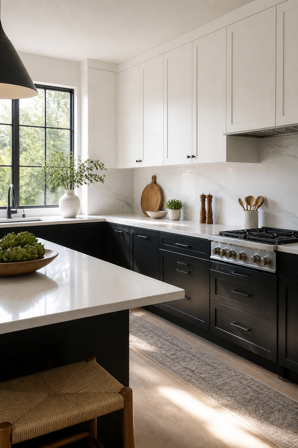
Shaker-style cabinets carry a recessed panel that sits flat inside a four-piece frame, a profile born in the 1800s that still reads clean enough for a modern kitchen. Paint that frame crisp white and the room brightens without looking country; paint it matte black and the same lines turn sharp and current. The style works either way because there is no decorative molding fighting the color, just geometry.
Quality shows in the joint where the rail meets the stile. Look for a door with a true mortise-and-tenon or doweled corner, not a butt joint held together with staples. A well-built Shaker door feels rigid when you knock on it and stays square through humidity swings.
For a project you are assembling yourself, ready-to-assemble cabinets can hold paint well if the material is right. Fenix NTM surfaces take paint especially cleanly and resist the fingerprints that ruin standard matte black finishes. Powder-coated wood or metal doors also survive the knocks of daily use better than basic painted MDF. Expect to spend a few hundred dollars on a small bank of RTA uppers and lowers, with assembly taking one solid weekend.
5. High-Gloss Finishes
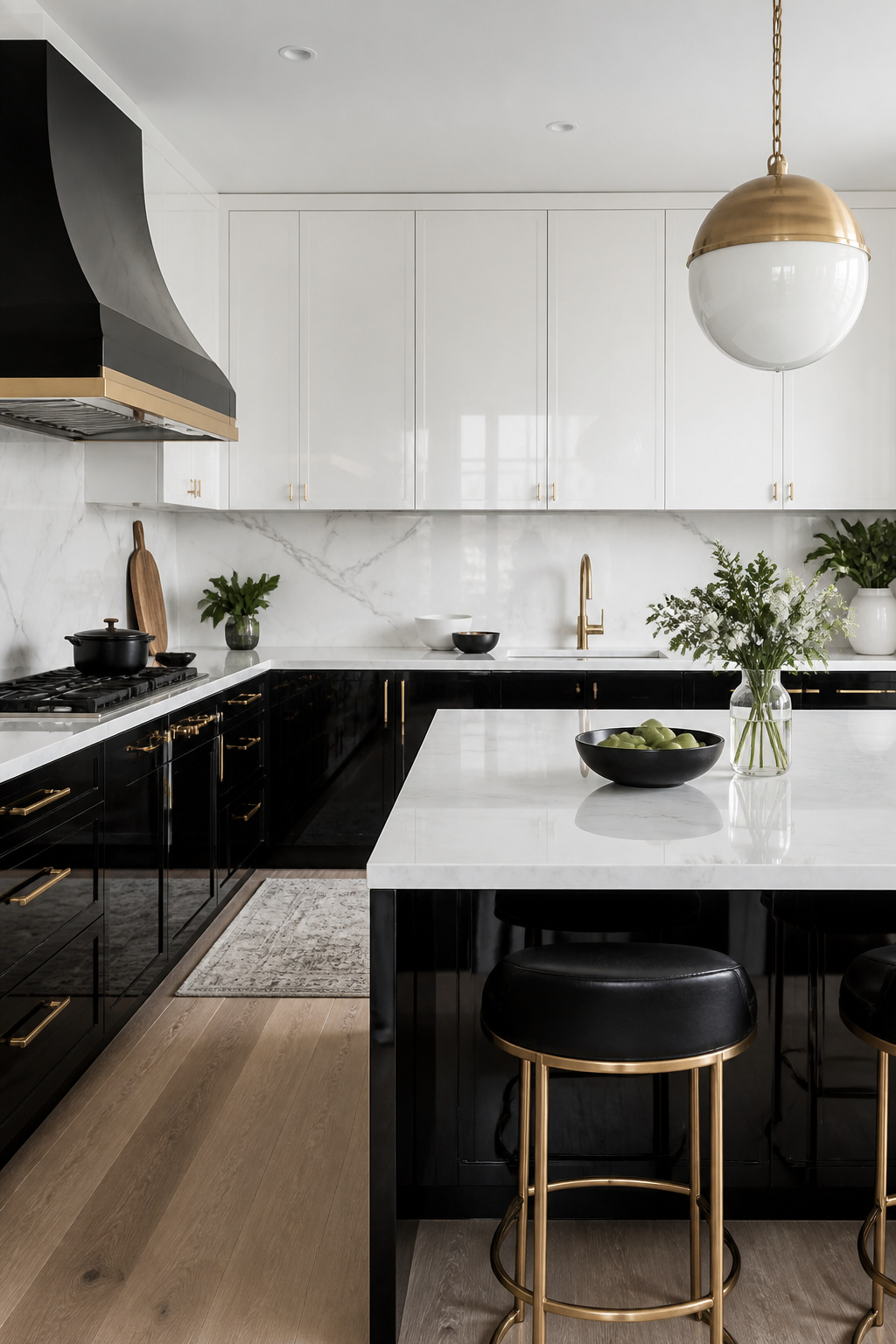
Reflective surfaces can pull light into a black and white kitchen that would otherwise stay dim, but the finish you choose changes how much living with it costs you. Lacquer carries the deepest mirror-like reflection and the highest price, acrylic sits in the middle with a bright, plastic-like shine, and thermofoil wraps a thin vinyl film over MDF for the budget end of gloss. All three show fingerprints; lacquer and acrylic make them glaringly obvious, while the slightly softer reflection of thermofoil hides smudges a little longer.
The real question is whether gloss serves the calm of a two-tone kitchen or fights it. Black glossy cabinets read dramatic and deliberate, almost nightclub; white gloss reads clean but can feel clinical if it dominates both uppers and lowers. What convinced me, reading through the advice that held up across sources, was the split strategy: keep high-gloss white above eye level where hands rarely reach, and run something flatter below. The reflection still bounces ceiling light around the room, but the lower half stays quieter and the whole space avoids that polished-to-anxiety feeling. Clean only with a soft microfiber cloth; paper towels etch micro-scratches over months, and ammonia-based cleaners will flatline the sheen you paid for.
6. Farmhouse Style
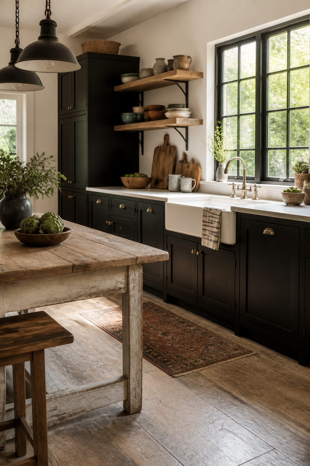
A farmhouse black and white kitchen lives or dies on the sink. The apron-front style is the anchor, and if you are upgrading to one, you cannot use a standard sink-base cabinet. That swap alone rewires your layout, so plan for it before you order anything else.
The warmth comes from the fixtures, not the palette. Open plate racks and beadboard panels do the work here, but they can tip fast into showroom territory if every surface is too crisp. Let the wood stay imperfect — oak or walnut on a shelf or floor, left to show wear — or the contrast reads as staged. The same sources that push black Shaker cabinets paired with white quartz counters note that wood is what keeps the room from feeling like a set.
Black metal pendant lamps help, though they pull toward industrial if you are not careful. The balance you want is between the starkness of the palette and the utility of the pieces. A plate rack with dishes actually used, a sink front dented from pots, beadboard with paint that has settled into its grooves: that is what separates lived-in from catalog.
7. Marble Accents
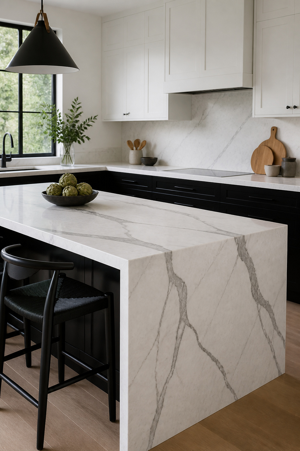
Real marble and quartz that mimics it read very differently in a black and white kitchen, and the veining is what separates the two. In a two-color room, bold, directional veins on a white slab become the bridge between the cabinets; faint or blotchy patterns disappear against black and read as dirty gray. If you are choosing an island top or a backsplash strip, hold the sample against both your black and your white surfaces before you order.
Marble mosaics behind the stove look high-end, but both the stone and the grout need strict sealing to survive cooking splatters. Skip this and oil marks the veining permanently within a month of real use. Quartz copies the look without the sealing ritual, though the pattern repeats more obviously across a large island. For a small backsplash section, that repetition barely shows. For a 6-foot island, it can look like wallpaper.
The practical call: use real marble where you will see and enjoy it daily, seal it yearly, and accept that etching from lemon or wine is part of the material. Use quartz for the heavy-work zone behind the range, where splatter is constant and maintenance is the last thing you need.
8. Small Space Solutions
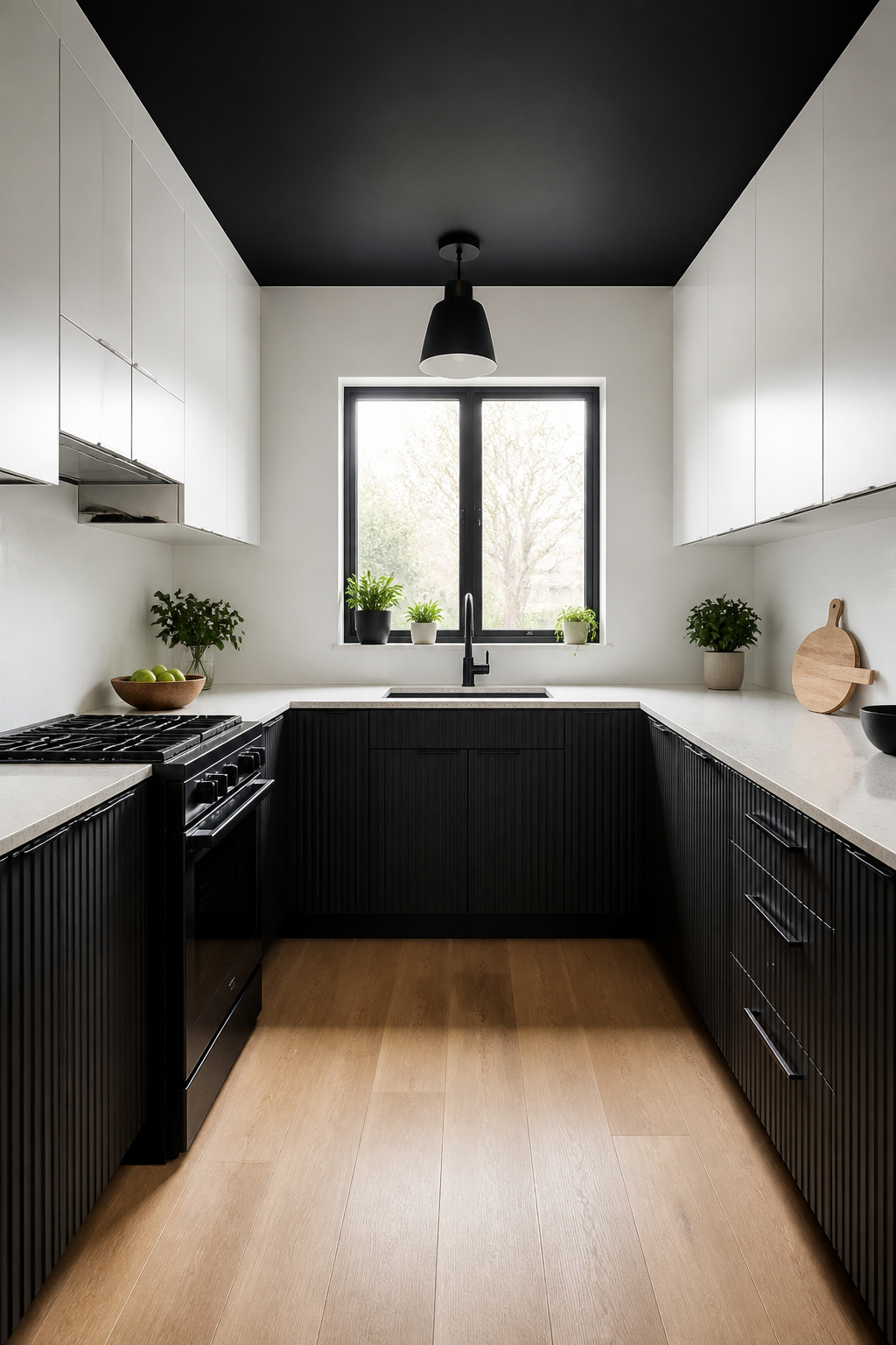
Black and white can expand a tiny kitchen or shrink it further, and the difference comes down to where each color lives. White upper cabinets recede visually, pushing the walls back and bouncing light around, while black lower cabinets anchor the floor and keep the space from feeling untethered. That combination, white uppers over black bases, is the safest move for a rental or first project because it grounds without closing in.
A black ceiling sounds wrong until you see it in a galley kitchen. The logic flips: instead of fighting the narrow box, you paint the ceiling black so the wall line dissolves upward. The eye reads the white walls as taller than they are, and the black overhead becomes depth rather than weight. It works best where natural light is limited, because a white ceiling in a dim galley just reads as gray and dirty.
If the space has low ceilings or small windows, keep the black to accents, handles, fixtures, or a single countertop. The perceived space matters more than the contrast.
9. Scandinavian Influence

Scandinavian black and white kitchens read lighter than American farmhouse because the palette stays tight: matte black for the lower cabinets, abundant white above, and light wood only where it brings warmth, not where it adds clutter. The farmhouse version tends toward heavier contrast, more hardware, and wood tones that compete rather than rest. Nordic kitchens let the materials breathe.
Natural light is the part you cannot fake. White upper cabinets and walls reflect what comes through the window, but matte black base cabinets absorb it. If your kitchen faces north or sits under a porch, that absorption tips the room toward gloom. Layered lighting fixes some of this: cool, bright task lights over prep areas, warm under-cabinet strips to soften the black surfaces after dark.
You do not need to import from Denmark to get the look. Affordable American lines carry flat-panel doors in matte black and soft white that sit at the right price for a weekend project with a few hundred dollars. The difference is in the restraint: one wood tone, one black, one white, and nothing that reads as decoration rather than function.
10. Industrial Elements
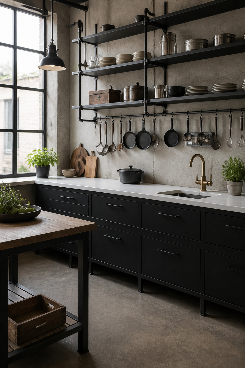
Black iron pipe shelving reads as industrial without much effort, which is exactly why it can tip into restaurant back-of-house faster than you’d expect. The move is pairing that raw hardware with something refined: white quartz countertops underneath keep the look intentional rather than accidental. Reclaimed wood shelves on the pipe help too, adding warmth the all-metal version strips away.
Metal mesh cabinet inserts hit the same note at lower cost than they appear. The visual weight reads factory-grade, but you’re often just cutting panels into existing doors rather than replacing whole boxes. Factory-style lighting, painted black if the fixture already has presence, does the heavy lifting for mood with minimal spend.
Concrete countertops and exposed brick amplify the urban feel if your space already has them, though both sit at the higher end of a weekend-and-a-few-hundred budget. Painted black ductwork or beams achieve nearly the same effect when the architecture hands them to you. The limit worth respecting: one raw element per sightline. Two reads designed; three reads like you inherited a commercial kitchen and stopped there.
11. Transitional Designs
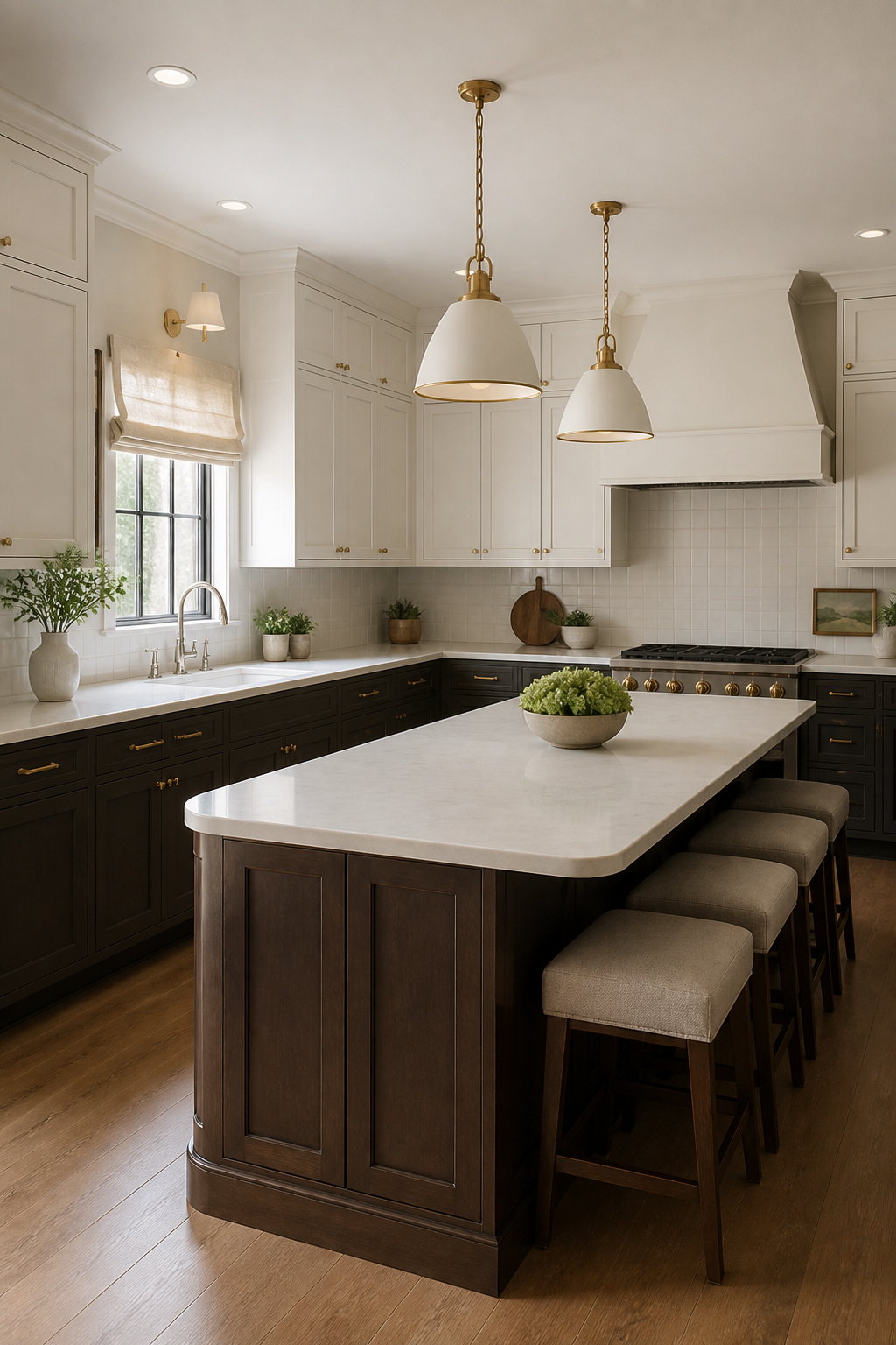
A transitional black and white kitchen lives in the space between periods, not inside one. It borrows the order of modern lines but keeps the warmth that minimalism often strips away. The result reads as intentional without feeling staged, and that balance is why the look outlasts purer styles that date themselves faster.
Mixing chrome and brass hardware is where most people hesitate, and the hesitation is fair. Done without a plan, the metals fight. The workable approach is to treat one finish as the lead and the other as punctuation: brass for cabinet pulls that repeat across every door, chrome for the faucet and pot filler that share the same visual zone. Keep the two metals from touching on the same plane, and they read as layered rather than mismatched.
Warmth comes from material choices, not color compromise. Unlacquered brass gains patina and softens the contrast over time. White oak or walnut underfoot or on a single bank of cabinets does more to soften the palette than any beige accent could. Curved edges on a counter or a rounded light fixture break the grid without breaking the scheme.
The survival of this style through trend cycles comes down to flexibility. A kitchen built on contrast and proportion can absorb new hardware, different stools, a changed pendant without gutting the whole room. Pure modern demands the complete thought; transitional lets you edit.
12. Black Backsplash
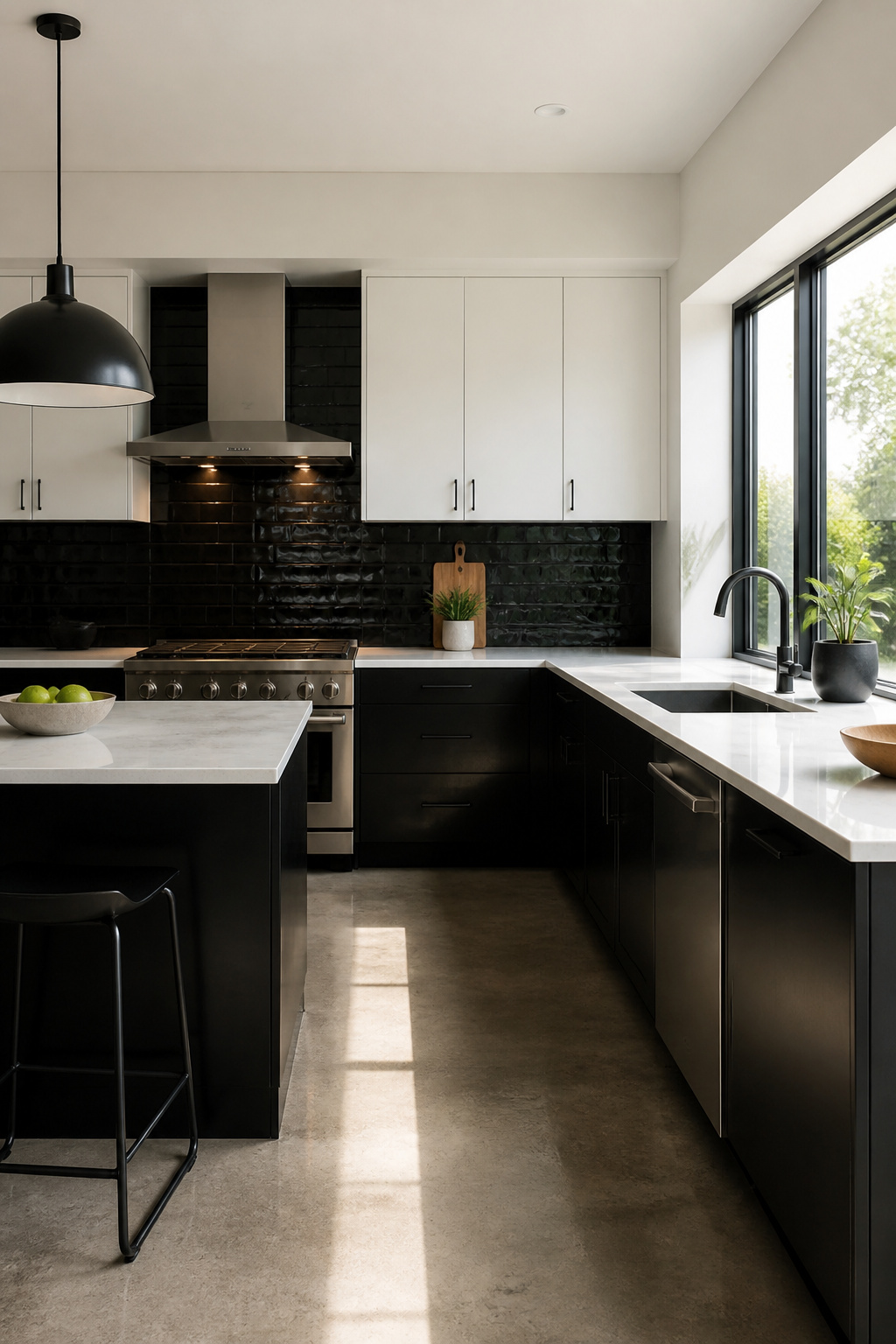
A black backsplash behind white or light counters inverts the usual kitchen formula and gives the room its depth back there, where walls tend to disappear. You notice it the way you notice a dark doorframe in a white room: it holds the space together without shouting.
Zellige tiles work especially well for this because their glaze catches light unevenly, so the black reads as a texture rather than a flat hole in the wall. Subway tile in black does the opposite, giving you clean lines and a graphic, almost printed look. Glass keeps the surface reflective, which helps if your kitchen runs short on natural light. Paint is the renter’s exit ramp; a satin or eggshell black behind the stove scrubs reasonably well and costs a weekend, not a tile bill.
Grout color is where you commit to a maintenance life. White grout on black tile is the choice you will scrub every Saturday. The contrast looks crisp for about a week, then every cooking splatter and water spot stages a show. Dark grout on black tile hides the mess and lets the tile shape do the visual work. If you are drawn to that high-contrast grid, know that "easy to wipe" is not the same as "stays clean-looking." The black tile itself forgives; the white lines between never do.
13. Coastal Vibes
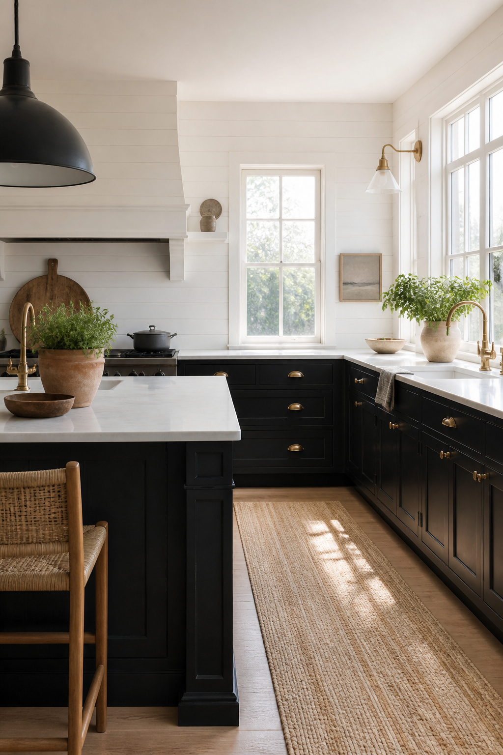
Black and white reads coastal only when the materials do the talking, not the décor. Shiplap walls in matte white, cabinets in soft black, and rope-loop pulls on drawers give the kitchen its beach-house identity without drifting into souvenir-shop territory. The line between coastal and merely airy is texture you can actually feel: sisal underfoot, the slight roughness of bleached white oak floors, the irregular grain of open shelving left unfinished. Skip the anchor motifs and the "beach" sign above the stove. One rope element and one weathered wood surface are usually enough; add a second rope detail and you have started a theme park. White oak works better here than walnut because its tone stays lighter and less aged, keeping the palette sun-bleached rather than rustic. A single terracotta pot with something green breaks the monochrome just enough, and the leaves do more for the room’s mood than any color accent you could buy. If the floor is already dark, leave the shiplap bare and put your texture budget into the pulls and one floating shelf. The restraint is what makes it feel like a real house that happens to face the water, rather than a rental staged for a long weekend.
14. Wood Accents
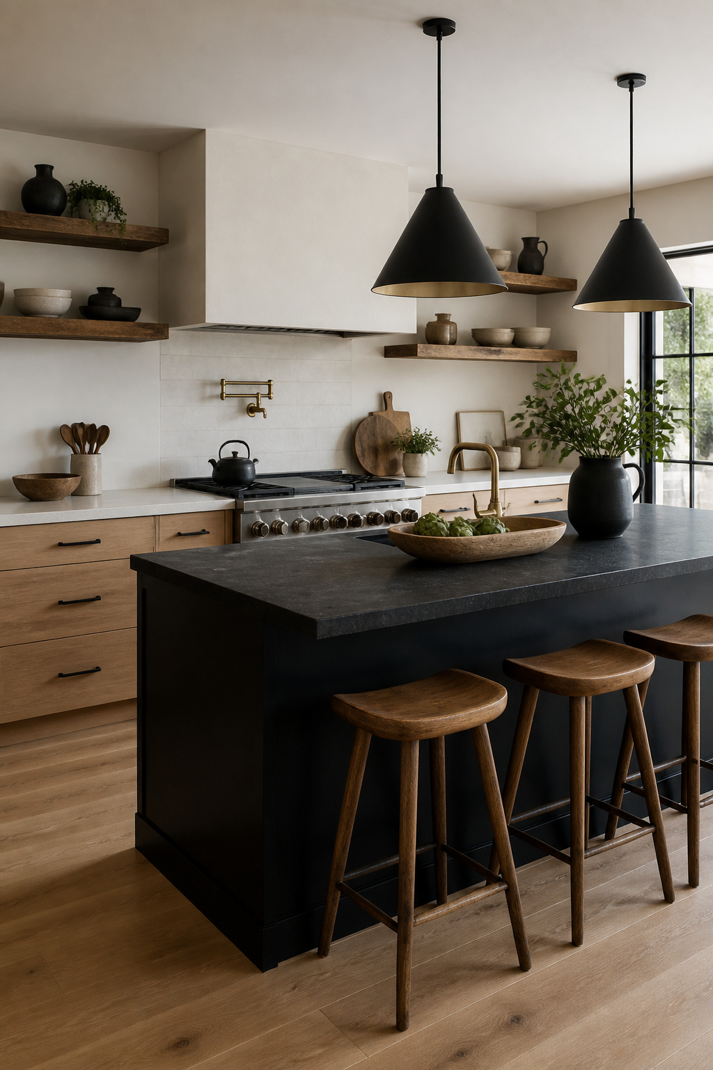
Wood is the one material that can warm a black and white kitchen without becoming a third color fighting the scheme. The trick is choosing the right tone and placing it where it reads as texture, not as competing pigment.
White oak and walnut are the two species that currently work best here. White oak feels lighter and less aged, with a neutral tone that sits quietly against both black and white surfaces. Walnut goes deeper and richer, useful when the room needs weight at the lower half. Bamboo sits somewhere between, though it can read slightly yellow if the surrounding whites run cool.
Where you put the wood matters more than how much you use. Flooring is the safest anchor; it grounds the room without drawing the eye upward. Open shelving in oak or walnut adds warmth at chest and head height without the visual mass of full cabinetry. Reclaimed wood with its knots and marks brings character, but keep it to one element or the grain pattern becomes the star of the room. The moment wood appears on cabinets, countertops, and shelving together, you have stopped designing a black and white kitchen and started designing a brown one.
15. Matte vs. Glossy Finishes

Matte black absorbs light rather than reflecting it, which makes the color read as deeper and hides the fingerprints that glossy black broadcasts across every surface. For cabinets and walls, that absorption is practical: you are not wiping smudges off every door front every evening. Sources point to ultra-matte options like Fenix NTM or powder-coated finishes as the durable choice for high-touch areas, since standard matte paint can still show greasy prints and textured wood veneers in deep charcoal use grain to mask what remains.
Gloss belongs on backsplashes and ceilings, where light needs to bounce. A glossy backsplash throws window light back into the room, and a glossy ceiling does the same overhead. The catch is maintenance: gloss shows everything. Anti-fingerprint technology for gloss exists, but matte remains the lower-effort default for anyone who cooks daily and cleans on weekends.
16. Checkerboard Flooring
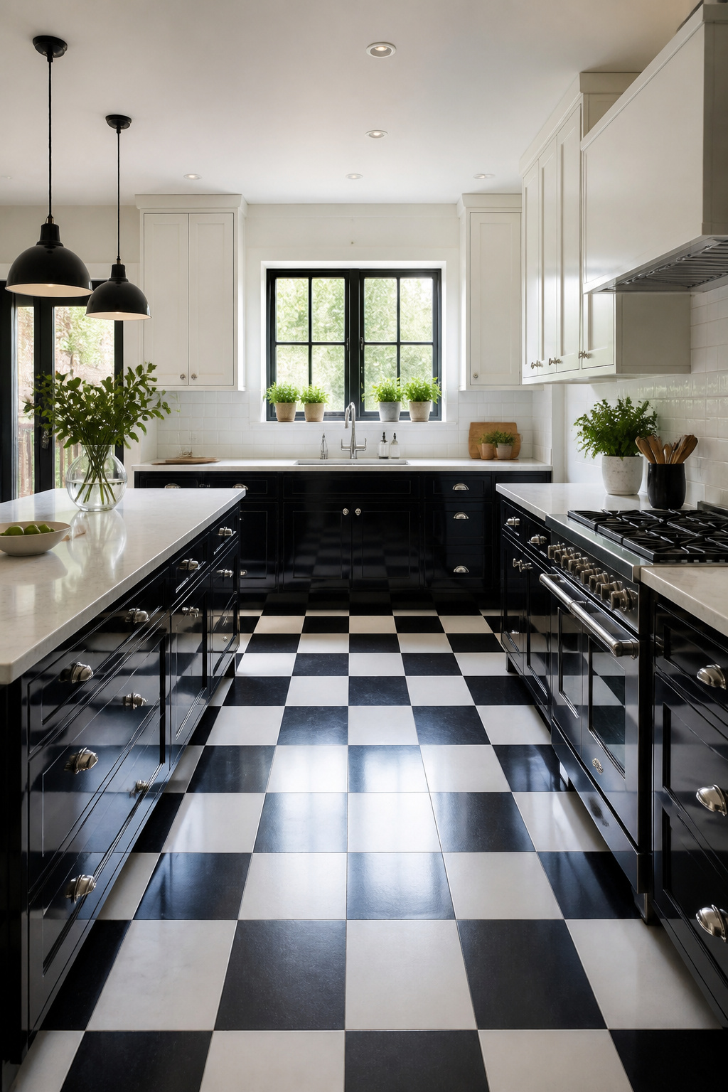
Checkerboard flooring in black and white reads as bold from the doorway, but it shrinks a room visually, so it works best in kitchens with at least a little breathing room around the cabinets. In a galley or a tight U-shape, the pattern fights the walls and the eye has nowhere to rest.
You have three practical routes. Sheet vinyl with a printed checkerboard runs the cheapest and installs fastest; the squares stay perfectly aligned because the factory printed them that way. Peel-and-stick vinyl tiles let you set the real thing at real scale, but buy from one dye lot and open every box before you start, or the black shifts to charcoal in patches you will not unsee. Painted wood subfloor costs least in materials and most in labor, and the brush marks show under kitchen light unless you rent a floor sander between coats.
Install flooring after cabinets if you want the cleanest sight lines. The cabinet bases give you fixed reference points to square the grid against, which matters more than it sounds once you are twenty tiles in and the hallway looks drunk. Snap chalk lines from opposite corners of the room first; where they cross is your center, and you work outward in quadrants so the pattern stays symmetrical at every threshold.
Painted wood needs a week of cure time before you walk on it with street shoes, and all three surfaces show crumbs and pet hair immediately. That last part is why fewer people suggest it lately; the look photographs well, but living with it means sweeping more often than you might commit to on a Sunday evening.
17. Statement Lighting
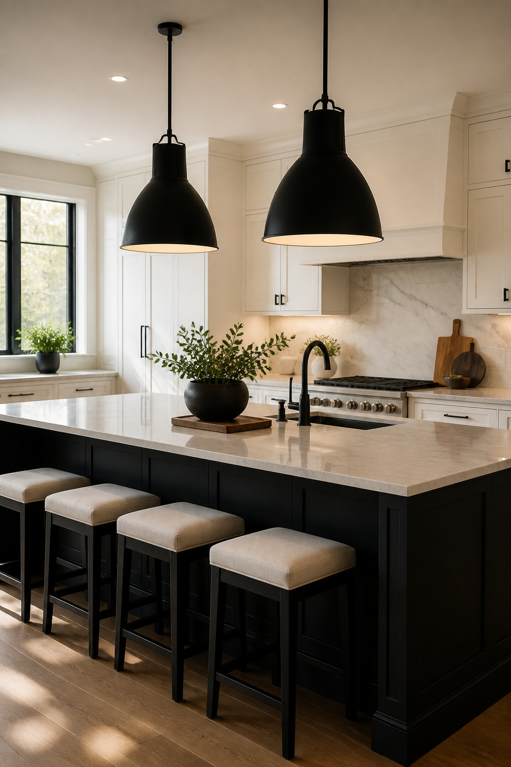
Oversized pendants and linear suspensions pull the eye upward in a black and white kitchen the way a good frame draws attention to a photograph. A black metal frame on an island pendant disappears against black cabinetry, so you lose the very contrast you installed it for. Matte black fixtures read as jewelry only when they sit against white or light surfaces, or when the light source itself creates a bright interruption.
Scale is the other place this goes wrong. A single pendant over a six-foot island looks like a placeholder; two or three in a row, or one linear suspension running the length, anchors the space properly. For sculptural pieces, a molecular chandelier above the island upgrades the whole room toward something like a fine dining setup without touching the cabinets.
If brass or gold is more your speed, it adds warmth that a strict black and white palette can flatten out. The sheen catches light differently than matte paint or flat stone, and that texture matters in a two-tone room.
Sources that do not look cheap exist, though you will not find them in the same aisles as the builder-grade basics. The trick is shopping the fixture, not the brand, and knowing that the black finish has to read as intentional against whatever it hangs near.
18. Open Shelving

Open shelves in place of upper cabinets work best above a coffee station or beside the range hood, not directly over the cooktop where grease settles fast. The dust is real: every plate and bowl becomes a surface you wipe, not just the shelf itself. If you cook daily, the maintenance is weekly at minimum, and styled collections look cluttered by day three unless you have the discipline to reset them.
Black shelves against white tile read as architecture, a deliberate frame. White shelves against black paint read as storage, floating and temporary. The contrast flips which element feels grounded. For renters, black metal brackets over existing subway tile add the look without losing cabinet space you already own; the swap back takes an afternoon when the lease ends.
19. Accent Colors
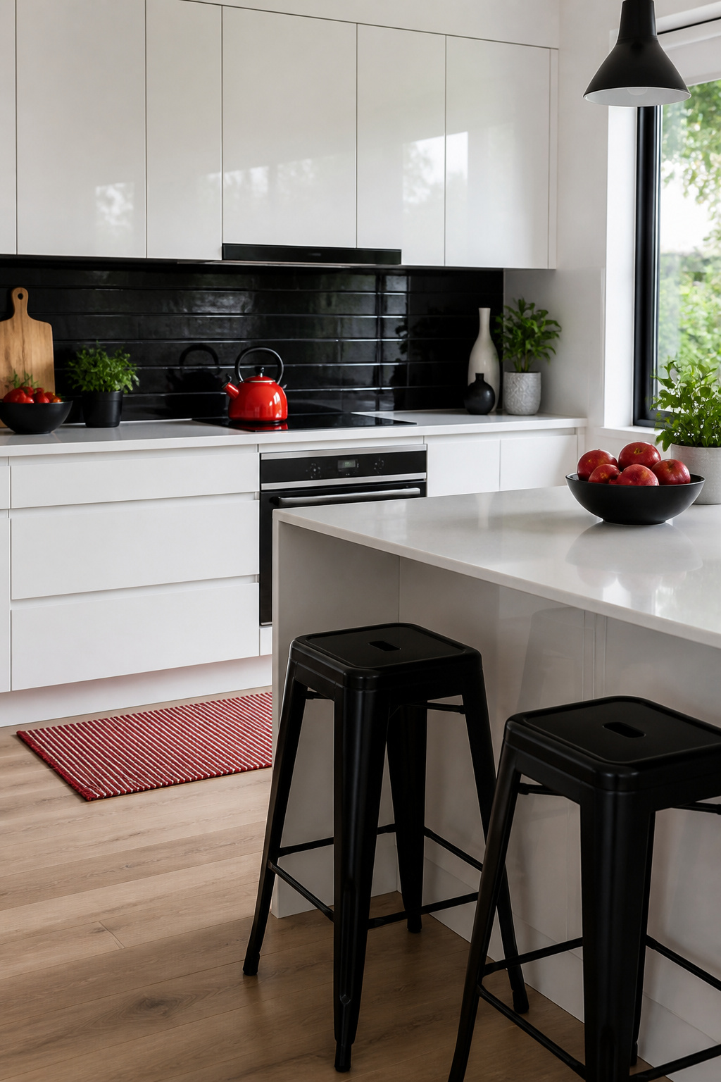
A black and white kitchen will accept almost any single accent color you bring to it. Red reads classic; sage green reads current; brass reads warm. The mistake is trying more than one at a time. The one-accent rule means you pick a single hue and let everything else stay monochrome. That red kettle on the counter, those brass pulls on the cabinets, the green ceramic tile behind the stove—one of these, not two.
Place the accent where your eye lands first and where swap-out costs least. A pendant light over the island, a set of bar stools, a row of canisters on the open shelf: these move or rotate without tools. Brass hardware goes deeper, but even that is a screwdriver job on a Saturday. Seasonal swaps follow the same logic. The red you loved in December looks heavy by March; trade the dish towels, the fruit bowl, the single large vase, and the kitchen shifts without a project.
Brass deserves its own note because it functions as both metal and warmth. Unlacquered brass darkens with use, so the accent evolves rather than holding still. If you prefer predictability, lacquered or coated finishes keep their tone. Either way, the brass belongs to the one-accent rule—pair it with a red tea towel and both fight for attention, neither wins.
20. Textured Surfaces
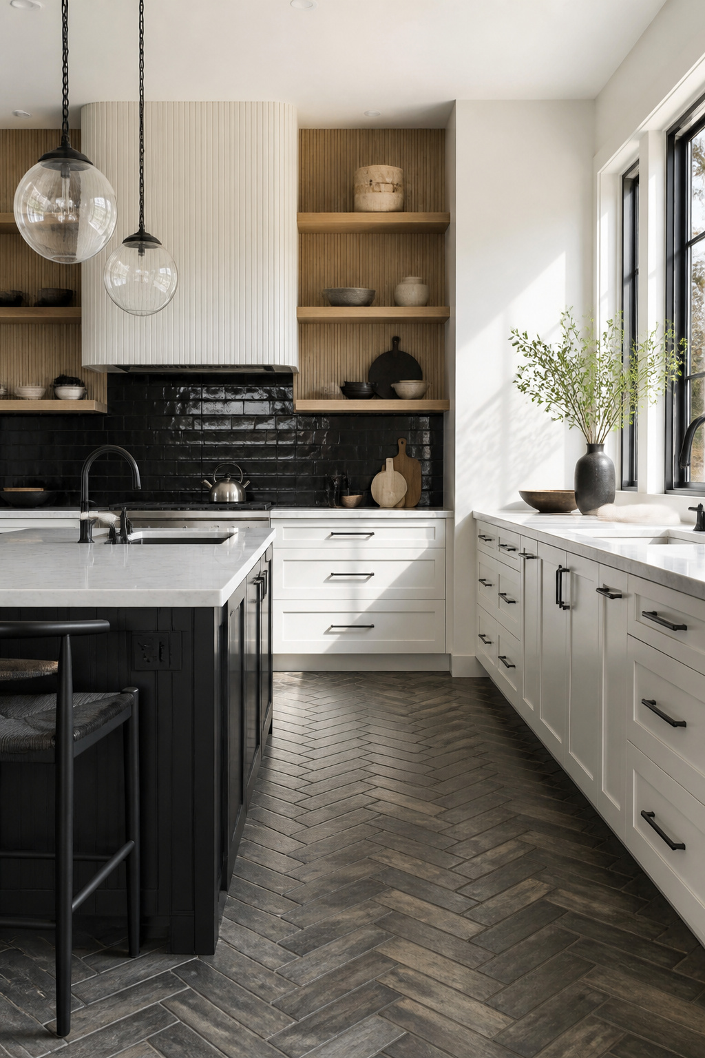
When your palette is only black and white, texture becomes the third color. Fluted glass in a cabinet door catches morning light and throws ribbed shadows across a countertop in a way flat glass never manages. Reeded wood on an island base or range hood does the same job, its grooves creating stripes of highlight and shadow that read as warmth even in a monochrome room.
Hand-zellige tile costs more than machine-made subway tile, sometimes double or triple per square foot, but the irregular surface and glaze variation give a backsplash the depth that two flat colors cannot. Hammered metal on a pendant or range hood adds the same relief at a lower price point, and it reflects light in scattered directions rather than mirror-like glare.
Where to spend depends on what the camera sees. Fluted glass and reeded wood photograph crisply and read instantly in listing photos. Zellige photographs well too, but its value is really in person, where you catch the iridescence shifting as you move. Hammered metal can go flat in photos if the lighting is direct, so place it where natural light grazes the surface rather than hitting it head-on.
Flat-front cabinets in high gloss or matte black run the risk of looking like a render. A textured finish on those same doors breaks up the expanse and reads warmer, which matters in a kitchen you actually live in rather than one styled for a shoot.
21. Rustic Touches
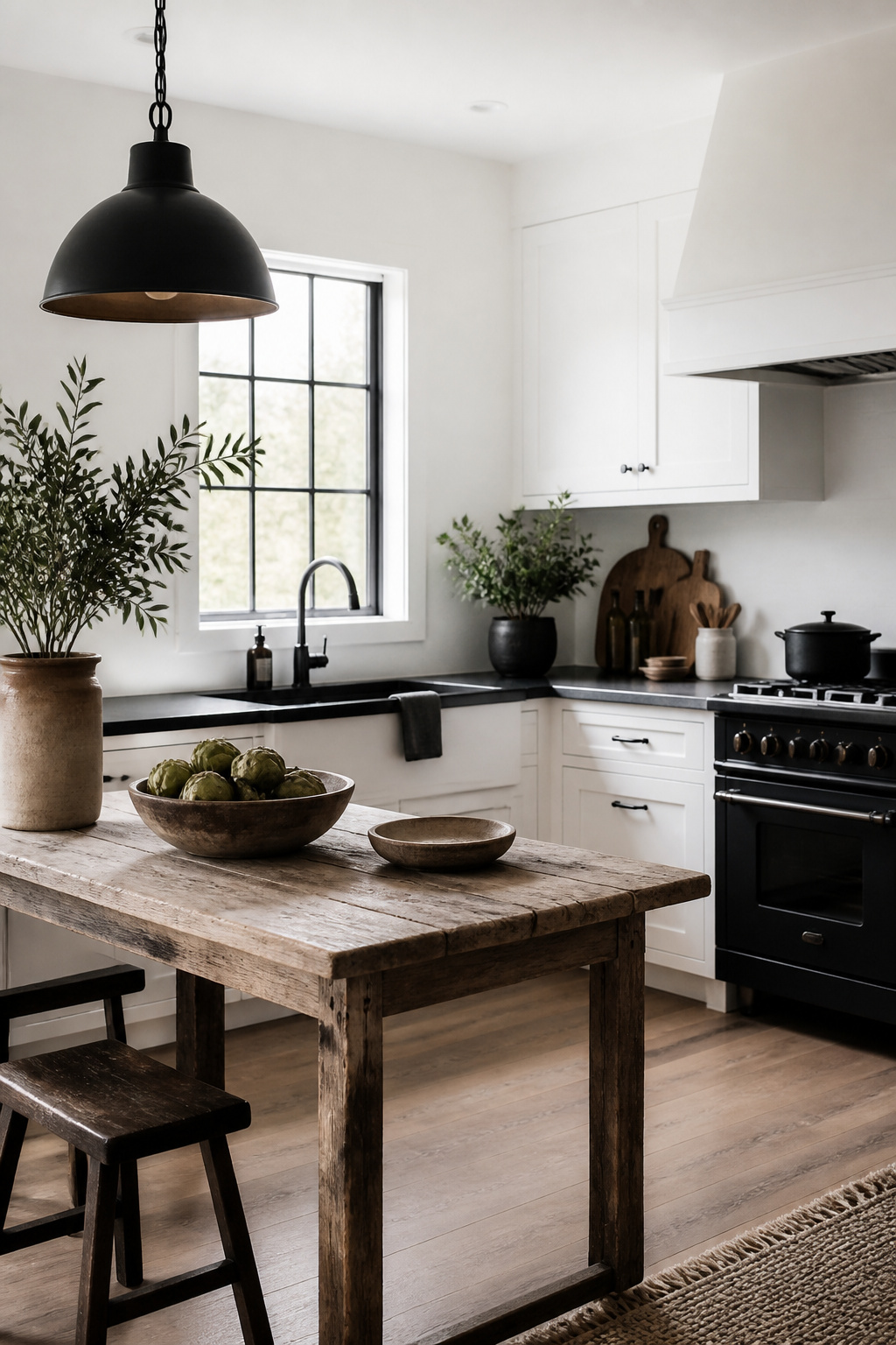
Distressed wood, forged iron, and imperfect surfaces are what keep a black and white kitchen from reading like a showroom floor. Salvaged wood on an island or open shelving introduces grain and wear that no paint color can replicate, and the warmth works as a bridge between black units and white walls without softening the contrast so much that the palette goes muddy. The same goes for matte black iron pendants or hardware: the visual weight anchors the room and keeps white walls from floating away.
The line between rustic and sloppy sits at intentionality. A mid-tone oak with visible wear on a countertop or shelf reads as considered; pale, washed-out wood or splintered barn boards that snag every dishcloth cross into neglect. Forged iron finishes should feel hand-worked, not rusted through. Curved edges on a basin unit or bracket help, since sharp angles everywhere read as harsh even when the materials are rough.
In a kitchen that still needs to function, limit the distressed finishes to surfaces you do not need to sanitize constantly. A reclaimed wood island countertop works; a reclaimed wood sink surround does not. Keep the forged iron to pendants, bar stools, or drawer pulls rather than anything that sits in the splash zone, because iron that actually ages will age faster there, and not in the way you planned.
22. Color Blocking
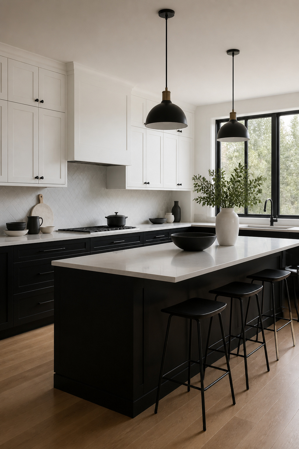
Color blocking works in a black and white kitchen when you treat each plane, wall, cabinet run, ceiling, or floor, as a single field of one color. The effect comes from where the two colors meet, not from the colors themselves. A crisp line at the corner of two walls, or at the top edge of base cabinets against uppers, does the visual work. Blur that edge and the room reads as muddy.
One way to play this: matte black base cabinets with white uppers, letting the countertop serve as the thin neutral border. Another is a full black wall against a full white one, carrying the black through cabinets and stone surfaces on that side so the plane reads as continuous. The transition line matters more than the contrast ratio. A horizontal break at 36 inches, standard counter height, feels stable; a vertical break at an inside corner draws the eye through the room.
If you are renting, peel-and-stick matte panels on one wall and fresh white paint on the opposite give you the same plane-to-plane effect without touching cabinets. The panels run $30–$50 per sheet at most home stores, and two sheets cover a typical eight-foot wall. Remove them when you leave.
23. Vintage Elements
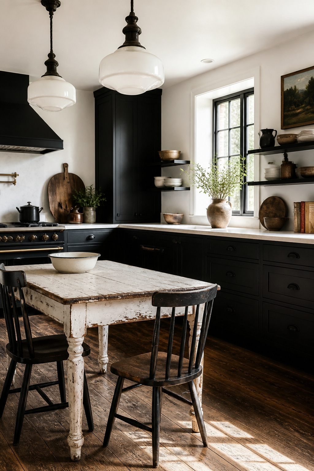
Old enamel tables with chipped edges and rust spots that show through the white finish belong in a black and white kitchen more than anything factory-fresh ever could. The surface reads as white from across the room, but up close you see the history: hairline cracks in the coating, a faint yellow where someone set a hot pan down decades ago. Hunt for these at estate sales in older neighborhoods, not antique shops, where the markup turns a fifty-dollar find into a three-hundred-dollar "statement piece." A table too far gone for daily use still works as a potting station in a mudroom or a display surface for heavy stoneware.
Schoolhouse lights are harder to fake. The milk glass diffusers on reproductions look cloudy instead of luminous, and the black ironwork lacks the slight asymmetry of hand-forged originals. When the wiring in a true vintage fixture frightens you, keep the shade and housing, then gut the interior for new sockets and cloth-wrapped cord. The result keeps the silhouette and the weight.
Original hardware tells the same story. Drawer pulls from the 1930s have a thinner profile than modern castings, and the black finish wears to gunmetal at the raised edges where fingers pulled for years. Reproductions from Whitechapel or Van Dyke’s get the shape right but start too dark and uniform. If you buy new, scuff the high points lightly with fine steel wool and let hand oil do the rest over months. The patience costs nothing.
24. Geometric Patterns
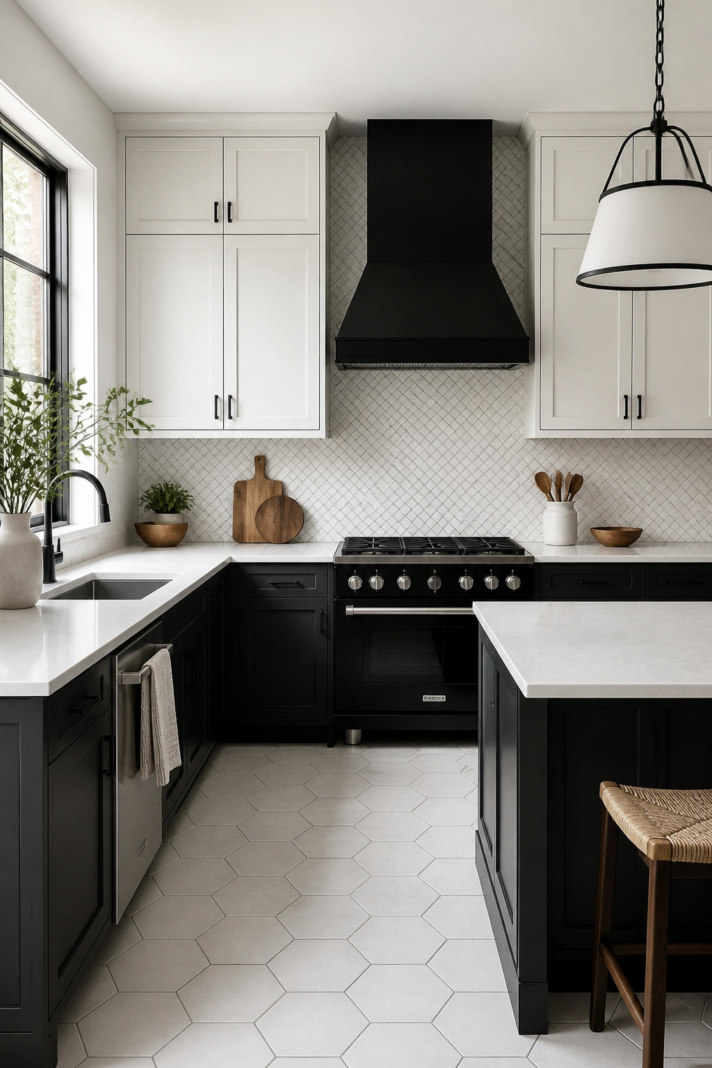
Hexagon tiles read as a single texture from across a room and only reveal their shape when you walk up to them. That makes them forgiving in a small kitchen where larger patterns would fight the cabinets for attention. Herringbone works the opposite way: the zigzag pulls the eye along its direction, so laying it to lead toward a window or the back door gives the room a destination instead of visual clutter.
The standard 18-inch gap between counter and upper cabinet is where pattern becomes noise. Smaller geometries, tight herringbone or a subway tile with dark grout, fit that rectangle without breaking into fragments. Oversized chevron or large hexagons need more wall to resolve; below that scale they read as incomplete shapes, like fabric cut off mid-repeat.
On cabinet fronts, rectilinear detailing adds the same interest without competing. A white door with a subtle grid of recessed lines gives the black hardware something to anchor to, and the geometry stays quiet enough that the room still feels like a kitchen, not a showroom. If the pattern is visible from the entry, it is too loud for the work triangle. Keep the bold moves for the floor or a single backsplash wall, and let the rest stay flat.
25. Natural Light
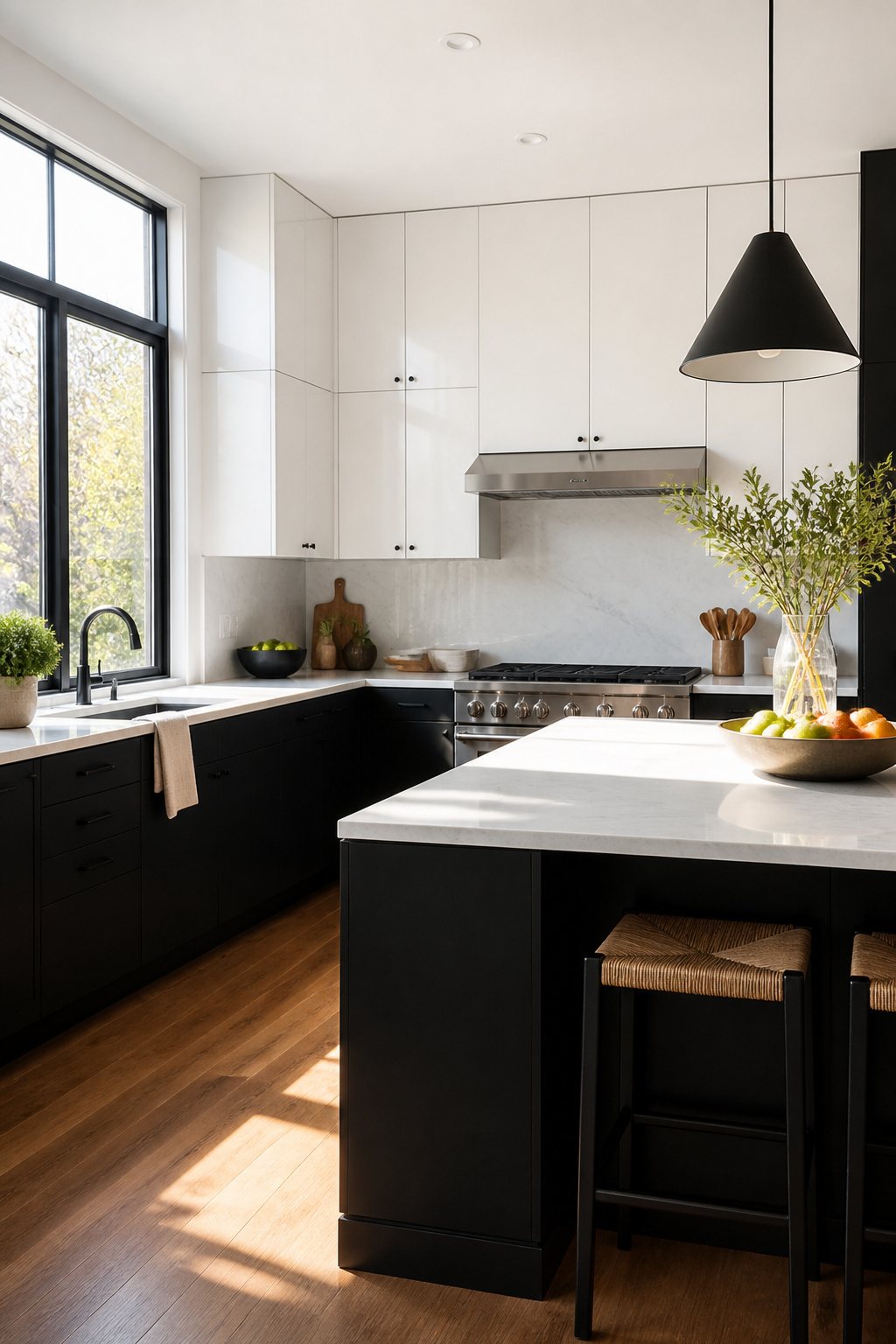
South-facing windows pour in warm, yellow-leaning light that can make white cabinets read creamy and black surfaces feel softer than they are. North-facing light stays cool and flat all day, which keeps whites crisp but can turn a black backsplash into a void that swallows depth. If your windows face north, you will need brighter artificial light than you think.
When the windows are fixed, the fix is layered. Bright, cool-toned overhead lighting at prep zones keeps the work safe; warm under-cabinet strips soften the dark cabinets after sunset and keep the room from feeling like a display case. The two-tone move still helps: white uppers bounce back what natural light you have, and black bases ground the space without stealing it. A kitchen with low ceilings or small windows should stay primarily white with black in the handles, fixtures, or a single island. Heavy black cabinetry where the light cannot reach turns the room into a cave, and no fixture arrangement fully saves that.
26. Bold Fixtures

Matte black fixtures read as deliberate in a black and white kitchen where chrome can look like you forgot to choose. Brass warms the palette without introducing color, and mixed metal, done well, means your faucet and hardware do not have to match your appliance pulls. The jump from standard chrome to matte black or brass runs roughly thirty to fifty percent per piece, which adds up fast across a full kitchen.
Spend that premium on the faucet and the cabinet pulls you touch daily. Save on smaller hardware like appliance pulls or towel bars, where the finish difference is less visible at a glance. Fixture finish is the hardest element to change later because it means full replacement, not a coat of paint. You can repaint cabinets or swap a pendant in an hour; a mounted faucet is a project you will postpone for years. Choose a finish you will still want to live with after the initial contrast thrill fades.
27. Layered Textures

A black and white kitchen lives or dies on texture, because without it you are staring at flat paint and flat laminate and wondering why the room feels like a photocopy. Layering fails when every surface competes for attention. The eye needs somewhere to rest.
Take matte black cabinets against honed white marble. The cabinets swallow light while the stone returns it softly, the honed finish keeping the marble from reading as slick or cold. Add brushed brass hardware and the metal catches a narrow gleam without announcing itself. Then rattan on a bar stool or pendant shade introduces something irregular, something that reads as found rather than fabricated. Four textures, two colors, no confusion.
The mistake is matching finishes too closely. Glossy cabinets, polished marble, and chrome hardware all reflect light the same way; the room turns into a hall of mirrors. Or every surface goes matte and the space goes dead. You want contrast in how materials behave, not just in how they look. Black and white gives you the contrast for free. Texture is what you have to build yourself.
28. Softening the Palette
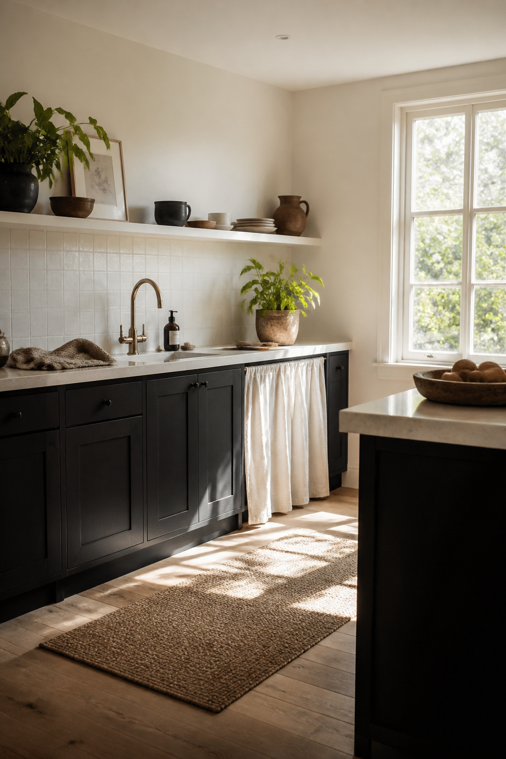
A black and white kitchen can turn cold fast if every surface fights for contrast. The trick is letting some tones slip into charcoal and off-white instead of holding the line at pure black and stark white. Push-to-open cabinets in charcoal with off-white neighbors soften the edges without losing the graphic quality that drew you to the palette in the first place.
Textiles do what paint cannot. A runner with some age to it, linen curtains that puddle slightly on the sill, or even a dish towel left to dry on the oven handle, all of them interrupt the visual noise of hard edges. Plants matter just as much. Leaves add green that reads as a neutral against black and white, and they do the practical work of making a kitchen feel like a room where people actually stand and breathe rather than one staged for a photograph.
Imperfect objects finish the job. A walnut breakfast bar with grain that runs unevenly, a bronze mirror backsplash that catches light differently through the day, a bowl with a visible throwing ring. These are the things that keep a high-contrast kitchen from feeling like a showroom. The used kitchen wins over the photographed one every time.
29. Custom Elements
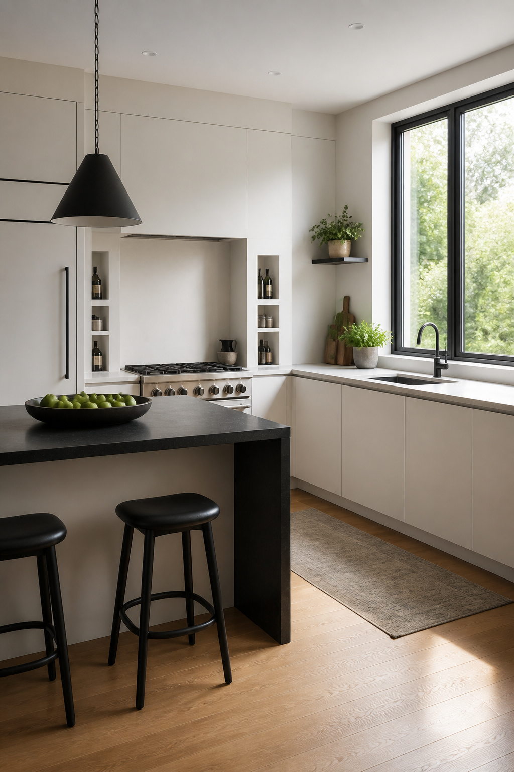
Built-in niches between wall studs cost less than most people expect because you are not adding square footage, just finishing a void that is already there. A shallow tiled niche beside the range for oils and salts, or a recessed shelf by the sink for soap, reads as custom carpentry without the cabinetmaker’s bill. Skip it if you are selling within three years; buyers see missing storage where you saw restraint, and patching drywall back to flat is easier than explaining the choice.
Panel-ready appliances are another place where the custom look outruns the price. The dishwasher or refrigerator takes a standard cabinet front so the kitchen reads as one continuous plane of black or white. The upcharge over a standard stainless unit is often just the panel itself, which a local cabinet shop can cut from your existing door stock if you order an extra during the original cabinet purchase.
Made-to-fit shelving in odd corners, above doorways, or flanking a window turns dead space into display. Paint it the same color as the surrounding cabinets and the eye slides over it as architecture rather than add-on. What you save on custom is in the measurement: shelves that are even half an inch short of the full recess look like a mistake, so build to the actual opening, not the nominal one.
30. Mixing Materials
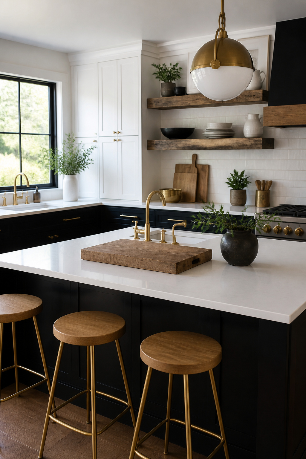
Stone and wood read as opposites, and in a black and white kitchen that tension is the point. A marble or stone countertop against painted cabinets already gives you two textures; add wood through a cutting board, a stool, or open shelving and the room stops feeling like a showroom. One material per function keeps it from becoming a pile of samples: stone on the counter, metal on the hardware, wood on the seat or shelf. Break that rule only where the eye needs a bridge, such as a brass rail on an oak shelf or a metal frame on a wood stool, so the materials talk to each other rather than compete.
Metal is where you choose warmth or coolness. Brass, gold, or copper hardware and fixtures lean warmer against black and white; stainless steel reads more industrial and sleek. Unlacquered brass in particular gains character as it ages, adding another layer without introducing a new color.
Wood floors or furniture are the fastest way to soften the contrast if the space feels stark. The combination works because the black and white palette accepts any tone of wood without clashing, from pale oak to something richer. Keep the wood to one application if the rest of the kitchen is already busy; let it do its job as a single warming note.
31. Functional Layouts
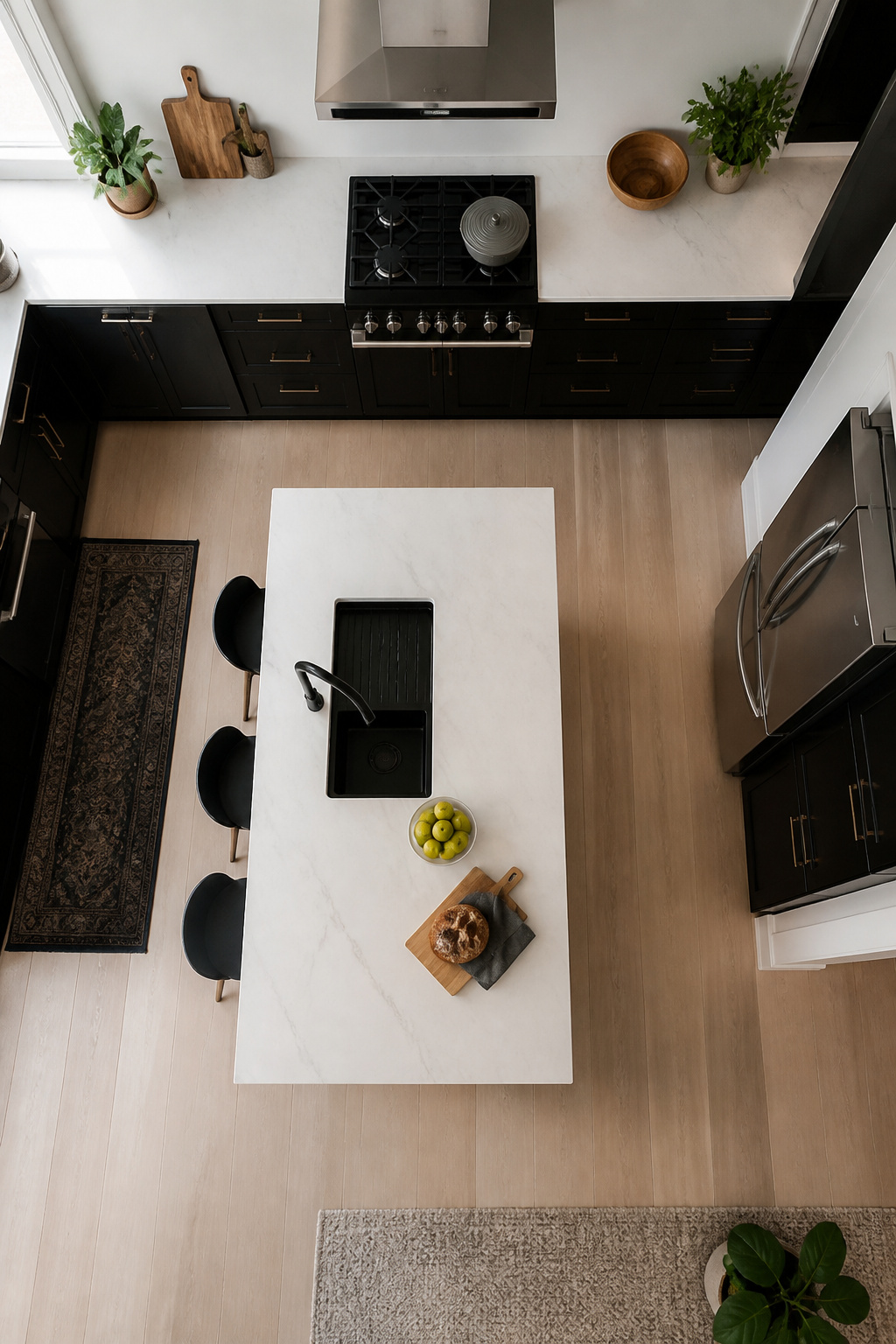
Black floors hide the coffee grounds and olive oil that white floors broadcast across a room. That is the practical edge of a dark finish, and it matters when you are standing at the stove every evening. The trade comes at the counter. A white or light stone surface reflects enough light to prep by, but it also shows every turmeric stain and water ring the moment they land. You will wipe it more, or you will learn to live with the evidence.
The prettiest black and white kitchen fails if the triangle does not work. Two-tone cabinets, with white uppers and black bases, can help the eye read the layout faster: the light color recedes and keeps the upper half open, while the dark base anchors the work zone. But the sink, stove, and refrigerator still need to sit close enough that you are not crossing the room with a hot pot or a dripping chicken.
Task lighting has to follow the actual tasks. Under-cabinet LEDs belong where you chop, not where the cabinets happen to end. A matte black iron dome or an aged brass pendant over the island warms the contrast and puts light where you stand; wall sconces fill the shadows that overhead cans leave along the backsplash. Build it from the work surface up, or you will be dicing onions in your own silhouette.
32. Warm Metallics
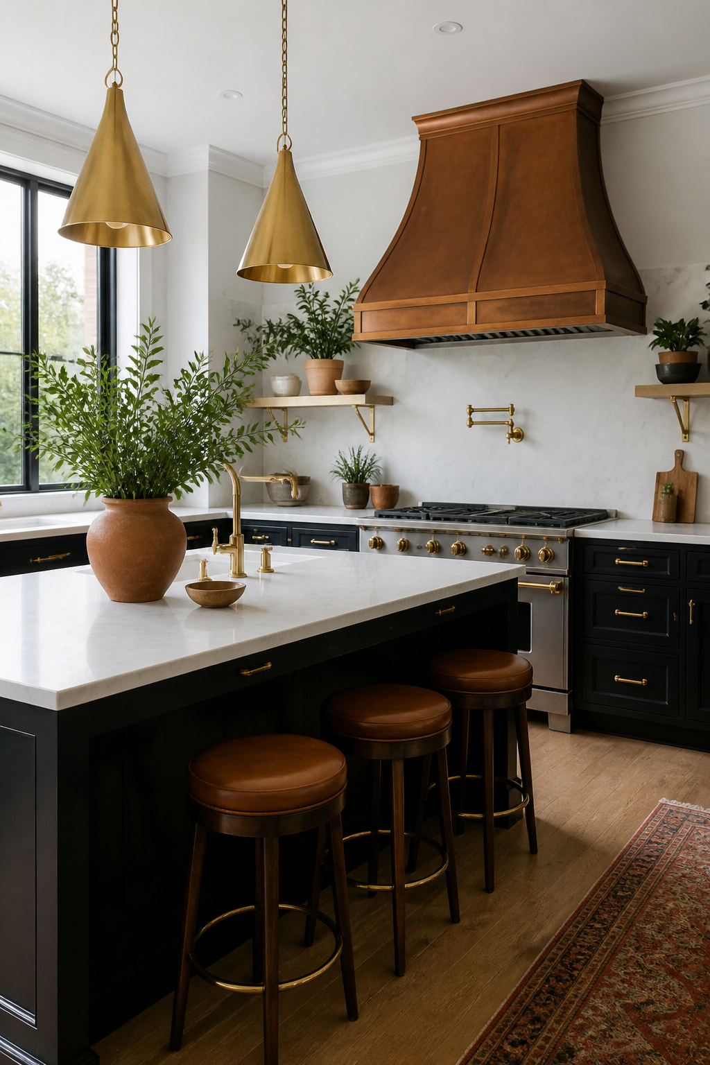
A black and white kitchen can read like a high-end gallery: beautiful, but not somewhere you want to linger with coffee. Warm metallics are the bridge that fixes this, and brass, copper, and bronze do the work faster than any other accent.
Brass hardware on white cabinets, a copper range hood against black tile, or bronze pendants over a white island each add the gold and reddish-orange tones that make the space feel lived-in. The finish you choose changes the personality entirely. Polished or lacquered brass stays bright and formal; unlacquered brass ages into a softer, mottled surface that looks like it has been there for years. Living finishes suit kitchens where you want warmth to accumulate, not perform.
Copper carries the same choice. A living copper sink or backsplash darkens and spots over time, which reads as character in a farmhouse setting and as neglect in a sleek one. Lacquered copper holds its color but needs to be right from day one, because it will not soften with age.
Where to put it matters more than how much. A brass faucet and hardware against white cabinets, with black window frames behind, catches morning light and spreads it through the room. One or two large pieces beat scattered small ones, which read as jewelry on an otherwise bare outfit.
33. Decorative Accessories
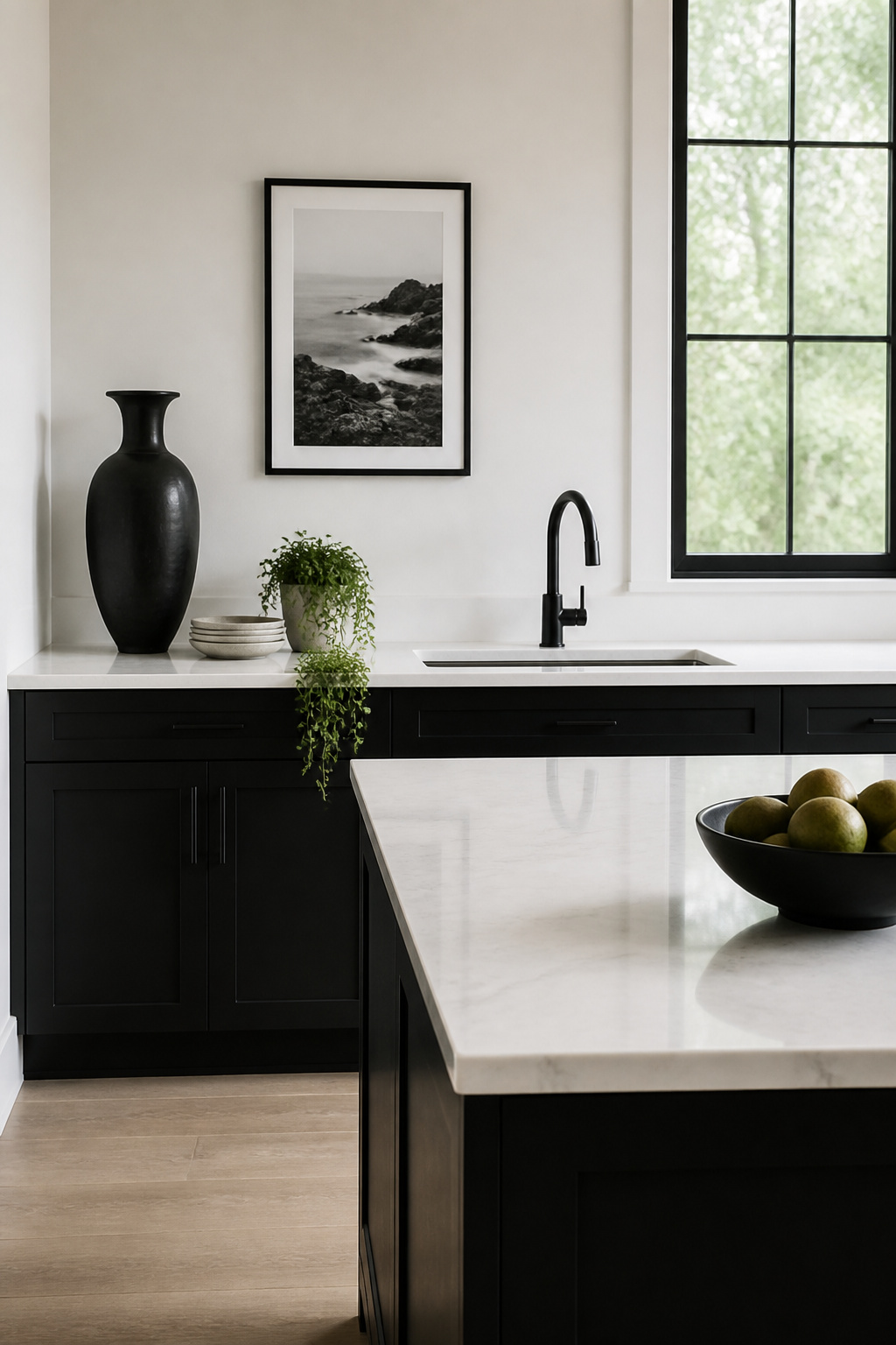
Countertops and open shelves in a black and white kitchen fill up faster than you expect. Start with the rule of three: one tall object, one low, one organic shape, spaced so your eye rests between them. A stack of white plates, a black ceramic pitcher, and a single trailing plant hits the mark without looking staged.
Black and white photography works here because it reads as texture rather than competing color. A framed print above the sink or a small gallery on the wall beside open shelving keeps the palette honest. Grey, used as a subtle transition, can separate working areas from display zones so the kitchen does not feel busy.
Wood and greenery are the usual softeners, but in a monochrome space they become statements rather than fillers. A small wooden bowl or one potted plant does what three would not; the contrast is already loud.
Know when to stop: if you have to move an object to use the counter beneath it, it belongs in a cabinet. The same restraint keeps shelves from looking like a shop display. One bare stretch of wall or one empty shelf corner lets the black and white scheme breathe.
34. Unique Backsplashes

Zellige tiles carry the uneven glaze and slight warping that factory tile tries to erase, which is exactly why they work in a black and white kitchen where everything else risks looking too planned. Sarah Stacey used glazed Moroccan zellige behind a range in an Austin farmhouse, paired with a black hood and leathered absolute black granite countertops to keep the warmth from tipping into rustic cliché. The iridescence shifts under task lighting, so the backsplash reads as texture rather than pattern.
Beyond zellige, terrazzo and mirrored backsplashes each solve a different problem. Mirrored tile reflects light the way glass does, widening a narrow galley kitchen without the clinical feel of a full mirror wall. Terrazzo adds the speckled variation that breaks up flat color fields, though the busy surface fights you if your countertops already have movement. Natural stone like marble mosaic reads high-end but demands strict sealing behind the stove; cooking splatters stain both stone and grout otherwise. Ceramic and porcelain stay the practical default, easy to wipe down and forgiving on a budget.
For renters, zellige and terrazzo are weekend projects you will uninstall when you leave. Mirrored tile installs with the same mastic, but the reflection shows every bump in the wall prep, so the surface needs to be flatter than textured drywall allows. What dates fastest is the mirror finish; it reads 2010s luxury condo faster than handmade tile reads any era at all.
35. Artistic Touches
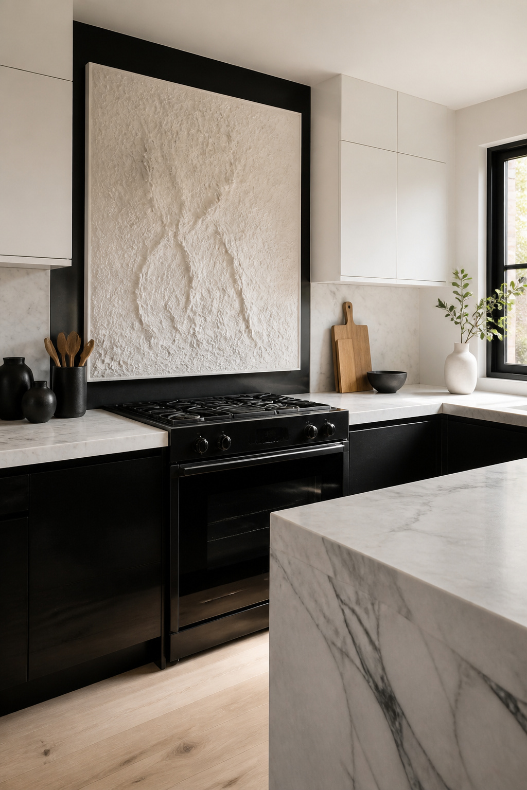
A single large piece above the stove survives the humidity better than a gallery wall. Steam rises, settles between frames, and eventually warps backing paper or breeds mildew in matting. One canvas, one ceramic relief, or one metal sculpture leaves nowhere for moisture to hide.
Scale matters more than most renters expect. A piece smaller than two feet across gets lost on a wall between cabinets, while something at shoulder width or wider reads as intentional architecture rather than an afterthought. If you are renting, lean a large framed print on the counter against the backsplash instead of drilling. It costs nothing extra and moves with you.
Hand-painted elements work best where grease and steam rarely reach. The side of a pantry door, the toe kick in a low-traffic corner, or a single cabinet panel you can remove and repaint later. Oil-based enamel holds up to wiping; acrylic chalk paint does not, so choose your moment and your location together.
For sculpture, think weight and air flow. A heavy ceramic on an open shelf over the coffee station is one elbow away from a bad morning. A wall-mounted clay piece, or something under five pounds on a narrow ledge above eye level, stays out of the chaos and still catches light from the window.
Why Black and White Endures
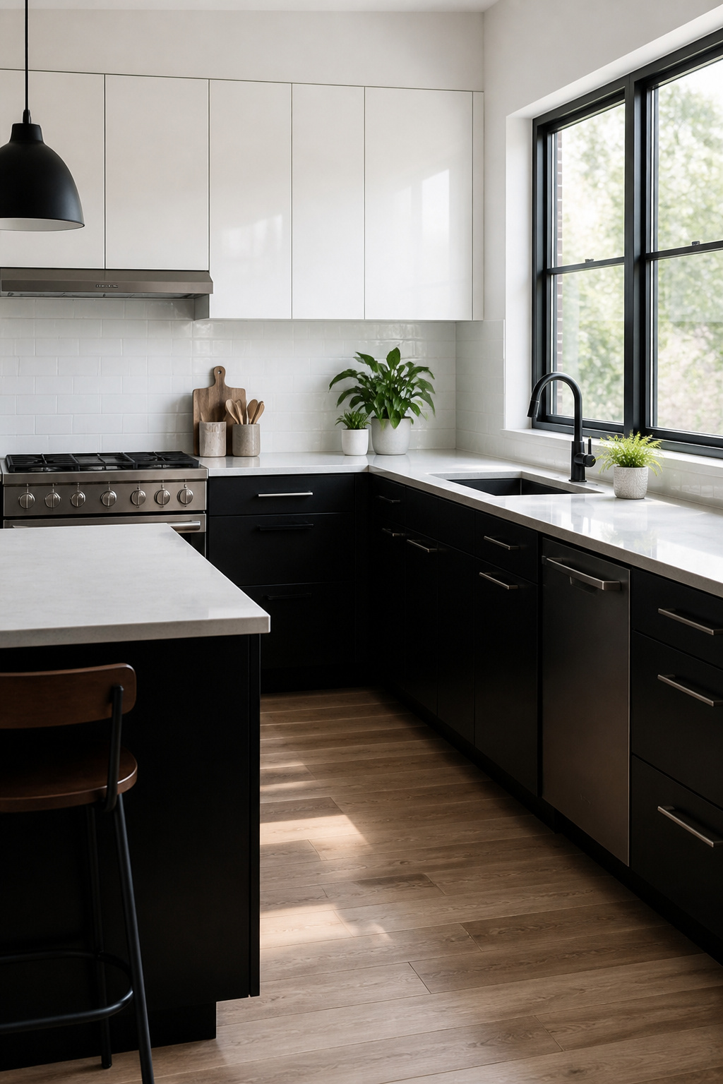
Black and white kitchens have ridden out every trend cycle for decades, and that staying power matters when you are spending your own money and your own weekends. The palette does not pin itself to 2016’s navy phase or 2019’s sage moment; it simply shifts with whatever else you bring in. Swap the hardware, swap the pendant lights, keep the cabinets.
The real advantage is avoiding the dated look that locks a kitchen to a specific year. Color choices tend to broadcast their era. The black and white base does not. It reads as modern or traditional depending on the door style and fixtures you layer on top, which means you are not tearing out good work because the shade aged badly.
You can play this as subtle or as bold as your space allows. High contrast for drama, softened with texture for something quieter. Either way, the foundation stays current without chasing the next thing.
Texture as the Third Color
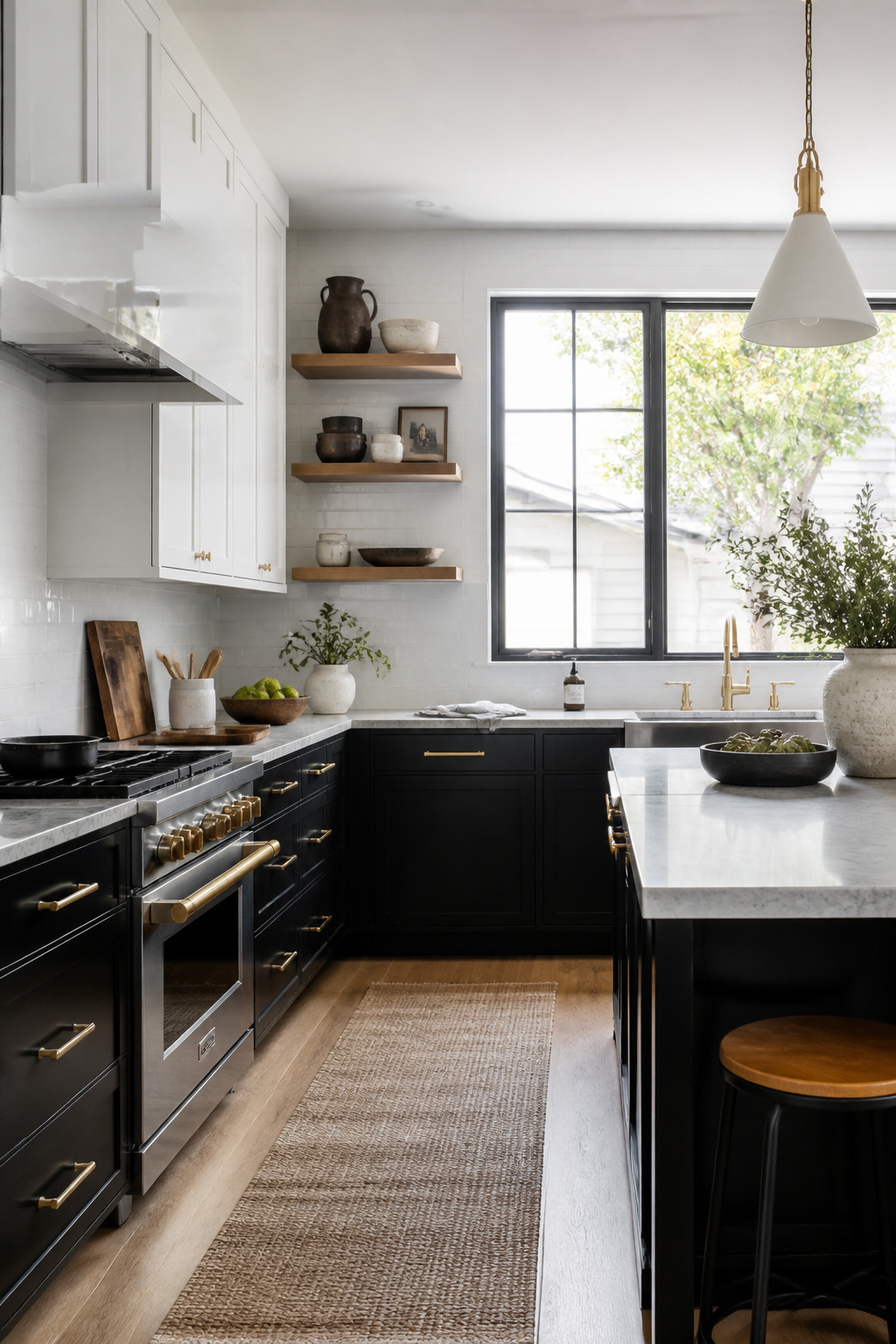
A black and white kitchen without texture reads flat, even when the contrast is sharp. The eye has no place to rest, so the space feels more like a rendering than a room. Wood, metal, and stone become the third color by giving the eye something to trace.
Wood belongs on the floor first. Boards with warm undertones keep a dark scheme from closing in, and texture in the grain, knots, or reclaimed marks breaks up the monochrome at the level where you actually stand. Oak or walnut on open shelving works the same way, but closer to eye line where the softness matters more. Stone counters or a brick surround near a hearth add weight that painted cabinets cannot manage on their own.
Metal handles the light. Copper, brass, or blackened steel reflect or absorb differently than paint, creating a shift across the day that reads as movement. Place it where the morning or afternoon sun actually hits: hardware, a faucet, the frame of a pendant. In a kitchen with full color, this play of highlight and shadow gets lost among competing hues. In black and white, it carries the whole room.
The mistake is scattering texture everywhere. Choose two zones, maybe three, and let the rest stay quiet.
Lighting for Dark Surfaces
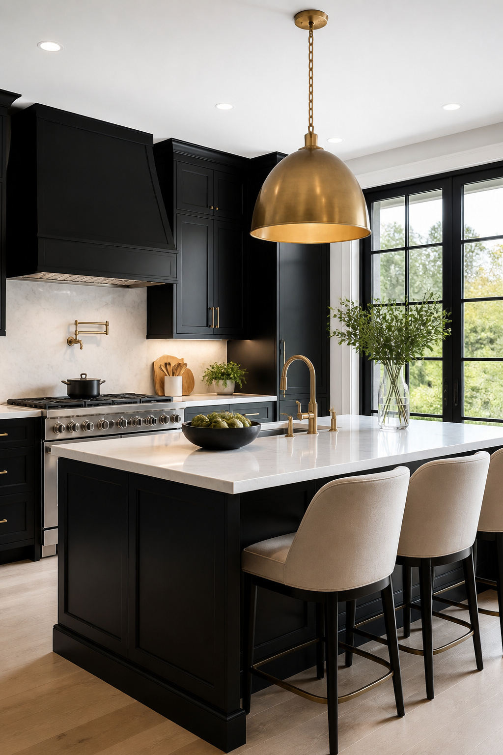
Dark surfaces absorb light rather than reflect it, so a kitchen with black cabinets or a black backsplash can shrink visually if you rely on a single overhead fixture. Layering is what prevents that.
Start with cool-toned task lights at roughly 3,000 to 5,000 lumens over your prep zones. This keeps the work bright and shadow-free. Under-cabinet LED strips add the second layer, and warm color temperature here softens what the cool task lighting leaves flat. The contrast between the two temperatures keeps the black from reading as a cave wall after sunset.
For ambient light, ceiling fixtures or recessed cans should fill the middle of the room where task lights do not reach. Accent lighting, like a brass pendant over the island or wall sconces, adds the third layer and brings warmth that black and white alone cannot. Brass or gold finishes work particularly well here; they add sheen against matte black and keep the palette from feeling sterile.
Placement matters more than fixture cost. A single row of downlights over a black island leaves the perimeter dim and the room smaller than it is. Spread the ambient sources, keep task light directional, and let the accent piece sit where your eye naturally rests. The black stays dramatic, but the space stays open.