
A black and white bedroom can run anywhere from a single gallon of paint to a full canopy bed, and the difference is not budget but how much black your space can absorb before it caves in. Small rooms with weak light need white to lead; sun-flooded spaces can finally let black anchor without turning heavy. The 70/30 rule governs every style below, from the $25 tool that does not belong in this room to the Crescent nightstand that keeps appearing because raw grain and cane paneling are what stop the palette from freezing.
1. Sleek Bohemian
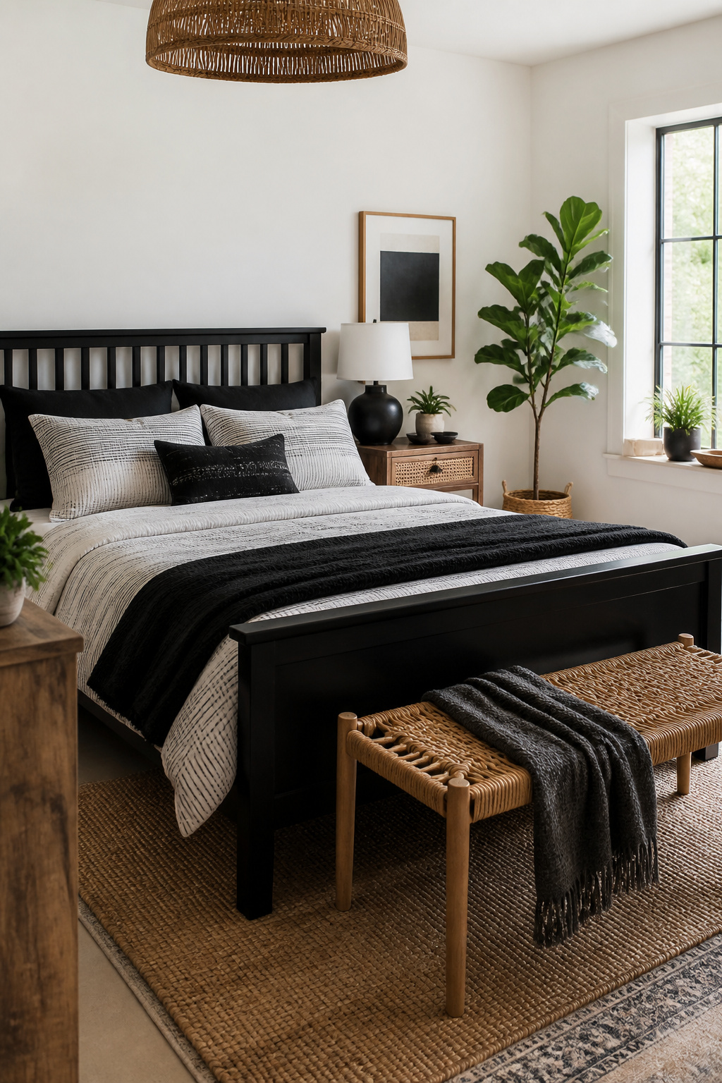
A black and white bedroom can turn sterile fast if you let the palette do all the work. The fix is simple: keep the bedding plain black and white, then let dark wood and living plants carry the warmth.
Start with solid or subtly striped cotton bedding, nothing busy. Against that quiet base, a warm-wood nightstand changes the whole room. A piece with visible grain and some texture, like cane paneling, softens a sharp black bed frame without fighting it. The contrast does half the design work for you. Add one or two potted plants near the window, where the green reads as intentional against the monochrome rather than random clutter. A small rock salt lamp or a woven bench at the foot of the bed layers in more natural material without introducing new color.
The restraint matters. Bohemian style often invites pattern overload, but here the black and white holds the line while the wood tones and greenery keep the room from feeling like a showroom. You get the calm of a limited palette plus the ease of materials that age well and do not demand a big budget.
2. Sophisticated Retreat

A vintage dresser against a clean white wall gives you the contrast without the showroom feel. The scratches and wear on old wood hold warmth that new paint cannot replicate, and that warmth keeps black and white from turning cold. Mix a 1960s credenza with a simple metal bed frame, or pair a new linen headboard with thrifted nightstands that still have their original hardware. The periods do not need to match. They only need to share a weight, a solid presence that keeps the eye moving between old and new rather than settling on one era.
The mistake is over-curating. If every piece looks deliberately chosen, the room reads as a set. Leave one element slightly wrong: a modern lamp that is too tall, a mirror with tarnished glass. The imperfection is what makes it livable. Black and white will always feel graphic. Your job is to soften the edges with time.
3. Farmhouse Chic

White walls with black accents and geometric rugs create a cohesive look, and this is one of the easier versions to execute on a rental budget since it leans on paint and textiles rather than built-in changes. You can paint one accent wall black and keep the other three white, or skip the paint entirely and use a picture ledge to produce a similar effect without the commitment. The geometric patterned rug ties the room together, and two-tone bedding keeps the palette from feeling flat. Wood accents on the headboard, window trim, or a pair of chairs at the foot of the bed add warmth that stops the space from reading as sterile. A $25 external reader and under-$200 scanner range is the kind of tooling that matters for digitizing old family photos, not bedroom makeovers; for this room, your costs sit in paint, a rug, and bedding you can take with you when you leave. Mix in high-contrast details like black fixtures or an assortment of accent pillows, and the room still feels put-together because the overall scheme stays locked to black, white, and gray.
4. Luxury Studio

A black canopy bed in a studio apartment proves that one large black piece does the anchoring for you. The surrounding white walls and white bench stay light, while brown blankets and accent pillows in varying shades add the warmth that keeps the room from feeling like a showroom. You do not need every accessory to carry the black-and-white theme for the look to hold together.
In a 480-square-foot New York studio, a sleeping nook separated by a white cube bookshelf uses the same principle: airy linens and small houseplants soften black window frames and a black lamp. A patterned tan pouf does the cozy work without matching anything else in the room.
Two ways to warm the edges of a black bed frame. You can layer neutral textiles in browns and tans directly on the bed, or place a warm-wood nightstand beside it. A piece like the Crescent 3-Drawer Nightstand, with visible grain and cane paneling, gives you texture, storage, and contrast in one move. The wood does half the design work; you do not need to hunt down matching black accessories to complete the look.
5. Dramatic Bohemian

A deep black bed frame against white walls does the heavy lifting in this look. The frame reads as architecture rather than furniture, especially when the bedding stays stark white and free of pattern. That contrast, not color, supplies the drama.
The boho part comes from what sits nearby. A warm-wood nightstand with visible grain and maybe cane paneling, something like the Crescent 3-Drawer style, softens the black without dulling it. The wood does half the design work by introducing texture and an earthy tone the black alone would lack.
Keep the textiles minimal and the accents grounded. Terracotta or clay in a throw blanket or a single piece of wall art keeps the room from floating off into pure graphic territory. The white walls and airy curtains keep it feeling like a bedroom rather than a stage set, and the bedding stays inviting because it is not competing with anything else for attention.
Two ways to play the wood: match the nightstand to a wood floor if you have one, or let it stand alone as the single warm note against carpet. Either works, but the lone warm piece needs to be substantial enough to hold its own, not a thin accent that gets lost.
6. Minimalist Nest

A single black wall changes the whole room without turning it into a cave. Pick the wall behind the bed, roll on one gallon of deep black paint, and let it dry overnight while you sleep somewhere else. The next morning, hang white-framed artwork in a grid or a loose cluster, nothing fussy. One gallon covers one accent wall in most bedrooms, and the Saturday you spend on it is the only weekend this project needs.
The white frames do the real work here. They lift the black from theater-dark to something that reads crisp on camera but still lets you wind down at night. Keep the bedding simple, add one large plant if the light allows, and you have the look that carried a 485-square-foot Montreal studio from cramped to intentional. The mistake is overloading the wall with too many frames or frames too small; three or four pieces at least 16 by 20 inches each, spaced two to three inches apart, gives the eye room to rest. A matte black paint reads softer than gloss and hides roller marks better, which matters when you are working after dark on a single day.
7. Bold Patterns
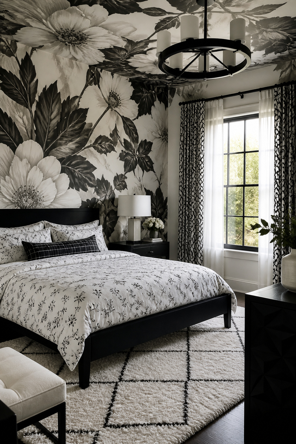
Pattern in a black and white bedroom works best when you choose one stage and let everything else play backup. A single oversized floral mural across a wall and ceiling reads as deliberate architecture, not clutter, because the eye lands in one place. Layer a smaller print on the bedding, and the shift in scale keeps both from fighting. What reads as chaos is usually the same visual weight repeated too many times: a bold rug, busy curtains, and a patterned duvet all shouting at once.
Pick one: bedding, rug, or curtains. Two if the second is nearly a solid. Three only if you want the room to feel like a hotel lobby. In Janet Gridley’s Minnesota bedroom, a wall of black-ground peonies by Thomas Darnell carries the whole design; the white bedding with black monograms steps back and lets it breathe. The same rule holds for abstracts. A swirling ceiling pattern draws the eye up and makes the walls feel taller, but pair it with plain bedding and a single round black pillow to anchor the bed. The contrast does the work; you do not need to add more.
8. Accent Pieces
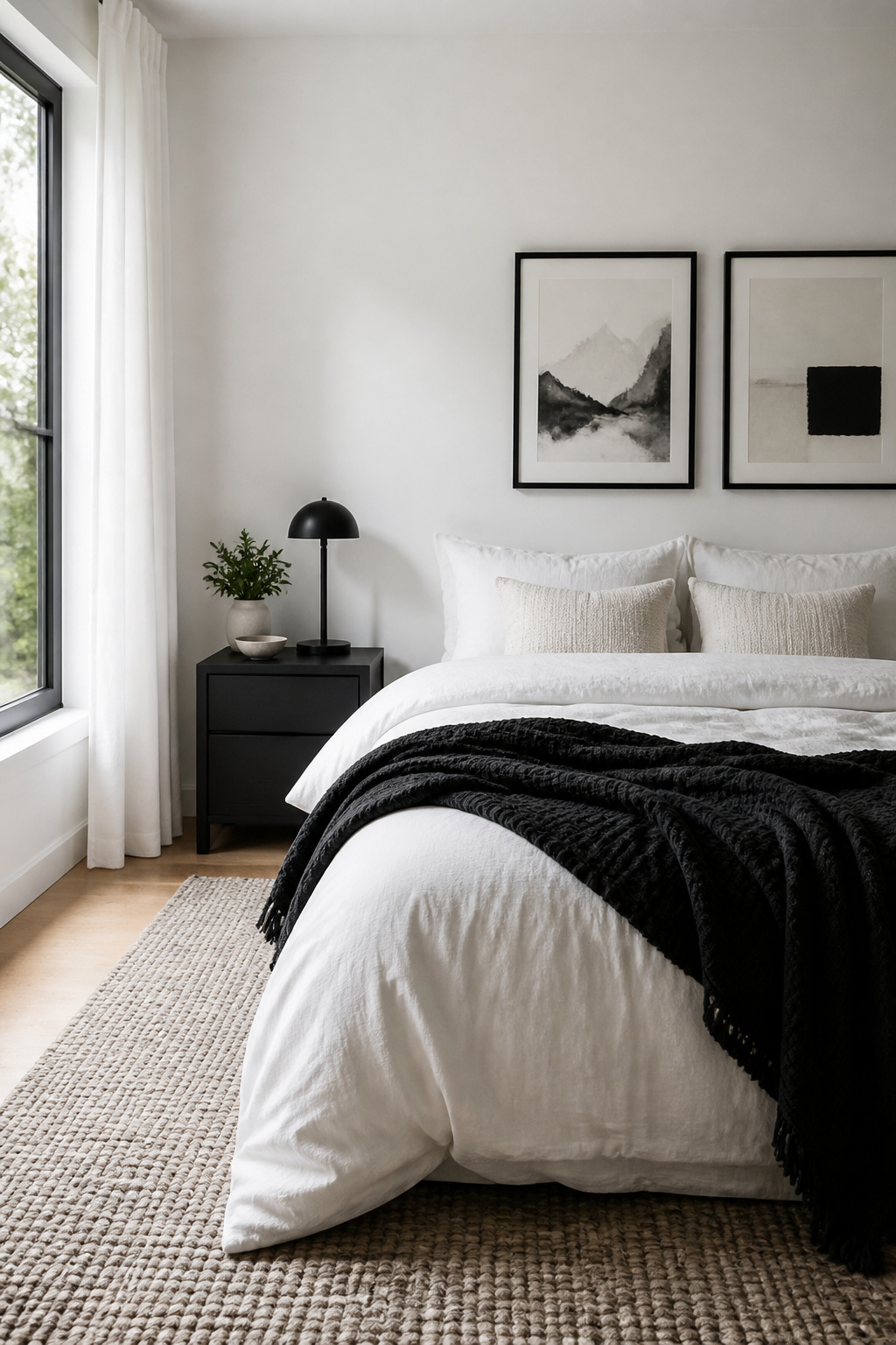
Accent pieces are where a black and white bedroom stops looking like a showroom and starts looking like yours. The 70/30 rule governs this. If your walls and bedding are white, about seventy percent of the room, let black handle the remaining thirty through lamps, picture frames, a vase on the nightstand, maybe a small bench at the foot of the bed. Reverse it if you went with the bold black wall.
White walls are the forgiving version for a first black-and-white room. Black shows up in controlled doses, and it is hard to screw up. A black throw on the bed adds texture without breaking the scheme. A framed photo or a small plant on the bedside table brings in warmth that the two-tone palette alone will not provide.
The area rug is another place to work the ratio. Let it add depth and keep the room from feeling flat. The 70/30 rule has never failed: pick which color leads, commit, and move on. Half-measures read as uncertainty, and a black and white room cannot afford that.
9. Natural Elements

A black and white bedroom can read cold fast. The fix is not more color. It is raw oak and rattan brought in as actual structure, not accent.
Raw oak on a bed frame or nightstand keeps grain visible under the monochrome. Rattan works for a chair back or pendant shade, adding weave without pattern. Unbleached cotton on bedding softens the contrast without breaking it. These three materials share an honesty: they look like what they are, and they age rather than wearing out.
Wood needs no special treatment in this palette. Leave oak oiled, not lacquered, so it picks up hand oils and darkens slightly at touch points. That living finish matters in a room built on two static colors.
For plants, choose what survives your actual habits, not your aspirations. A snake plant or ZZ plant handles low light and a missed watering. A fiddle leaf fig does not, and its crisp white pot will only highlight the brown leaves. Place one plant where you will see it daily, not where design rules say it belongs. A living thing you remember to water beats three you forget.
Rattan can sag over years in dry climates. Tighten weave with humid air, or accept the slouch as part of its character. Unbleached cotton wrinkles; iron it or do not, but decide rather than letting it look accidental.
10. Layering Textures

Linen over percale is the single biggest textile upgrade you can make in a black and white bedroom. Percale photographs sharp, but in real life it reads as oddly formal, like a guest room no one sleeps in. Linen wrinkles the second you look at it, and that rumpled, slightly nubby surface is exactly what keeps the palette from feeling cold.
Add one or two velvet or bouclé cushions and you break the matte flatness that regular cotton pillows settle into. A single bouclé lumbar cushion across the bed can pull the whole room together. Velvet does something different: it catches light on its pile and throws it back softer, so a black reads as depth rather than void. The two together, linen and something with a nap, give you layers you can feel without adding color.
11. Window Treatments

Sheer white curtains let daylight in without the fishbowl feeling, and a second layer in black or charcoal lets you sleep past sunrise. That pairing is what makes the combination work in a bedroom you actually use, not just photograph.
The hardware is where most people trip up. Two rods looks busy; one rod with a double bracket keeps the wall clean. Hang the sheer on the inner hook, the blackout on the outer, and both stack to the same side when open. What you get is a single column of fabric, not a tangle.
"Black and white are remarkably serene when used together, making this opposites-attract palette a natural fit for bedrooms."
That calm is the point. The sheer layer keeps the room from feeling heavy when the dark drapes are drawn back, and the dark layer keeps it from feeling exposed at night. For the rod itself, matte black or brushed brass both read as intentional; chrome tends to fight the warmth the sheer layer is there for.
If you are renting, a tension rod in the window frame avoids holes entirely. The tradeoff is width: you lose a few inches of stack space on each side, so the curtains sit closer to the glass when open. For a weekend project under a hundred dollars, that is usually acceptable.
Color Balance

The 70/30 rule is what keeps a black and white bedroom from feeling like a chessboard. One color carries roughly 70 percent of the room; the other fills the remaining 30 as support. Commit to which color leads, then stop second-guessing.
Equal 50/50 splits sound fair on paper, but in practice your eye bounces around without settling anywhere. The room ends up restless instead of restful.
Small rooms with weak natural light generally do better with white in that dominant role. Black absorbs light, and a 70 percent black room can feel like a cave if the windows are already working against you. Flip it the other way in a large, sun-flooded space, where black walls or major black furniture can finally read as grounded rather than heavy.
When the ratio slips toward 60/40, the scheme starts to look accidental. At 50/50 it looks like you could not decide. The supporting color works best as punctuation: a black bed frame against white walls, or white trim cutting through black paint. Pick your lead, hold the line near 70/30, and the tension between the two colors starts to feel intentional rather than nervous.
Texture
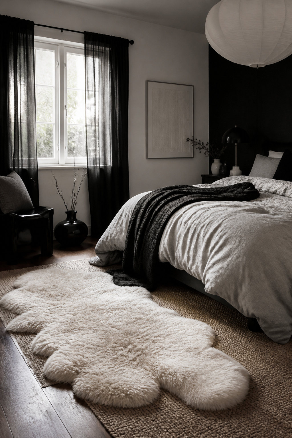
In a black and white bedroom, texture has to do all the work color isn’t doing. Two tones give you nothing to hide behind, so every smooth surface reads as cold. Glossy paint, crisp percale, bare hardwood, lacquered furniture: it photographs clean and feels like a dentist’s waiting room by morning.
Linen, velvet, jute, and sheepskin are the textiles that actually warm the space. Linen on the bed softens the contrast without adding a third color. Velvet on a pillow or chair catches light differently than flat cotton, which keeps the eye moving. Jute underfoot adds roughness, though it is scratchier than people expect, so place it where bare feet won’t hit it first thing. A sheepskin or shaggy wool rug near the bed is nearly foolproof, and your feet will notice at 6 am.
The mistake is treating these as props. A single sheepskin tossed precisely in the center of a rug looks like a catalog set. Layer the jute rug with the sheepskin slightly off-center, let the linen duvet sit unironed, put the velvet where you actually lean. The room should look like someone lives there, not like it is waiting for a camera.
Lighting

A black and white bedroom will eat light faster than you expect, especially if you leaned into the black wall trend. Plan three circuits or you will be squinting through dinner and blinded at midnight.
Overhead lighting is for vacuuming and folding laundry, not for living in. A chandelier centered on the ceiling checks that box and gives the room its one vertical moment against all those horizontal stripes. Choose one with some visual weight; in a monochrome room it reads as sculpture when it is off.
Wall sconces flanking the bed keep nightstands clear for books and glasses. They also drop the light pool exactly where you need it for reading without sending glare back off white walls.
Bedside lamps are the layer you actually use. The mistake is matching them to the chandelier too tightly. Let the metals fight a little; it keeps the room from looking like a showroom set.
Bulb warmth is where this palette lives or dies. Anything below 2700K turns a black wall muddy and makes white bedding look institutional. Anything above 3000K and you are in a hospital corridor. Test one bulb before you buy six. The sweet spot is usually 2700K with a high CRI, so the black stays rich and the white stays clean rather than falling gray.
Accent Colors

Tan and gold warm up a black and white bedroom without breaking the palette. A 400-square-foot NYC apartment shows the move: mostly white walls, small black accents in the hardware, then a gold-framed mirror and one jewelry hook for the only metallic shine. That is enough. The gold reads as luxury because there is so little of it.
LA takes the same palette earthier. A black, white, and tan bed sits against white walls, flanked by twin vases and arched mirrors. The tan does the heavy lifting here, not the gold. It grounds the room, makes it feel like a hotel suite rather than a photo setup.
The mistake is picking the metallic first. A gold lamp or fixture before your black and white base is settled will push you toward warm whites you did not want, or make the black look muddy. Get the ratio of black to white fixed first, and let one of them lead. Equal halves looks nervous; your eye keeps moving. Once one color dominates, tan or gold steps in as a third tone, not a rescue.
Frequently Asked Questions
How do I create a cozy black and white bedroom?
Layer warm textures like linen, velvet, and sheepskin against the stark palette, and plan three lighting circuits so you can dim the room for evening. Raw oak, rattan, and living plants add warmth without adding color. The 70/30 rule keeps the scheme from feeling cold: let one color dominate and the other support.
What colors go well with black and white in a bedroom?
Tan and gold warm the space without breaking the monochrome. A single gold-framed mirror or jewelry hook reads as luxury because the restraint makes it noticeable. Earthy tan on bedding or accent pieces grounds the room and moves it away from a photo-setup feel. Get your black-to-white ratio fixed first, then add metallic or neutral tones as a third layer rather than a rescue.
How can I add texture to a black and white bedroom?
Mix linen over percale for bedding, add one or two velvet or bouclé cushions, and layer a jute rug with a sheepskin slightly off-center. In a monochrome room, texture does all the work that color usually handles. A chunky knit pouf next to smooth surfaces and rich curtain fabrics also build the layered, inviting look.