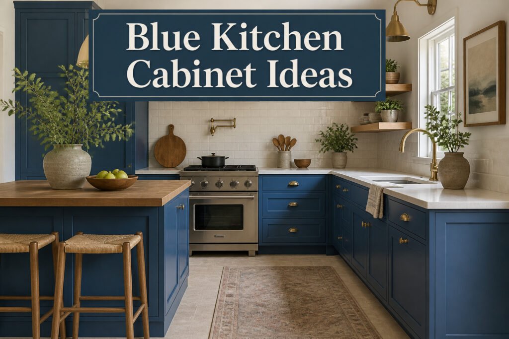
Blue kitchen cabinets work at nearly every budget and commitment level, from a single painted island to a full room in high-gloss navy. What separates the ones that stay looking intentional from the ones that read as unfinished is usually the finish and the prep underneath. Joe Lucas’s California kitchen made that point concrete: the same walls felt taller once white cabinets went glossy blue, because the reflective surface caught and threw light the matte white had swallowed. The catch is the sanding, the flawless base coat, and the fingerprints you will wipe daily.
1. High-Gloss Blue for a Modern Kitchen
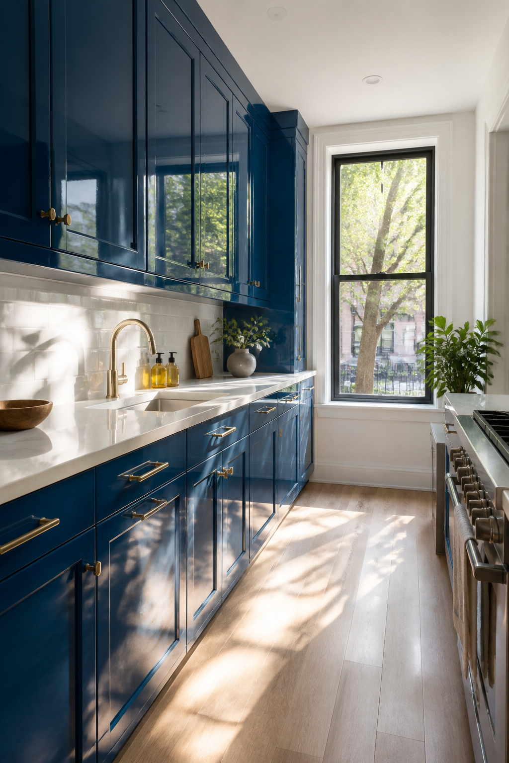
High-gloss blue cabinets throw light around a room like almost nothing else in kitchen design. The reflective surface catches morning sun from a window or under-cabinet LEDs at night, and that bounce makes a tight galley kitchen feel like it has breathing room. You see the effect clearly in spaces like the California kitchen designer Joe Lucas reworked: cabinets that started white, then went glossy blue, and suddenly the same walls felt taller.
The finish reads modern because it is unforgiving. Every fingerprint shows, and a brush stroke in the paint stands out like a scar. That is the trade you make for the mirror-like surface. If your kitchen sees heavy daily traffic, you will wipe these doors more often than matte or satin equivalents. For a rental you are refreshing before a sale, or a kitchen you use mainly on weekends, the maintenance is manageable. For a household with kids and three meals cooked from scratch daily, the shine becomes a part-time job.
The blue itself can go deep navy or something brighter; the gloss handles either. What matters is the prep underneath. A high-gloss coat sits on top of a perfectly smooth base, not over old varnish or uneven primer. Skimp on the sanding and the light you wanted to catch will spotlight every flaw instead.
2. Two-Toned Blue and White Cabinets
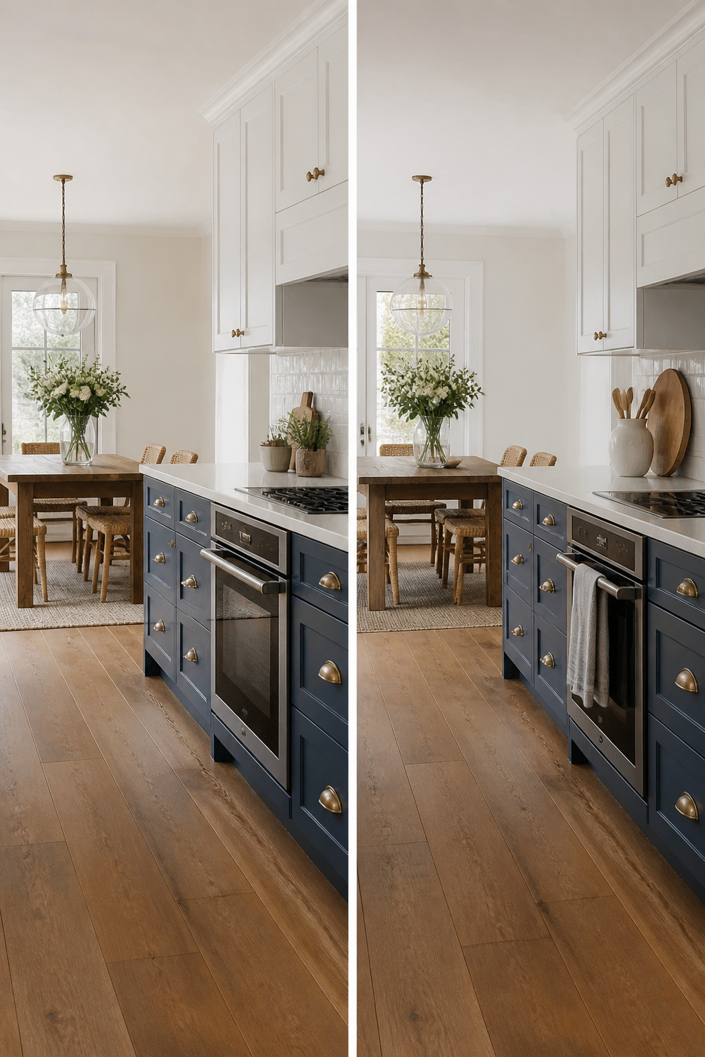
The two-tone pairing that keeps showing up in kitchens that actually get finished is blue lowers, white uppers. It splits the difference between committing to a color and playing it safe.
You get the depth where it counts. Lower cabinets in navy or a softer mid-tone blue ground the room; white uppers keep the walls from closing in. Brass hardware against that combination reads classic rather than trendy, which matters if you are painting existing boxes instead of replacing them.
What convinced me, reading through a dozen of these setups, is how forgiving the balance is. Traditional kitchens and contemporary ones both handle it. The blue-and-white combination is not new, but it survives because it is practical: the heavy color sits below eye level where fingerprints and scuffs actually happen, and the light color above reflects what window light you have.
If you are renting and painting is an option, this is the approach to test. Two gallons of cabinet paint in different colors, a weekend of sanding and brushing, and you have a kitchen that photographs well and lives well.
3. Blue Kitchen Islands as Focal Points
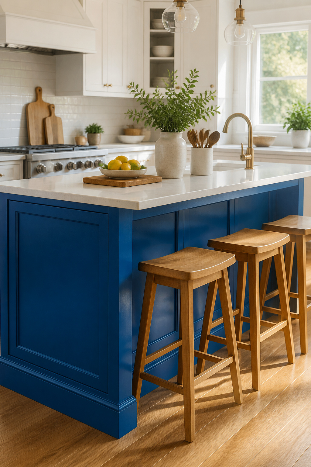
Painting just the island in blue keeps the commitment small and the impact sharp. A single bold mass of color anchors the room without turning every wall into a statement. The rest of the kitchen stays bright and neutral, which is how MBC Interior Design keeps the look modern: white perimeter cabinets, white walls, then one saturated island in the middle.
Designer Jessica Davis and architect Gustave Carlson took this approach in a 1970s Joseph Eichler home in California, using a bright blue island and matching cabinets as deliberate jolts of color against the classic architecture. The island became the photograph, the thing your eye finds first.
What convinced me, reading through the projects that pull this off, is that the blue needs to be bright enough to read as intentional, not leftover. A muted shade can look like you stopped halfway. The perimeter cabinets stay in a clean white or warm off-white so the blue does not compete with itself. Two cans of paint versus twenty, one weekend versus a full kitchen shutdown, and you still get the idea across.
4. Blue Cabinets with Warm Wood Accents
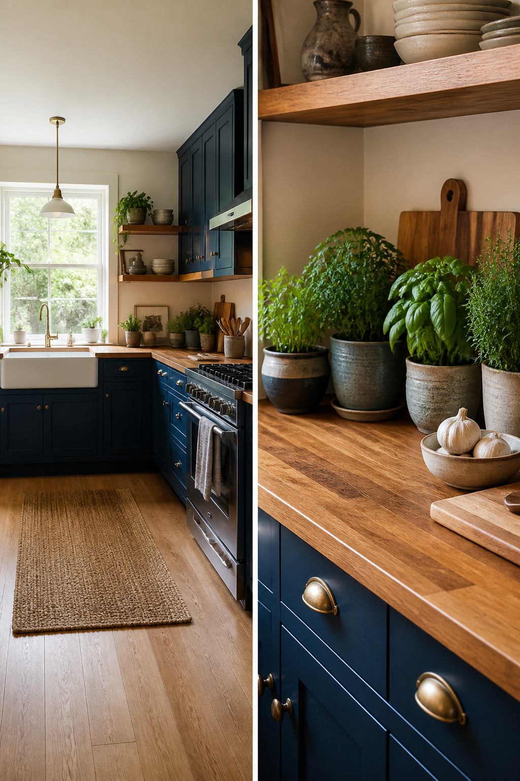
Blue kitchen cabinets with warm wood accents solve the problem most people worry about first: the color can read cold if it sits alone. Natural wood tones pull it back toward something livable.
You have more places to add that warmth than you might expect. Open shelving in a light oak, a butcher block island top, or even exposed ceiling beams each do the same work of softening the blue. One kitchen pairs deep-hued cabinets with a pale wood island; another runs blond wood cabinetry against an ocean-colored island and gets the same balanced result. The common thread is contrast in tone, not in style.
If you are choosing a paint, Sherwin-Williams Grays Harbor is one shade that shows this clearly. Studio McGee used it with rustic beams and a butcher block island top, and the wood keeps the deep blue from flattening into something gloomy under kitchen lighting.
For a weekend project, a wooden countertop on your island or a swap to wood drawer fronts you can install yourself lands in that few-hundred-dollar range. The grain adds texture the eye reads as handmade, which helps when the cabinets themselves are a stock blue and not custom.
5. Contrasting Backsplashes with Blue Cabinets
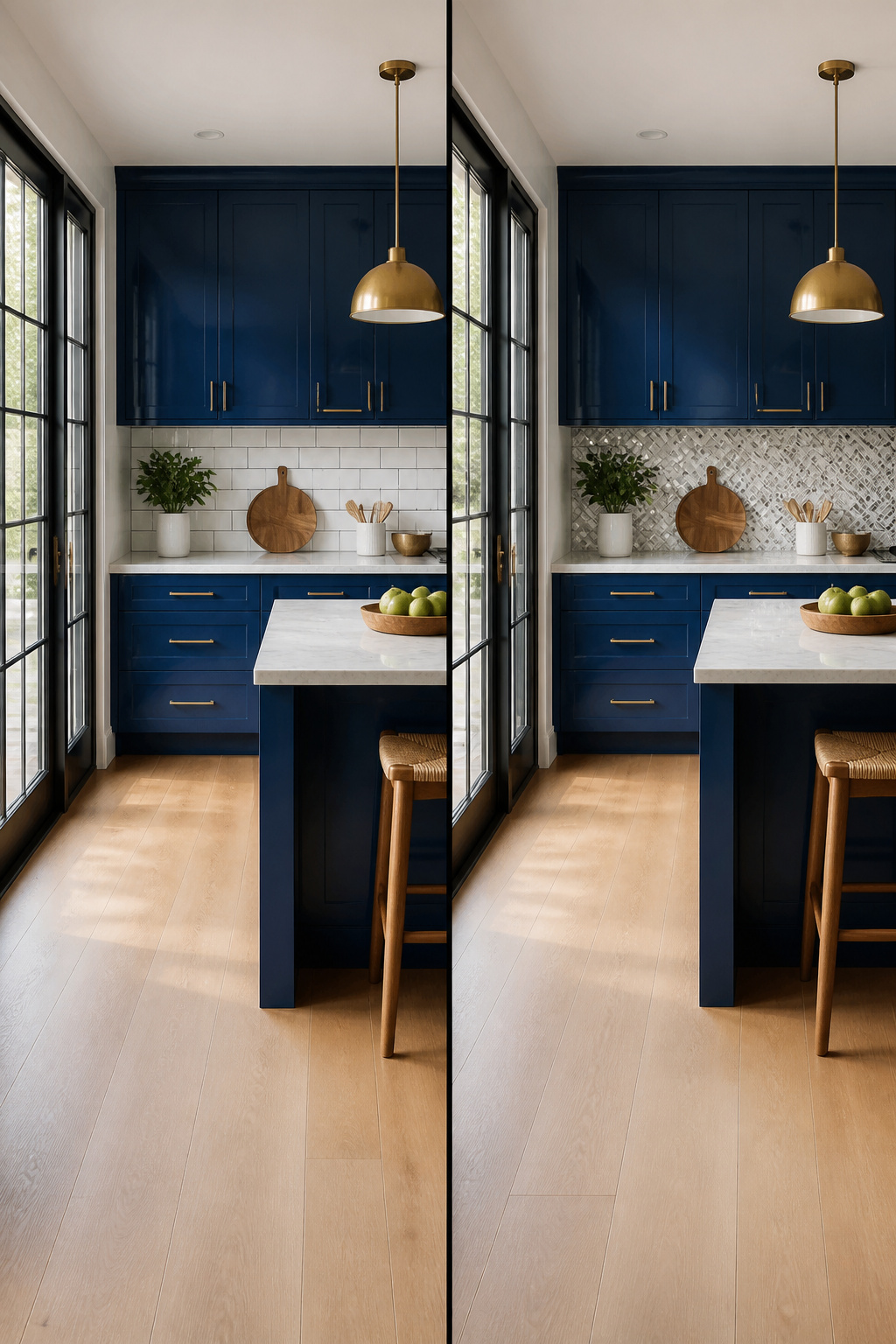
A backsplash that fights the cabinets instead of echoing them is where a blue kitchen starts to feel designed rather than decorated. White or gray tiles with real texture, a hand-laid pattern, anything that catches light differently than the flat cabinet faces, will do more for the room than matching the blue ever could. Patterned tile against solid blue adds the visual interest that keeps the eye moving.
Black-and-white tile works with any shade of blue cabinetry, from a dusty slate to something far more saturated. The high contrast reads as intentional, not busy, because the palette stays disciplined to two colors. In a Toronto kitchen with Yves Klein Blue cabinets, designer Sam Sacks used a white exposed-brick wall as the counterweight; the raw texture and the electric blue argued with each other in exactly the right way, kept in check by black countertops and a few bare plywood cabinet doors. The lesson there is that the contrast can come from finish as much as from color. A glossy blue against matte brick, or matte cabinets against glossy tile, hits the same note without the commitment of exposed masonry.
Subway tile in pure white is the safe fallback, but safety is not the goal here. Choose the tile that makes the blue look chosen.
6. Blue Cabinets with Brass Hardware
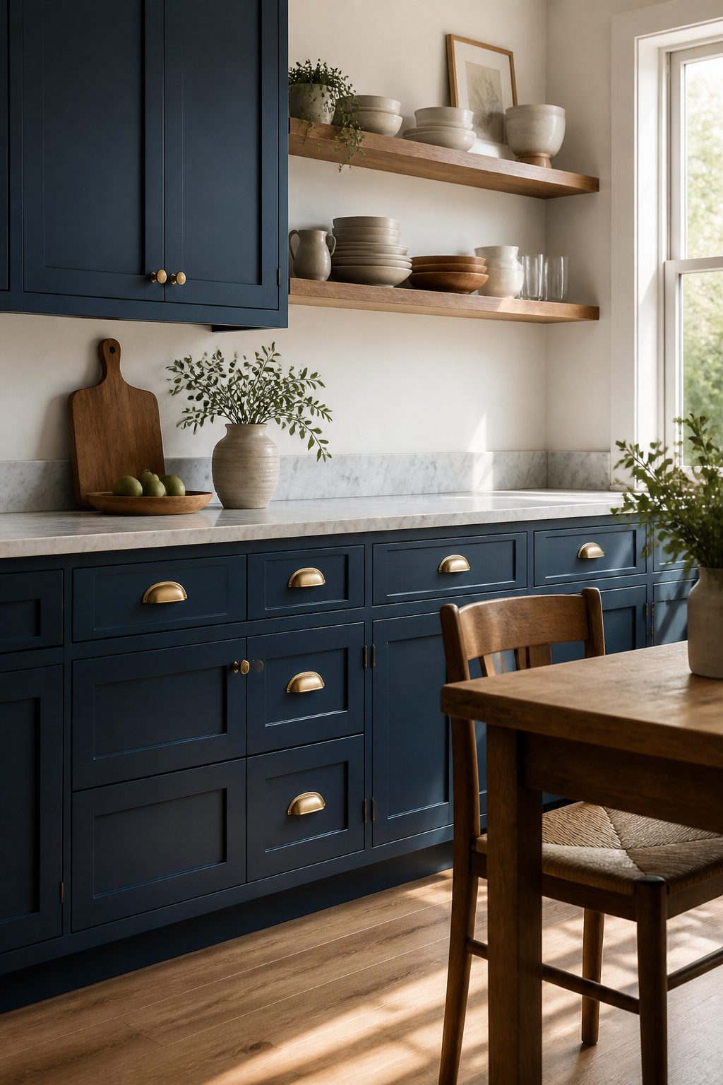
Brass hardware against blue cabinets works because the two temperatures correct each other. Cool blue can read sterile or flat under overhead kitchen light; brass warms it back up without drifting into country-kitchen territory. The combination shows up in kitchens running from crisp navy to soft sky blue, and the hardware itself can be as small as a drawer pull or as large as a lantern pendant.
The sources point to a few specific pairings worth noting. A custom mix of Sherwin-Williams Stardew and Uncertain Gray, cut fifty-fifty, reads as a muted sky blue that brass light fixtures pull toward the elegant rather than the coastal. Harbor by Cliq Studios, a deeper blue-gray, handles brass details the same way. Floor-to-ceiling blue cabinets with brass hardware and a rolling ladder edge toward dramatic, though that last setup assumes ceiling height and budget most weekend projects do not have.
Brass against blue succeeds when the metal has some age to it, not mirror-bright polish. Satin or antiqued finishes pick up less grease and water spotting, which matters in a room where you handle raw chicken and wash spinach. If you are renting and replacing cabinet hardware is your only permitted change, brass pulls on blue-painted existing cabinets deliver the effect for the cost of a screwdriver and an afternoon.
7. Soft Blue Shades for a Coastal Vibe
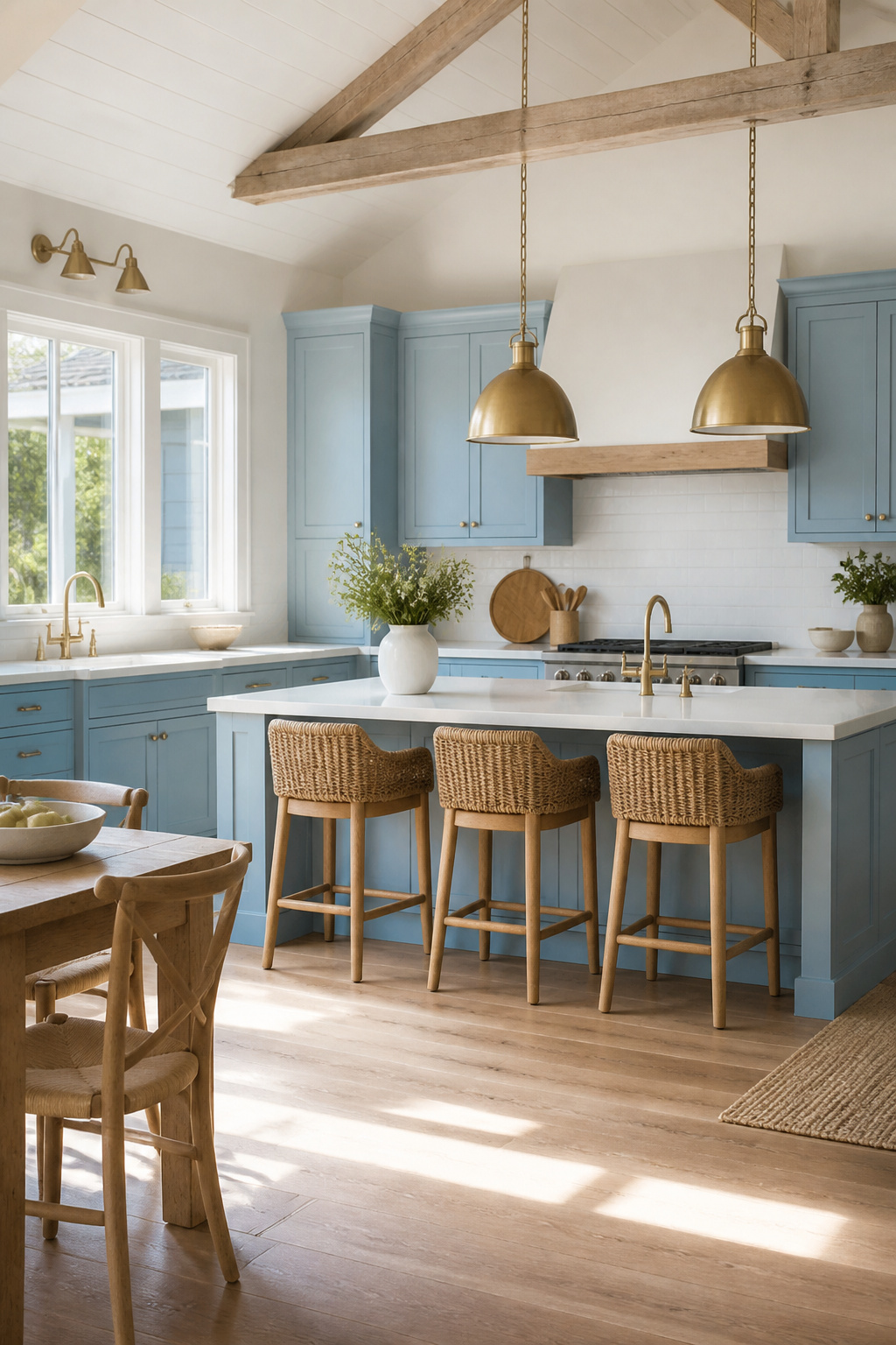
Soft blues read as water and sky rather than statement, which is why they settle a kitchen without shouting over it. Where navy or cobalt demand attention, a pale gray-blue or sky tone lets the room breathe. Designer Daun Curry used the faintest sky blue on cabinets in a Hamptons kitchen, paired with pale gray marble; the effect stays bright without going all-white. For a similar result, Sherwin Williams Stardew cut half-and-half with Uncertain Gray gives that weathered coastal cast, or Harbor by Cliq Studios runs slightly deeper with the same relaxed feel.
Wicker, natural wood tones, and brass lantern pendants layer well against these shades because nothing competes. One kitchen mixes blue cabinets with natural wood and brass hardware; another uses floor-to-ceiling soft blue with brass details and a rolling ladder to keep the look from floating away. The risk with these lighter tones is driftwood blandness. Anchor the space with texture: rattan bar stools, a honed marble or butcher-block surface, or even just visible wood grain on open shelving. Without that counterweight, the room can feel like a rental beach house rather than one you live in.
8. Bold Blue and Black Contrasts
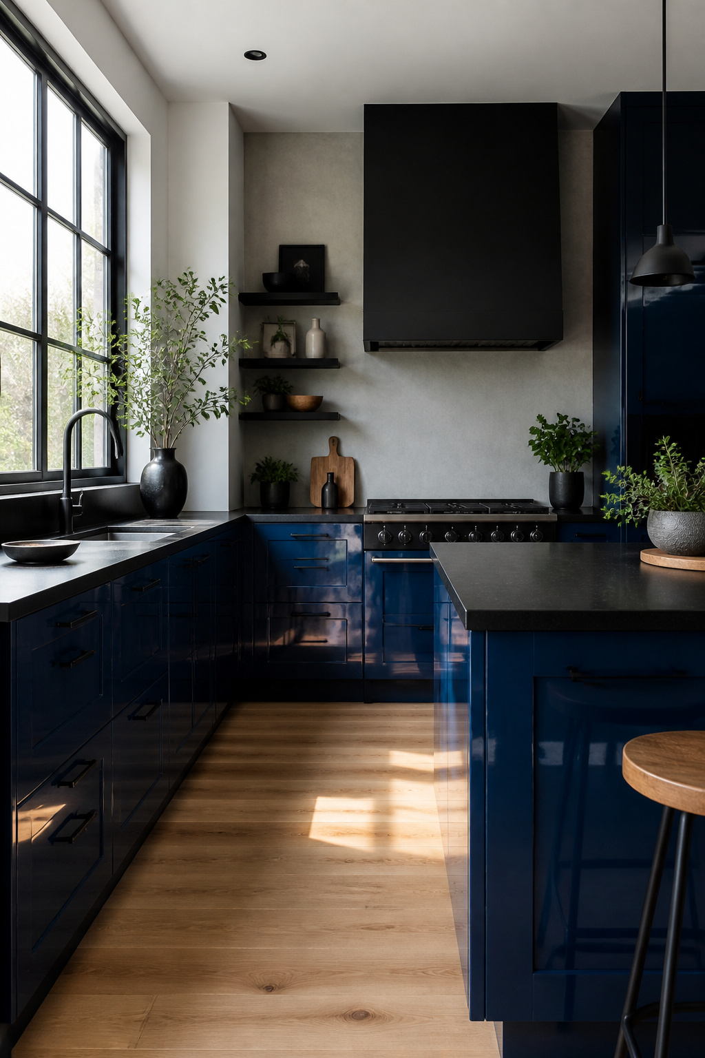
Pairing deep blue cabinets with black hardware or fixtures builds a sharper contrast than most color combinations allow, but it is also easier to get wrong. The risk is a kitchen that reads as cave-like rather than dramatic. One way to keep it contemporary rather than oppressive is to borrow from the high-gloss approach used in some navy kitchens, where reflective surfaces bounce light back into the room and keep the dark tones from flattening everything out. If you are not ready for full black cabinets, deep blue acts as a workable intermediary, giving you most of the mood with less of the maintenance headache. For a renter or weekend DIYer, this is probably not the place to start if your kitchen has small windows or a single overhead fixture. The combination demands either strong natural light or a deliberate lighting plan you will actually install, not just imagine.
9. Blue Cabinets with Industrial Accents

Pairing blue cabinets with raw industrial materials keeps the color from feeling too finished or precious. Exposed brick, metal shelving, and concrete countertops each do something different with the same base blue. Brick warms it; metal sharpens it; concrete grounds it. A Toronto kitchen by designer Sam Sacks used Yves Klein Blue against a white exposed-brick wall and added black countertops plus bare plywood doors for an intentional, unfinished energy. The plywood is the telling detail: it costs little and signals that you are not polishing every surface.
For a weekend project, skip the brick demolition. Mount open metal shelving above your blue cabinets and swap cabinet pulls for exposed hardware in blackened steel or raw iron. A concrete-look laminate counter runs $30–50 per square foot installed, against $65–135 for poured concrete, and reads the same from three feet back. The risk is going half-industrial: one metal shelf looks like storage, not strategy. Use at least two elements, spaced across the room, so the roughness reads as a choice rather than a leftover.
10. Vintage Charm with Blue Cabinets
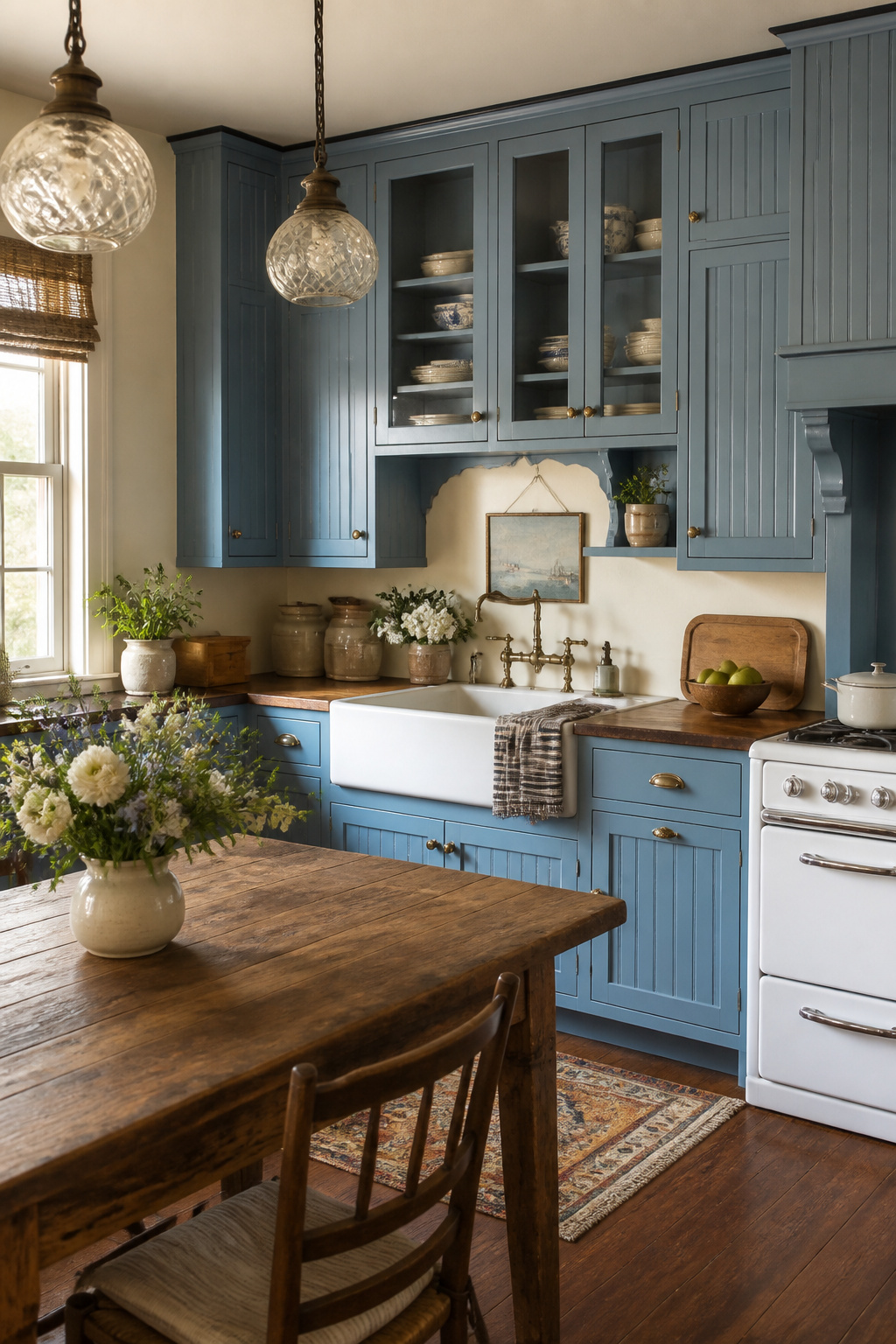
Vintage blue cabinets gain their character from the details you choose to layer on top of the color itself. A beadboard panel insert turns a flat Shaker door into something that reads 1920s cottage or 1940s farmhouse depending on what surrounds it. The vertical lines draw the eye up, which helps in a kitchen with standard eight-foot ceilings where you want visual height without crown molding you might not be allowed to install.
Glass knobs are the hardware move that seals the impression. Reproduction bin pulls and cup handles in oil-rubbed bronze work too, but clear glass with a slight green cast hits the note without looking like costume jewelry. You will feel them every day, so buy one single knob first and live with it through a week of cooking before you commit to twenty.
An apron-front sink completes the triangle. Fireclay reads more authentic than porcelain-coated steel, but it also weighs enough that you need to confirm your base cabinet can take the load, especially in a rental where the cabinet box may be particleboard. If you are unsure, a thinner gauge stainless apron-front gives the silhouette without the structural question. The blue cabinet framing it is what makes the sink look chosen rather than inherited.
11. Matte Blue Finishes for Quiet Elegance

Matte blue finishes trade the mirror-like reflection of gloss for something quieter. The surface reads as soft, almost velvety, and that texture plays against polished countertops or metal hardware without competing for attention. You will spend less time wiping fingerprints off matte cabinets than you would with a gloss coat, which is worth weighing if the kitchen sees daily traffic from kids or pets.
For paint, Benjamin Moore lists several blues that suit this treatment. Aegean Teal 2136-40 and Van Deusen Blue HC-156 both carry enough gray to stay subdued in matte; Hale Navy HC-154 goes darker if you want the cabinets to ground a lighter room. The common thread is that each color has body to it, so flattening the sheen does not flatten the look entirely.
Pairing matters here. Where gloss can carry a cabinet color alone, matte benefits from contrast elsewhere. Think glossy quartz counters, a brushed brass pull, or even just a wall in clean white so the blue does not sink into gloom. Good Housekeeping’s read on gray-blue cabinets applies: keep the surrounding elements light and the matte finish reads as intentional, not muddy.
12. Blue Cabinets with Marble Countertops
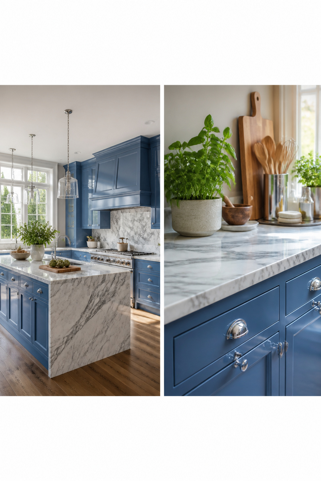
Marble countertops give blue cabinets a cooler, more pulled-together look than most pairings manage, because the gray veining does the color-matching work for you. Against smoky blue cabinets, classic gray-veined marble reads chic rather than cold, especially when you keep the upper walls a clean white so the room does not topple into gloom. Medium blue cabinets with marble work best when the hardware stays sleek chrome and the uppers shift to light gray, letting the stone bridge the two blues without fighting either one. The veining itself is what makes the pairing forgiving: it breaks up solid color, adds depth without pattern, and picks up the undertone in whatever blue you chose. If your marble runs warmer, test it against your cabinet sample in afternoon light before you commit, since a yellow vein can turn a crisp blue muddy.
13. Blue Cabinets with Glass Fronts

Solid color on every cabinet door can flatten a kitchen, especially in a darker blue. Glass fronts in blue frames break the run of paint and give you somewhere to show dishes you actually use. The glass itself reads as open space, so the room keeps an airy feel even where the color is deep.
Upper cabinets are the natural spot for this. You look at them straight on, not down into them, so the display reads as intended. A Toronto kitchen by designer Sam Sacks used electric blue uppers against white brick; the height and the color hit kept the look from feeling loose or accidental. You do not need tall ceilings to pull this off. Two or three glass-front uppers on an eight-foot wall, flanking a range or centered over a sink, is enough to break up the mass without turning the kitchen into a curio cabinet.
The risk is overloading the display. Leave at least half the uppers solid, and keep what sits behind the glass to one color family: white plates, or clear glass, or a single stoneware tone. The blue frame does the work; the contents should not fight it.
14. Blue Cabinets with Patterned Tile Flooring
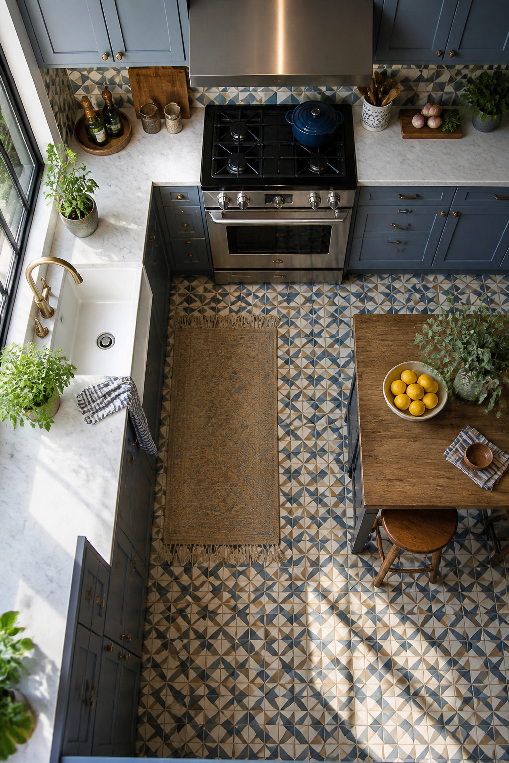
Patterned floor tile next to blue cabinets sounds like a lot until you see it done right. The trick is treating the floor as the single bold move and keeping the cabinets solid and quiet. A pale blue-gray cabinet like Benjamin Moore’s Wolf Gray reads almost as a neutral against herringbone or geometric tile, letting the pattern do the work without the room shouting back at you.
Start with a tile that picks up the cabinet’s undertone rather than matching it dead-on. Warm blue cabinets want terra cotta or warm white in the tile; greener blues pair with charcoal or sage details. The cohesion comes from the relationship, not the repetition.
The risk is visual chaos. You avoid it by running the tile only where it belongs underfoot and resisting the urge to echo it on the backsplash. One source kitchen used statement pendant lights overhead and let the floor and cabinets carry the entire color story. No competing patterns on walls, no second bold gesture.
This pairing takes more confidence than safe choices like wood or plain stone. It also reads instantly intentional rather than accidental, the look of someone who collected pieces over time rather than buying a matching set. For a weekend project with a few hundred in tile and a day of labor, that payoff is hard to match with any single cabinet color alone.
15. Blue Cabinets with Natural Stone Backsplashes
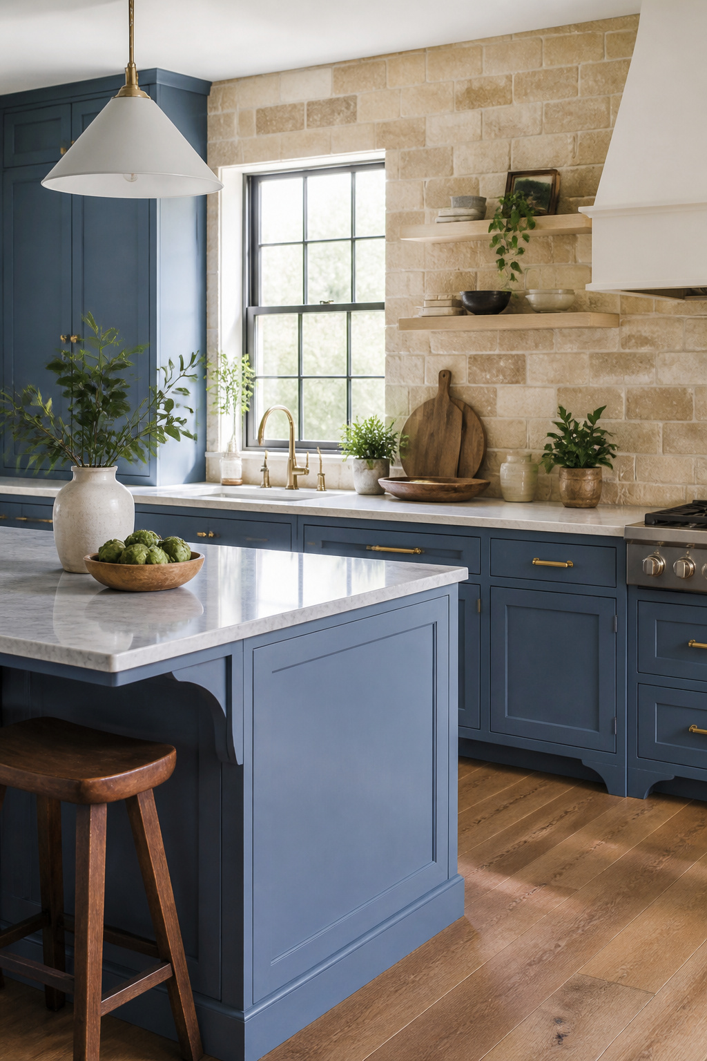
Smooth painted blue cabinets read as flat color from a distance, and that is where a natural stone backsplash earns its place. The pitted surface of travertine or the split, uneven face of slate catches light differently across every inch, so the wall behind your counter never looks like a single sheet. Designer Daun Curry used this tension deliberately in a Hamptons kitchen, pairing barely-there sky blue cabinets with pale gray marble backsplashes and island surfaces. The stone’s soft veining and slight temperature variation kept the pale blue from feeling like a painted box.
For a weekend project on a real budget, you are likely working with stock cabinets in a mid-tone blue, not a custom pale mix. Travertine-look ceramic tile runs cheaper than solid stone and still delivers the surface variation that matters here. The rule is contrast in texture, not in color drama: let the cabinets carry the hue and let the backsplash carry the irregularity. Slate leans darker and more rustic; travertine reads warmer and works against both navy and softer blues. Either one saves you from the flatness that makes painted kitchens feel like a showroom instead of a room someone uses.
16. Blue Cabinets with Copper Accents
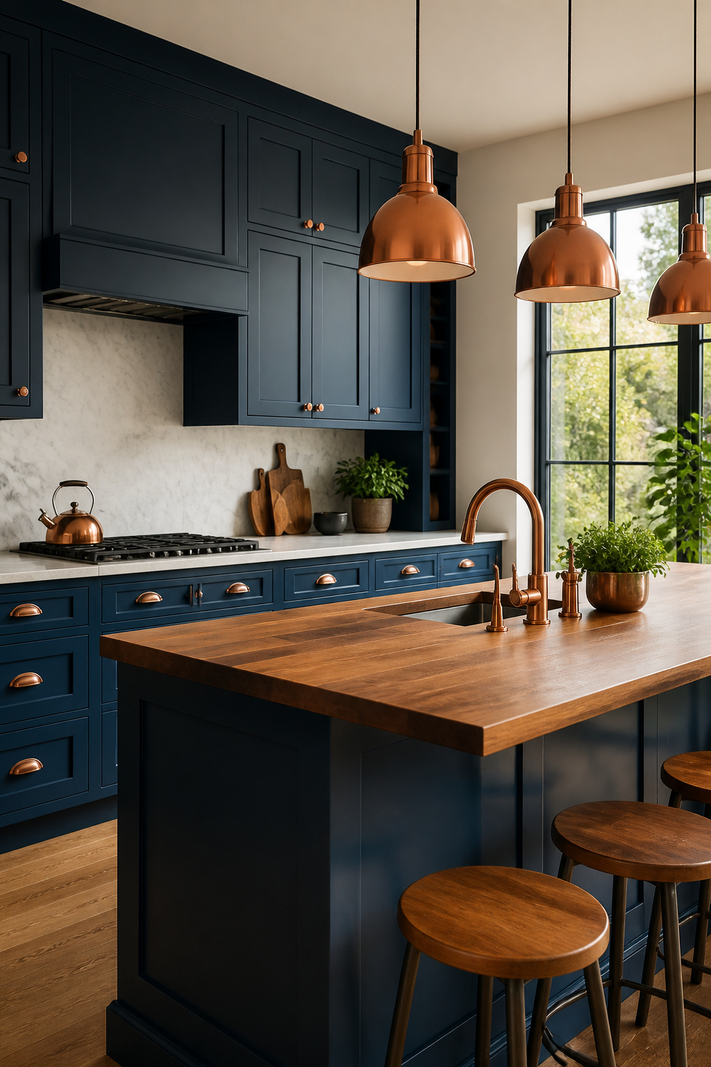
Copper reads warmer than brass against blue cabinets, and it ages into a softer patina rather than the spotty tarnish silver develops. That patina is what sells the pairing: a navy or slate cabinet front stays crisp while the hardware mellows to a rosy brown over five or six years of morning coffee and hand-washing dishes.
You do not need to commit everywhere. A copper faucet and two drawer pulls on either side of the range hood frame the cooking zone without turning the kitchen into a showroom. Light fixtures over the island in aged copper do the same work from a distance, and they cost less than replacing every hinge and knob. The warm tone cuts the coolness of blue without fighting it the way orange wood can.
If you rent, stick to hardware and portable pieces. Copper faucet finishes scratch more easily than chrome, so landlords rarely install them; swapping your own cabinet pulls and keeping the originals in a bag takes ten minutes when you move.
17. Blue Cabinets with Bold Wall Colors
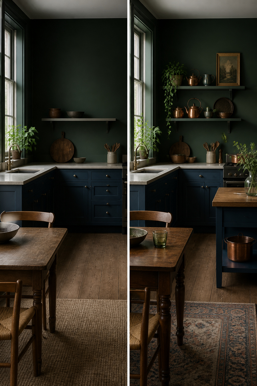
White walls next to blue cabinets read as safe because they are. You lose the cabinets in all that blank space, and the room flattens into something you have seen before. The stronger move is a wall color that pushes back: deep green, rich burgundy, or even black accents that turn the kitchen into a single composed room rather than cabinets floating in neutral territory.
This is where most weekend projects slip. Two saturated colors in the same sight line will fight unless one clearly leads. Let the cabinets carry the blue, then choose a wall tone that is darker or dustier, never equally bright. A deep green wall behind navy cabinets works because both colors sink rather than shout; burgundy against a mid-tone blue succeeds for the same reason. The balance is tonal, not matching.
Black operates differently. Used as an accent wall or on adjacent fixed elements like a window frame, it sharpens the edges of bold blue cabinets without adding a third color to manage. The contrast reads as deliberate in a contemporary kitchen, accidental in a traditional one. Keep the surrounding materials quiet: matte counters, simple hardware, no additional patterns. The drama is already in the pairing; more layers tip it into noise.
The risk is real. Paint samples look different at 8 a.m. and 6 p.m., and a color that felt rich in the can can go flat under overhead LEDs. Test a two-foot square directly beside the cabinet face, live with it for a full day, and be willing to shift one tone lighter or grayer. The cost is a second sample jar, not a room repaint.
18. Blue Cabinets with Subway Tiles
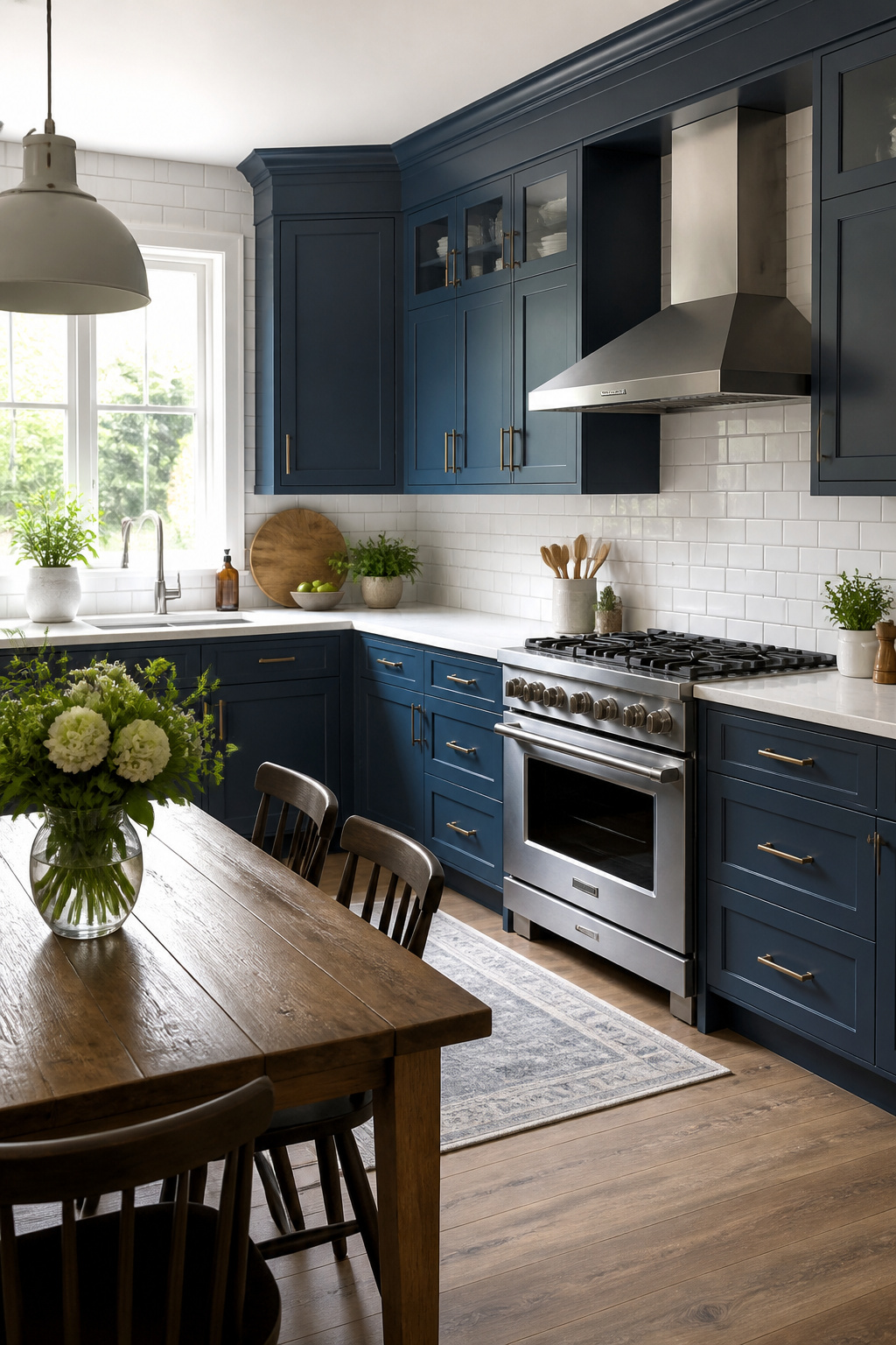
White subway tile is the pairing that lets blue cabinets read as either traditional or contemporary without forcing you to choose. The crisp contrast keeps the blue from feeling heavy, and the grid of rectangular tiles adds structure that works whether your cabinets are flat-panel or raised. Cream subway tile softens the look slightly and bridges toward warmer elements like brass hardware or wood floors.
You see this combination most often with navy or medium blue lower cabinets and white uppers, which creates the depth that makes a small kitchen feel finished rather than cramped. The tile does not compete; it gives the eye a place to rest. If you are renting and tiling only the backsplash zone behind the stove, subway tile keeps the material cost low and the pattern simple enough to remove later without a full gut.
The risk is uniformity. Too much white above and too much blue below can look like a formula. Varying the grout color, or running the tile to the ceiling behind open shelving, breaks the grid just enough to keep it from feeling like a catalog photo.
Shades That Work
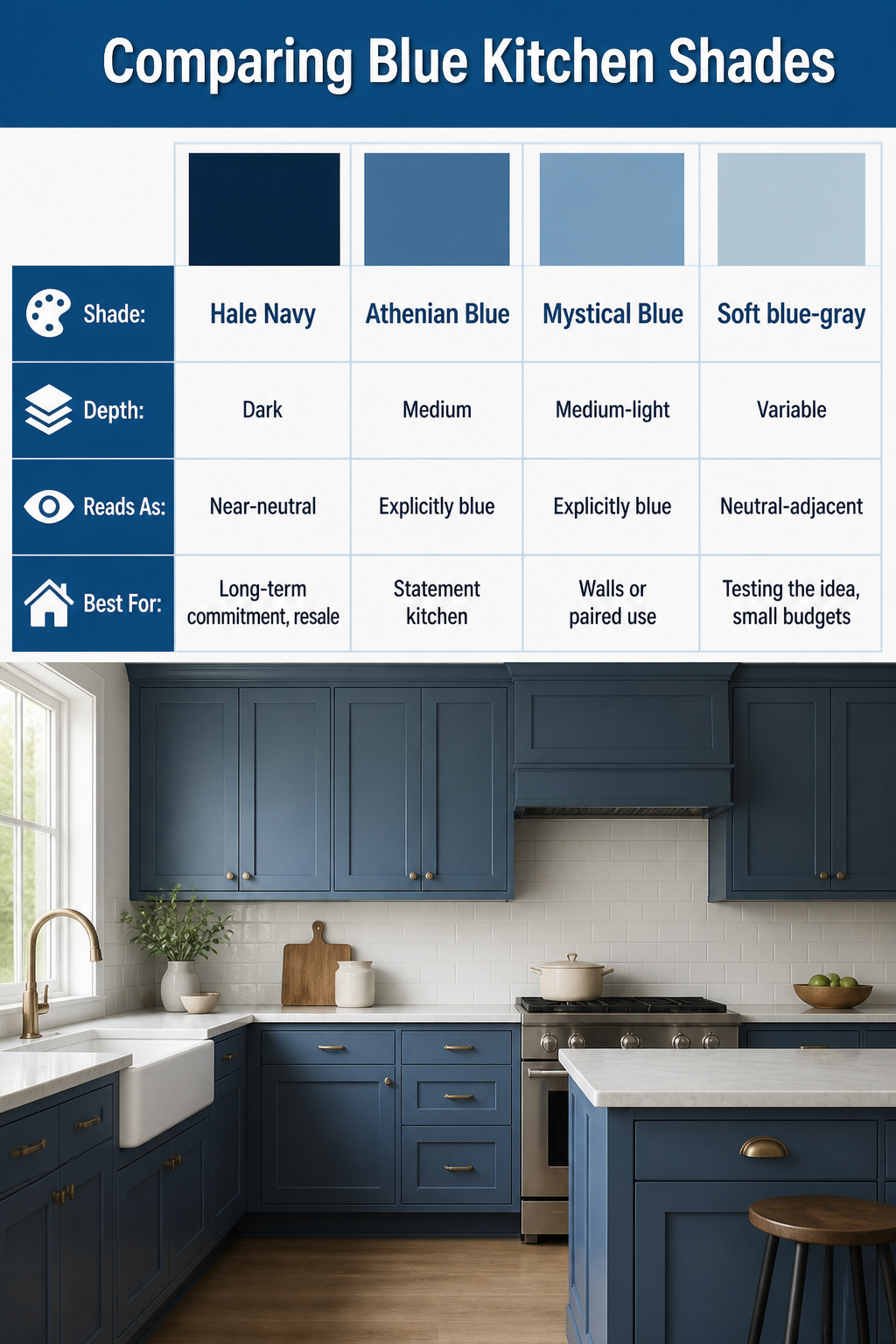
Hale Navy by Benjamin Moore has become the default dark blue for a reason: it carries enough warmth to avoid reading cold, but enough coolness to stay crisp beside white trim. In most kitchens it functions as a near-neutral, something you notice without the room feeling themed.
Lighter blues shift the other direction. Athenian Blue and Mystical Blue, both Benjamin Moore shades, read as explicitly colored the moment they go on cabinets; they announce a choice rather than settling into the architecture. A designer pair in New York used Athenian Blue on cabinets and Mystical Blue, slightly paler, on the adjoining walls to keep the kitchen from flattening into a single note.
If you are uncertain where you land, soft blue-gray is the most forgiving starting point. It handles shifting daylight better than cleaner blues, which can pick up purple or teal undertones depending on your windows and bulbs.
| Shade | Depth | Reads As | Best For |
|---|---|---|---|
| Hale Navy | Dark | Near-neutral | Long-term commitment, resale |
| Athenian Blue | Medium | Explicitly blue | Statement kitchen |
| Mystical Blue | Medium-light | Explicitly blue | Walls or paired use |
| Soft blue-gray | Variable | Neutral-adjacent | Testing the idea, small budgets |
Test any candidate on poster board or cardboard, taped to the cabinet faces, and check it morning through evening before you buy the full gallon.
Testing Blue Paint in Your Kitchen
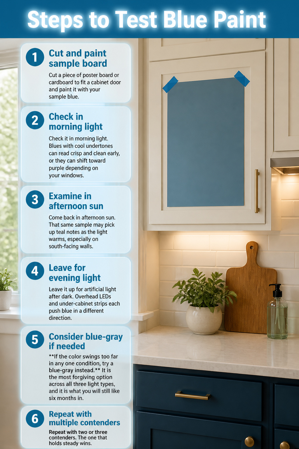
- Cut a piece of poster board or cardboard to fit a cabinet door and paint it with your sample blue. Tape it in place where the actual cabinet sits, not flat on a wall.
- Check it in morning light. Blues with cool undertones can read crisp and clean early, or they can shift toward purple depending on your windows.
- Come back in afternoon sun. That same sample may pick up teal notes as the light warms, especially on south-facing walls.
- Leave it up for artificial light after dark. Overhead LEDs and under-cabinet strips each push blue in a different direction.
- If the color swings too far in any one condition, try a blue-gray instead. It is the most forgiving option across all three light types, and it is what you will still like six months in.
- Repeat with two or three contenders. The one that holds steady wins.
What to Pair with Blue Cabinets

You picked your blue. Now the question is what stays and what goes with it. Here is what actually works, and where it can go wrong.
- White countertops keep blue cabinets readable. In a kitchen with smoky blue lowers and white uppers, the counter is the bridge. Crisp white walls above keep the whole wall from feeling like a pool. Gray veined marble does the same job but adds movement; just know the veining will compete with a busy floor.
- Gray uppers with medium blue lowers read as one cool story. Chrome hardware keeps the temperature consistent. Brass instead of chrome warms the same palette, though the two metals fight if they touch. Pick one and repeat it.
- Natural wood is the fastest way to keep blue from feeling like a showroom. A light oak island against deep blue cabinets, butcher block on a worktable, open shelving, or even a wood floor stripe underfoot. The wood tone matters more than the species: pale and honeyed work, orange-tinted oak can look dated against cleaner blues.
- Mixed metals work only when one dominates. Brass pulls with a stainless faucet is fine; brass pulls, brass faucet, and brass pendant is better if you want calm, worse if you want deliberate contrast. Two finishes at 50/50 looks like a mistake you have not fixed yet.
- Two-toned blue and white kitchens survive longer than all-blue walls. Navy lowers and white uppers, or a blue island against white perimeter cabinets, give you the color without the cave effect.
Frequently Asked Questions
What colors go with blue kitchen cabinets?
White, gray, and natural wood tones balance blue cabinets best. Brass or gold hardware adds warmth, while black sharpens the look. The article pairs deep blues with black countertops and white brick, and softer blues with pale marble or butcher block for contrast that keeps the room grounded.
Are blue kitchen cabinets a good idea?
Yes, blue cabinets work across kitchen styles from traditional to modern and hold up over time. The shade range runs from barely-there sky tones to saturated navy, so you can match the intensity to your space and how you use it. They also photograph well if you are refreshing before a sale.
What shade of blue is best for kitchen cabinets?
Hale Navy by Benjamin Moore is the standby for dark blues because its undertones stay neutral under changing light. If you are unsure, a soft blue-gray forgives the most and shifts least from morning to evening. Test any shade on poster board taped to the cabinet for a full day before committing.