
The best bedroom ideas for men split cleanly between weekend paint jobs and full builds, and the deciding factor is almost always whether you rent or own. A single forest-green accent wall behind the headboard takes a Saturday and a roller, but reclaimed wood paneling or stone veneer demands structural commitment you may not be allowed to make. One concrete detail from the pieces below: peel-and-stick wallpaper in brick or wood grain comes back down when the lease ends, and costs less than the sneakers you are already wearing.
1. Layered Fabrics

Layered fabrics build warmth in a men’s bedroom without drifting into decorative-pillow territory. Start underfoot with a high-pile mohair or blended silk rug beneath the bed, then anchor the bed itself in crisp linen with a piped edge. That contrast, soft against structured, keeps the room from feeling staged.
Wood paneling behind the bed adds another layer entirely, one that reads as architectural rather than added-on. If the space still feels flat, a single vintage textile repurposed into a pillow or throw introduces depth through age and wear, not pattern overload.
The risk here is clutter. Two solid moves: keep the palette restrained, and limit yourself to three distinct textures in view at once. Mohair underfoot, linen on the bed, and one older piece with history. Anything more starts to compete. Skip pleated curtains or textured wallpaper in the same room; they fight the same battle and the room loses coherence. Let the textiles do the work of warming the space, then stop.
2. Streamlined Furnishings

A platform bed with a low profile frame and clean edges does more for a masculine bedroom than any collection of matching sets ever will. The idea is to let the room breathe. One well-built dresser beats two pressed-wood pieces that fight each other for attention.
Deep finishes ground the space in a way pale wood rarely manages. Slatted walnut, dark-stained oak, or even a saturated charcoal upholstery on a simple headboard reads as intentional rather than heavy. The same goes for bedding: textured solid linen or natural fibers like wool and cotton keep the palette quiet without going flat.
The mistake most people make is treating empty wall or floor space as a problem to solve. It is not. Hotels that get this right use the void as part of the design, backlit headboards and pendant lights doing the work that extra furniture would have cluttered. For a weekend project on a real budget, that means measuring what you actually need to store, buying for that number, and stopping. A single under-bed drawer system or built-in shelf line handles the clutter; the rest of the room stays open.
If you are choosing between a sleek modern frame with no storage and something bulkier that promises both, take the slimmer piece and add a container later. The visual weight you save is worth more than the convenience you think you will use.
3. Dark Green Walls
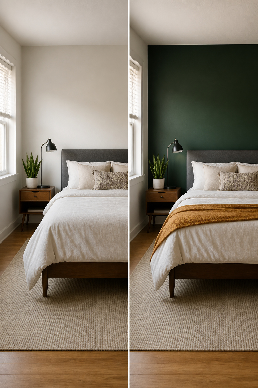
Forest green walls read as dramatic in a photo and surprisingly livable once you are in the room. The trick is painting only one wall if you are not ready for four. A deep green accent behind the headboard gives you the atmosphere without boxing you in, especially when the other three walls stay warm white or a pale neutral that bounces light back in.
Pair the green with lighter accents so the room does not flatten into a cave. White bedding pops hard against olive or forest tones, and a warm throw in ochre or mustard keeps the palette from feeling cold. Wood nightstands and a single plant help too; they add texture that reads as intentional rather than decorated.
If you rent, an accent wall is an easy Saturday job. One roller, one wall, and you can paint it back when the lease ends. The commitment is low, the change is real, and you will know inside a week whether you want to keep going or stop at one.
4. Showcase Collectibles

A bedroom is the right place for the guitars, jerseys, or concert posters that would feel out of place in the living room. The trick is treating them as a collection rather than clutter.
Group like with like: three framed album covers hung in a row read as intentional; the same three scattered across the room reads as leftover. Shadow boxes work for anything fragile or signed, and they turn a jersey into a piece that holds its own against actual art.
The editing matters more than the collecting. A single shelf of baseballs tells a story. A shelf, the nightstand, and the top of the dresser all covered in baseballs tells the story of someone who cannot stop acquiring baseballs. Limit yourself to one surface per category, and leave breathing room around each piece.
If the collection is large, rotate it. Store half and swap every few months. The room stays fresh, and you actually look at what you own instead of glazing over it.
5. Accent Walls

An accent wall is the most common starting point for a bedroom refresh, and for good reason: it changes the whole feel of the room without touching the other three walls. The question is what to put on it and which wall to choose.
Paint is the cheapest route. A single bold color behind the bed does the work of artwork, especially in red or another strong shade that holds its own against simple furniture. If you rent, peel-and-stick wallpaper is the safer bet. Brick and wood-grain patterns look close enough to the real thing that you will not miss the paneling, and you can pull it down when the lease ends. Wood slats or paneling cost more and take longer, but they add actual texture you can feel.
Pick the wall the bed sits against, or the one your eye hits first when you walk in. Light matters: a wall that catches morning sun can handle a darker color, while a shadowed corner needs something lighter or it will read as a hole. The one mistake to avoid is choosing a wall with a door or window dead center; the break in the surface kills the effect you paid for.
6. Industrial Elements
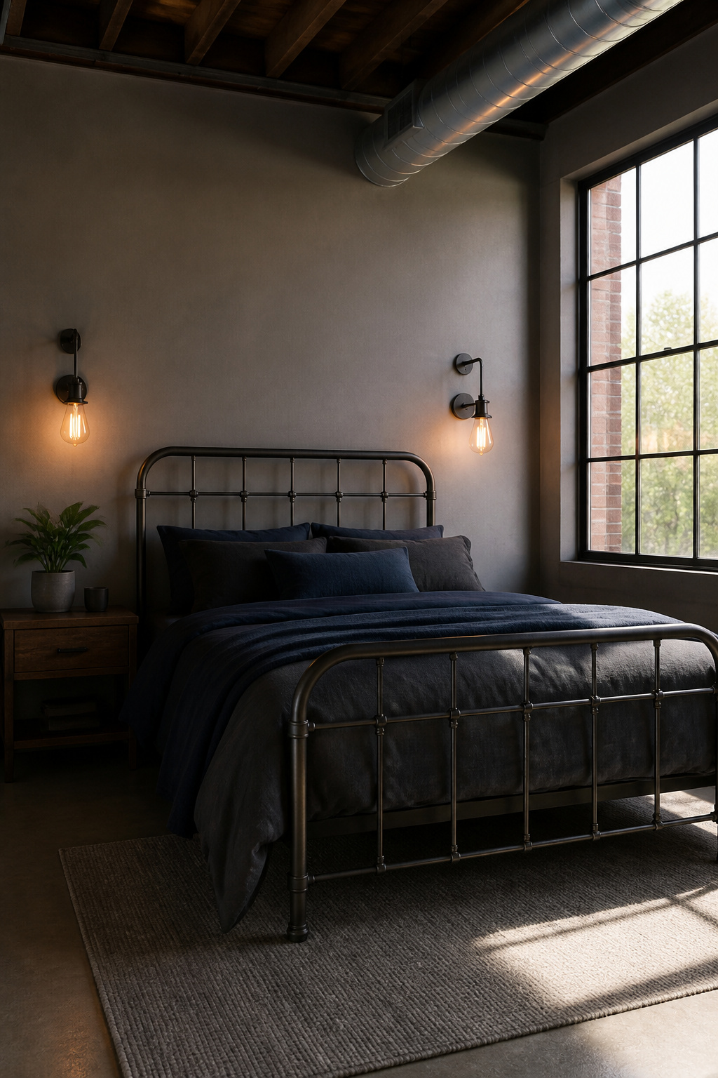
Metal and concrete read masculine without trying, but the bedroom is not a loft and should not feel like one. The move is one or two industrial pieces, then stop.
A metal bed frame does most of the work by itself. It sets the tone against drywall and carpet in a way concrete floors and exposed brick never could, and it moves with you. Wall-mounted industrial lighting over the nightstand adds the second hit of texture without taking floor space. If the fixture has a visible Edison bulb and a simple metal shade, that is enough. Two metal pieces in a small room is the ceiling; add a third and you have started a theme park.
Small hardware is where you correct course. Drawer pulls in matte black or raw steel tie the bed and lights together, but wood on at least one surface, a nightstand or a shelf, keeps the room from going cold. Leather or cotton bedding in charcoal or deep blue, not gray alone, adds the warmth that industrial spaces usually get from age and wear you cannot fake in a weekend. Plants help too, though one is plenty.
The mistake is treating industrial as a total look. Exposed pipe belongs in a converted warehouse, not a rental where you will patch the walls in twelve months. Keep the rough materials to furniture and fixtures you own, not the architecture you do not.
7. Mood Lighting
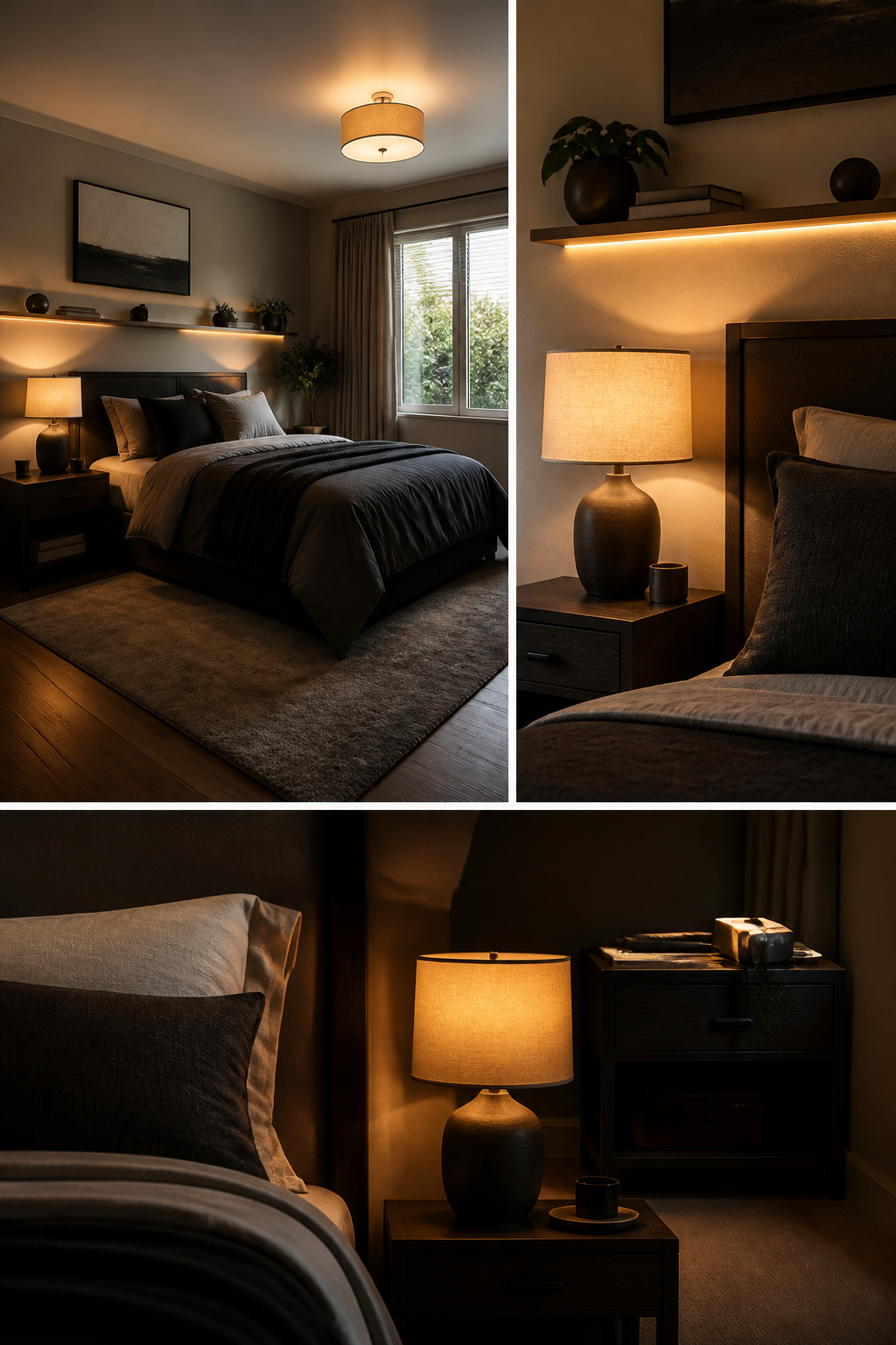
Overhead lighting alone flattens a room, washing out texture and making even a well-designed space feel like a waiting area. What fixes it is warm-toned light at three levels: ambient, task, and accent.
Start with your ambient layer at 2700 to 3000 Kelvin, which is the warm range that keeps white LEDs from reading as hospital triage lighting. That temperature works for ceiling fixtures as your base, then add task lighting where you actually use the room. Bedside lamps or sconces put light where you read or charge your phone without asking the ceiling fixture to do everything.
Accent lighting is where most bedrooms stop too early. LED strips behind the headboard or along shelf undersides pick out objects and add depth the overhead fixture cannot reach. The trick is putting all three layers on dimmers, because a single static level feels wrong for both working and winding down. A floor lamp with a warm bulb and a thrifted look can run under the cost of a pair of sneakers and still carry the room after dark.
8. Geometric Patterns
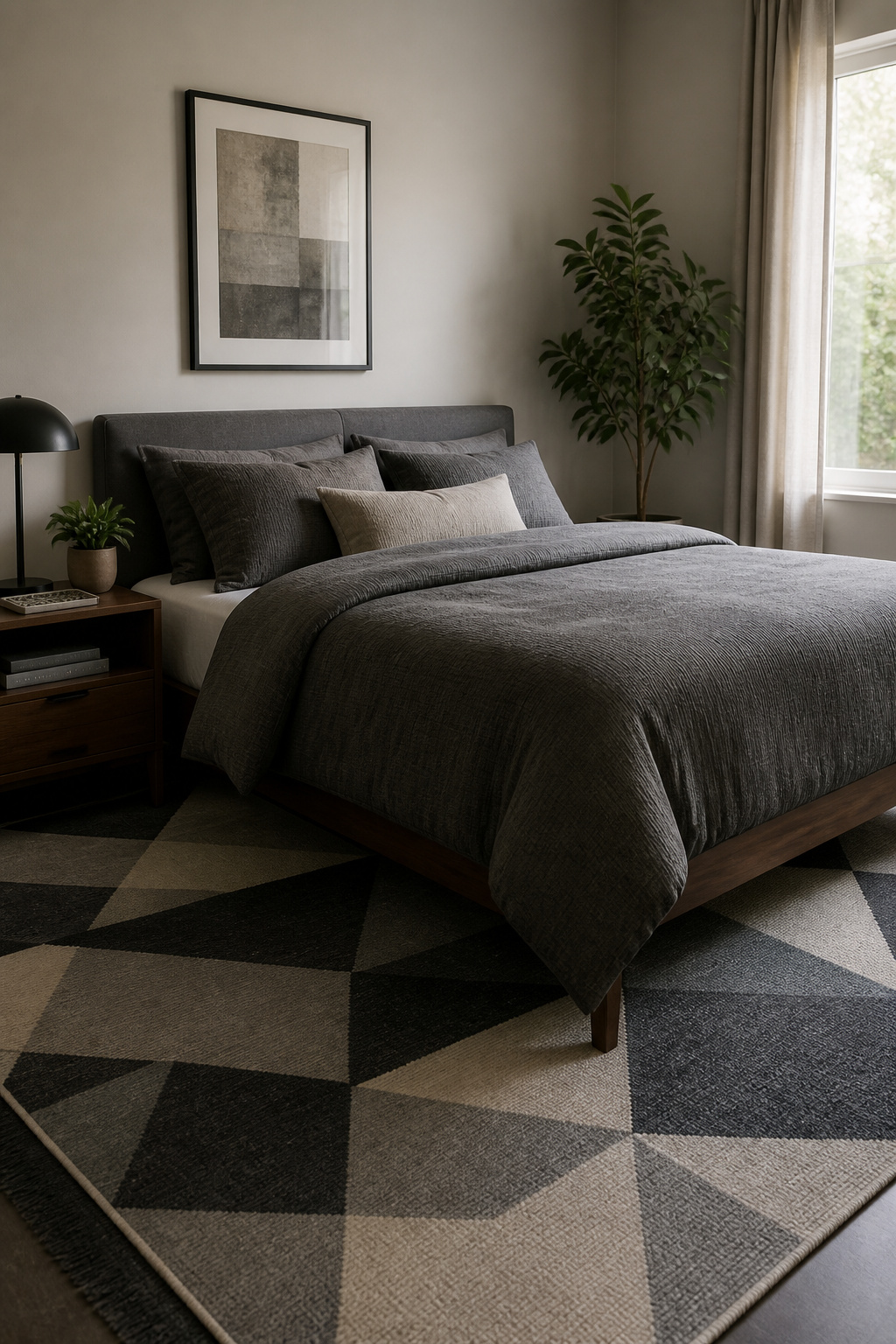
Geometric patterns add visual interest without demanding a full redesign, and getting the scale right is what keeps them from looking busy. A large-scale pattern on a rug or bedding works on a large surface because your eye reads it as texture from a distance; the same pattern on a throw pillow fights the room. Small, tight repeats belong on accents: a single cushion, a small tray, or the inside back of a bookshelf.
Mixing patterns is where most weekend projects go wrong. The rule that held up across every space that actually worked was one dominant scale per sightline. If your rug carries a bold geometric, keep bedding to a quieter stripe or a solid with texture. Two competing large patterns in the same view, and neither one wins. Wood paneling laid in a geometric pattern can anchor a whole wall, but pair it with plain linens so the room has somewhere to rest. Wall murals or geometric wallpaper on one feature wall give you the look without the commitment of wrapping the whole room, and painting over is straightforward when you are ready for a change. Tiling behind a headboard or across a single wall gives the same effect with more permanence, so rent with your lease length in mind.
9. Natural Materials

Wood and stone do the heavy lifting for warmth in a masculine bedroom, and you do not need the real thing everywhere to get the effect. A reclaimed wood headboard or accent wall carries the texture and history that makes a room feel grounded. If solid plank is out of budget or your lease says no, convincing wood-look veneers and laminate panels have improved enough that the difference shows only on close inspection. Use those on larger surfaces where cost or weight matters, and save real wood for pieces you touch daily: a bedside table, the bed frame itself.
Stone works the same way. A stone fireplace or feature wall adds mass and cool texture that balances softer furnishings, but natural stone is heavy, expensive, and often permanent. For a weekend project, stone-veneer panels or even well-made resin alternatives give you the visual weight without the structural demands. Use them on a single wall, never the whole room, or the space starts to feel like a lodge lobby.
Where sources split is on mixing wood tones. One approach says keep it simple and let a single species dominate. The other, which reads more lived-in, layers multiple tones deliberately: warm oak furniture against a cooler walnut accent, or a pale pine shelf against medium birch flooring. The trick is contrast with intention. Match nothing exactly, but stay within two or three tones total, and repeat each tone at least twice so nothing looks accidental. A gray wall scheme, common in men’s bedrooms, can read flat and cold without this warmth; the wood does the softening so you do not have to abandon the cooler palette you wanted.
10. Functional Furniture
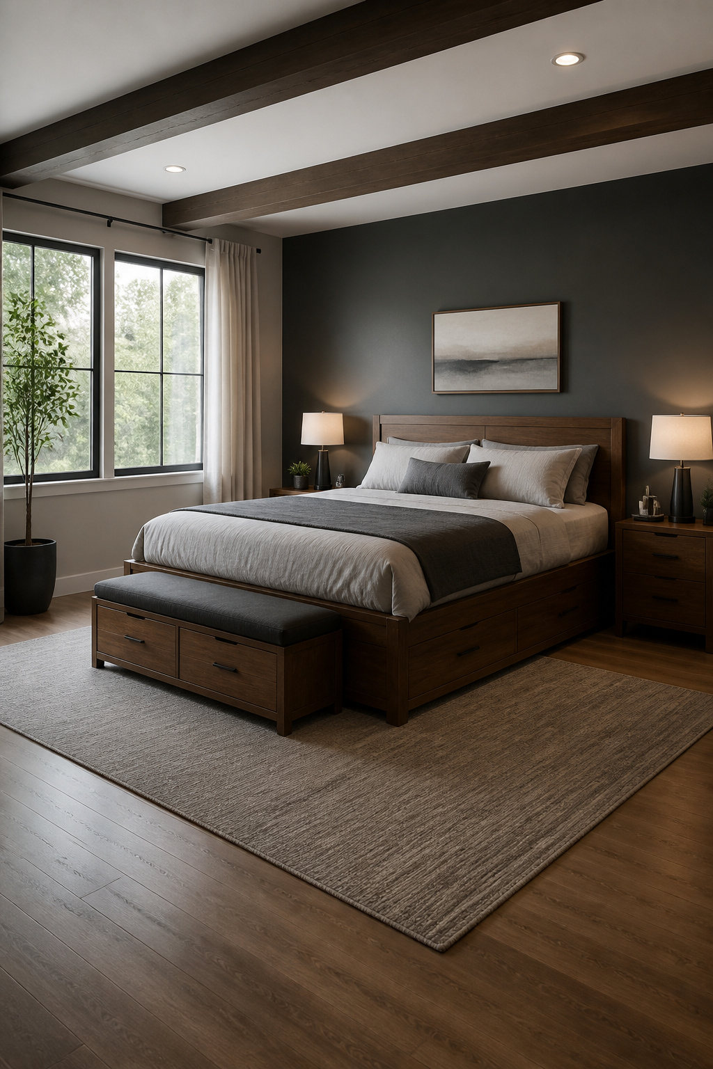
Storage beds eat floor space you do not have to spare. A full platform with drawers underneath holds out-of-season clothes or spare bedding where a separate dresser would crowd the wall. The tradeoff is mattress height: you climb in a few inches higher, and cheap frames let the slats sag after a year of real weight. Test the drawer glide in the store, loaded, because a sticky track becomes a morning annoyance you tolerate for years.
Nightstands with drawers beat open shelves for the same reason doors beat open racks: visible clutter reads as mess even when it is organized. One drawer for glasses and phone, a second for the notebook you keep meaning to write in, and the surface stays clear for the lamp and the water glass. Benches at the foot of the bed look useful in photos but often become landing pads for clothes you meant to put away. If you actually sit there to tie shoes, a hinged top with storage for linens earns its footprint. Otherwise it is one more surface to clear, and a small room needs fewer of those, not more.
Built-in furniture or a wall-mounted system saves the inches a frame legs steal, though renters face the anchor holes later. The real test of any piece is whether you open it daily or seasonally; everything else is staging.
11. Plants

A single Sansevieria on a windowsill or nightstand does more than sit there looking structured. It pulls pollutants out of the air, which matters when your bedroom doubles as a charging station for a laptop, phone, and whatever else is plugged in beside the bed. The plant itself is nearly impossible to kill. Water it every four weeks, or let it go hydroponic and skip the soil entirely, which removes the bacteria and fruit flies that come with potting mix.
Placement is what keeps the room from feeling like a greenhouse. One plant is enough for air quality; two is fine if you want the look. Put them in containers that read as deliberate, not decorative: raw concrete, matte black ceramic, or simple unglazed terracotta. A six-inch pot on a dresser works. A floor planter beside the desk works. What does not work is clustering three or more plants in one corner, which shifts the vibe from controlled to tended, and not in the way this room needs.
If you travel or simply forget, the hydroponic route is the safer bet. No soil, no rot, no mid-project replacement.
12. Artwork
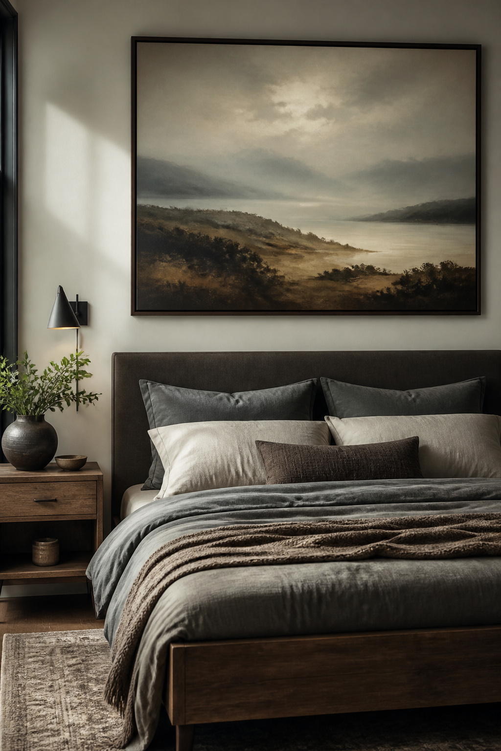
One large piece above the bed beats a cluster of small frames every time. A single oversized print anchors the wall, gives the eye somewhere to rest, and reads as intentional rather than accumulated. Hang it so the center sits roughly at eye level, about 57 to 60 inches from the floor, or 8 to 12 inches above the headboard if you are working around a bed. Scale matters: the artwork should take up roughly two-thirds to three-quarters of the furniture width below it, or it will look like it is floating instead of grounded.
Framing can go one of two ways. A slim black or dark wood frame keeps things clean and masculine without sliding into predictable "man cave" territory. Or skip the frame entirely and mount a canvas wrap for a softer edge that still holds weight. A large-scale landscape with tonal textures, something moody and slightly cinematic, carries personality without demanding a gallery wall’s worth of curation. You spend a weekend and a few hundred dollars once, not twice.
13. Quality Bedding

Crisp white sheets read cleaner in a masculine bedroom than any pattern, and they stay readable for years. Sources keep coming back to them because they let the rest of the room carry texture while the bed itself stays calm.
Solid linen wins over pattern for longevity. A textured solid in wool or cotton, or a simple natural fiber, ages without dating itself the way a geometric print might. You can swap in one or two bold pieces through pillowcases or a throw and still keep the overall neutral ground.
Fabric weight matters by climate. Heavier weaves suit cold winters; lighter linen breathes through humid summers. The point is to buy for the temperature you actually sleep in, not the showroom you saw it in.
A dichromatic or trichromatic neutral scheme holds up because it adapts when you move or repaint. Saturated shades on the walls, simple bedding, and the room still reads effortless rather than decorated to a theme. That is the balance that survives a weekend budget and still looks intentional.
14. Unique Rugs
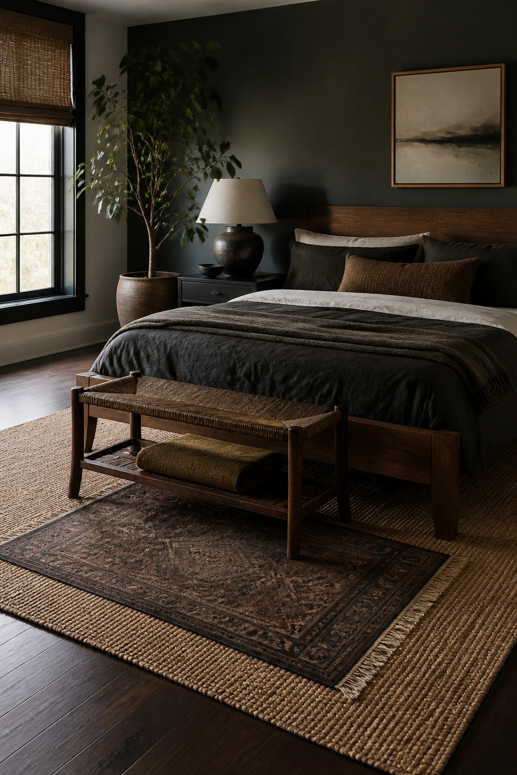
A rug that extends roughly two feet past each side of the bed gives you something warm to land on in the morning and keeps the room from feeling like a mattress floating on a floor. For a queen bed, that usually means an 8×10 foot rug minimum; go larger in bigger rooms rather than centering a small one and leaving bare floor at the perimeter.
Low pile, under a quarter inch, vacuums easily and does not trap dust the way shag does, which matters more than softness if you are tracking in workshop grit or job-site debris. Medium pile feels better underfoot but holds hair and grit; skip it if you have a dog or do not own a serious vacuum.
On hardwood or concrete, the rug is doing all the work of noise dampening and warmth. Over existing carpet, a flat-weave layer adds pattern without competing texture, though it will shift unless you put a thin grip pad underneath. That combination, flat weave over low-pile carpet, is the most practical way to add visual structure to a rental where you cannot change the flooring itself.
15. Smart Technology

Smart lighting lands in two categories: the kind you use every evening and the kind you set up once for guests. For a bedroom that actually earns its place, skip color-changing bulbs and put money on dimmable fixtures with warm-to-cool temperature control. The difference shows up at 10 p.m. when you want to read without blasting your eyes, or at 6 a.m. when you need enough light to find socks without feeling interrogated.
Speakers follow the same split. A single soundbar or a pair of small satellite speakers tucked on a bookshelf beats a spread of visible boxes. If you listen to music daily, the expense sits in the right column. If the device mostly gathers dust, it reads as clutter.
Cord management is where most rooms fall apart. Run wires behind the headboard or along baseboards with adhesive channels; the strips cost a few dollars and take ten minutes to install. For renters, this matters more than owners. You cannot patch drywall in a rental, so every visible nail is a decision you will stare at for a year.
Small screens and voice assistants have their place, but limit them to one surface. A phone charger on the nightstand is already enough competition for your attention. Adding a smart display across the room does not improve sleep; it just gives you another source of blue light to justify.
Color Schemes That Hold Up

Navy, charcoal, and forest green show up on every list of bedroom ideas for men for good reason. They read as grounded rather than decorative, and they forgive real life: scuffs on charcoal bedding, a navy wall that goes months between touch-ups, forest green that does not fight the warm undertone of rental beige carpet.
The mistake is treating any one of them as the whole room. A navy duvet on navy sheets against navy paint flattens into a cave. The fix is lighter accents with texture, not just color: ivory linen, pale oak, warm brass. These break up the depth without drifting into bright or playful territory.
Black and white works the same way, though it risks feeling like a set piece unless you soften it. Add one warm material, even a $25 oak picture ledge, and the room stops performing and starts living.
Charcoal walls with warm wood and cream textiles hit the balance most reliably: masculine without the theme-park quality of a "man cave." The palette does the work; you do not need leather club chairs or vintage aviation posters to signal the intent.
Textures That Add Depth

A room built on one texture reads flat no matter how much you spend. Mix at least three textures, and the space starts to hold light differently. Think of it as layering a nubby throw over smooth linen, or setting a high-pile rug against bare floor. The contrast does the work, not the individual piece.
Wall panelling brings in one texture cheaply; MDF runs relatively inexpensive and paints up clean. If you are renting, that same principle moves to textiles. A vintage textile repurposed as a pillow cover pops against crisp linen bedding with a piped edge, and the cost stays in the few-dollars-at-a-thrift-store range. For the floor, a large area rug with some handwork in it, Turkish or Persian in origin, anchors the room and adds warmth underfoot without demanding matching furniture.
Where to find them cheap: thrift stores and estate sales for textiles and rugs, home centers for MDF panelling you install yourself. The goal is unfussy comfort that still reads intentional, not a showroom stack of every material at once.
Personalization Without Clutter

The items you put on display should earn their place, not fill space by default. Group what stays by type or by color: all the vintage concert posters in one run, the leather goods in one tray, the matte black electronics in one corner. That single move turns random stuff into something that looks intentional.
Everything else goes into rotation, not accumulation. When you bring a new piece in, an old one comes out. A shelf that holds five objects looks curated; the same shelf with fifteen looks like you stopped editing. The under-bed drawer or the closet system you already have is where the off-season items live, not the display zone.
What reads as personality and what reads as clutter is mostly a question of density. The Lego collection, the three consoles, the stacked monitors: those belong in a different room, or at least behind a closed cabinet. The bedroom is where restraint reads as confidence.
Lighting Layers in Practice

Most bedrooms I see lit wrong rely on that single overhead fixture, and the room ends up flat and harsh no matter what furniture goes in. Layered lighting fixes this with three jobs: ambient for overall visibility, task for reading or dressing, and accent for whatever you want to notice.
Start with ambient from ceiling fixtures or recessed cans, then add bedside lamps or sconces for task work. LED strips behind a headboard or under shelving handle accent duties cheaply. The bulb temperature matters as much as the fixture: warm-toned bulbs keep a bedroom from looking like a hospital triage, while white LEDs read cold and clinical. Industrial spaces especially need that warmth to offset metal and concrete.
A floor lamp with presence costs less than a new pair of sneakers if you shop right, and it does more ambient work than most overheads. Dimmers earn their keep here, letting you drop the whole room to a lower gear after dark. The common mistake is stopping at step one, installing a bright central light and calling the room finished. That overhead alone flattens texture, kills shadow, and leaves you squinting at your phone in bed.
Furniture That Fits the Room

Start with the tape measure, not the furniture. A king bed needs 76 inches of wall and at least 24 inches of walk space on three sides to feel right. In a ten-foot room, that leaves you wedged against the window or blocked from opening the closet. A full-size bed in a small room leaves space for the room to work.
Clean lines read as calm. A platform bed with a bold headboard grounds the space without swallowing it. Pair it with nightstands that have enough surface for a lamp and a glass, but no more. If the piece does only one thing, it should probably do two. A bench at the foot of the bed holds laundry on Tuesday and gives you somewhere to sit and lace shoes on Saturday morning.
Minimalist furniture is not about owning less. It is about choosing shapes that do not compete. Wood, leather, and metal in darker tones, like charcoal or deep blue, add weight without clutter. Keep the edges crisp and the hardware simple. When every piece earns its footprint, the room feels larger than the square footage says it should.
Frequently Asked Questions
What colors are best for a masculine bedroom?
Navy, charcoal, and forest green work best because they read as grounded rather than decorative and forgive real-life wear. The trick is balancing them with lighter accents like ivory linen, pale oak, or warm brass so the room does not flatten into a cave. Charcoal walls with warm wood and cream textiles hit the balance most reliably.
How can I make my bedroom more masculine?
Lean sleek and minimalist with clean-lined furniture, then add darker, richer hues through paint or textiles. Incorporate wood, leather, or metal for texture, and keep the layout streamlined rather than crowded. One well-built dresser beats two pressed-wood pieces that fight for attention.
What kind of bedding is best for a man’s bedroom?
Crisp white sheets read cleaner than any pattern and let the rest of the room carry texture while the bed stays calm. Solid linen or natural fibers like wool and cotton age without dating themselves the way prints might. Pick fabric weight for your actual climate: heavier weaves for cold winters, lighter linen for humid summers.
How do I add personality to my bedroom?
Display your collectibles, guitars, jerseys, or concert posters as a curated collection rather than scattered clutter. Group like with like: three framed album covers in a row read as intentional, while the same three scattered across the room reads as leftover. Limit yourself to one surface per category and leave breathing room around each piece.