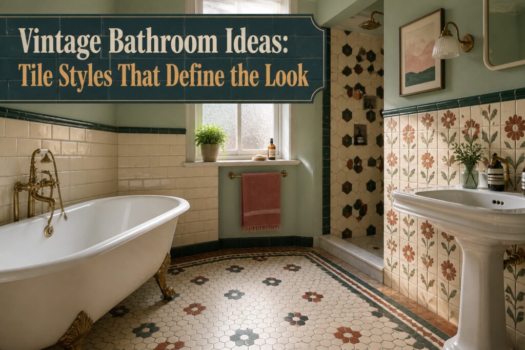
Vintage bathroom ideas range from weekend paint projects to full tile renovations that demand annual maintenance, and the deciding factor is not budget but how much upkeep you will actually follow through on. A cement tile floor needs resealing every year, without exception, or it records every spill like a diary; a checkerboard in epoxy paint takes an afternoon but starts peeling the moment you rush the dry time. The same 4-inch ceramic subway tile ships in different boxes at different prices, and the vintage effect lives entirely in the grout width you pair it with.
1. Checkerboard Floors
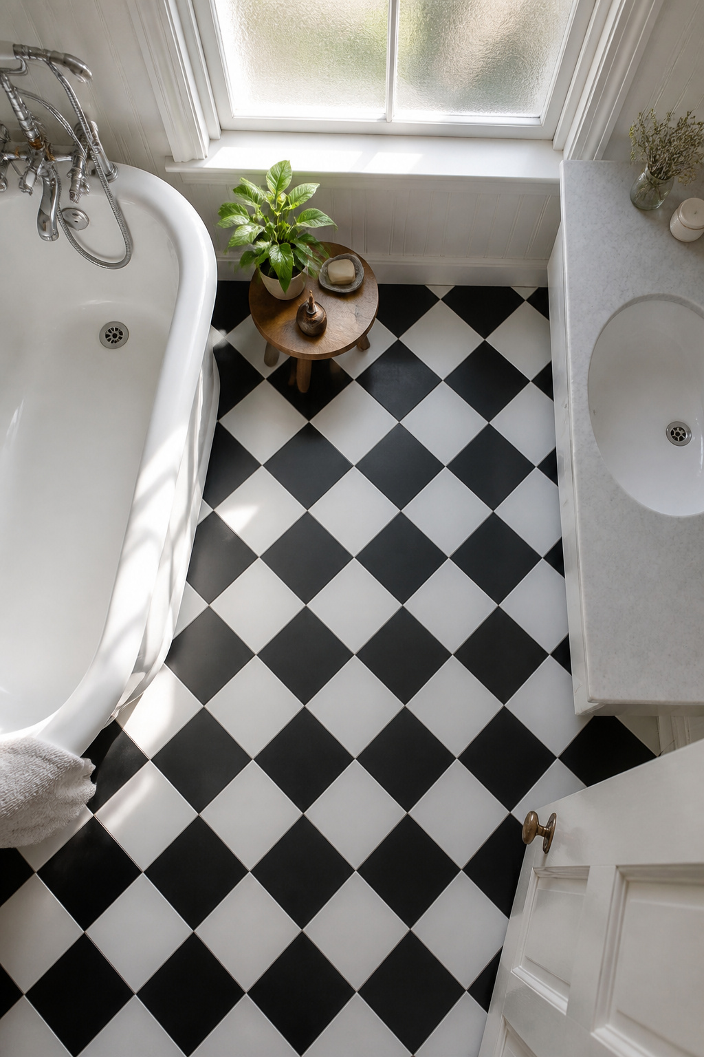
A black and white checkerboard floor brings instant 1920s and 1950s character without requiring a single period fixture. The high-contrast squares read as clean geometry from a distance and retro pattern up close, which is why they pair as naturally with a clawfoot tub as they do with a basic vanity you already own.
In a small bathroom, the pattern can feel busy fast. Keep the scale large, four inches or bigger per square, so the eye registers the rhythm without counting every tile. In a larger space, smaller squares hold their own and the repetition starts to feel like architecture rather than decoration.
Real ceramic or stone checkerboard runs into the thousands once you factor labor and a cement backer board. For a weekend budget, two paths work. Self-adhesive vinyl tile in black and white goes down in an afternoon with a utility knife and a straightedge; expect to replace it in five to seven years in a wet bathroom, but it costs a fraction of the real thing. If your existing floor is sound tile or sealed concrete, epoxy paint designed for floors lets you tape off the grid and roll it yourself. Follow the ventilation instructions exactly; the fumes are no joke, and cutting corners on dry time is where the peeling starts.
2. Pastel Tile
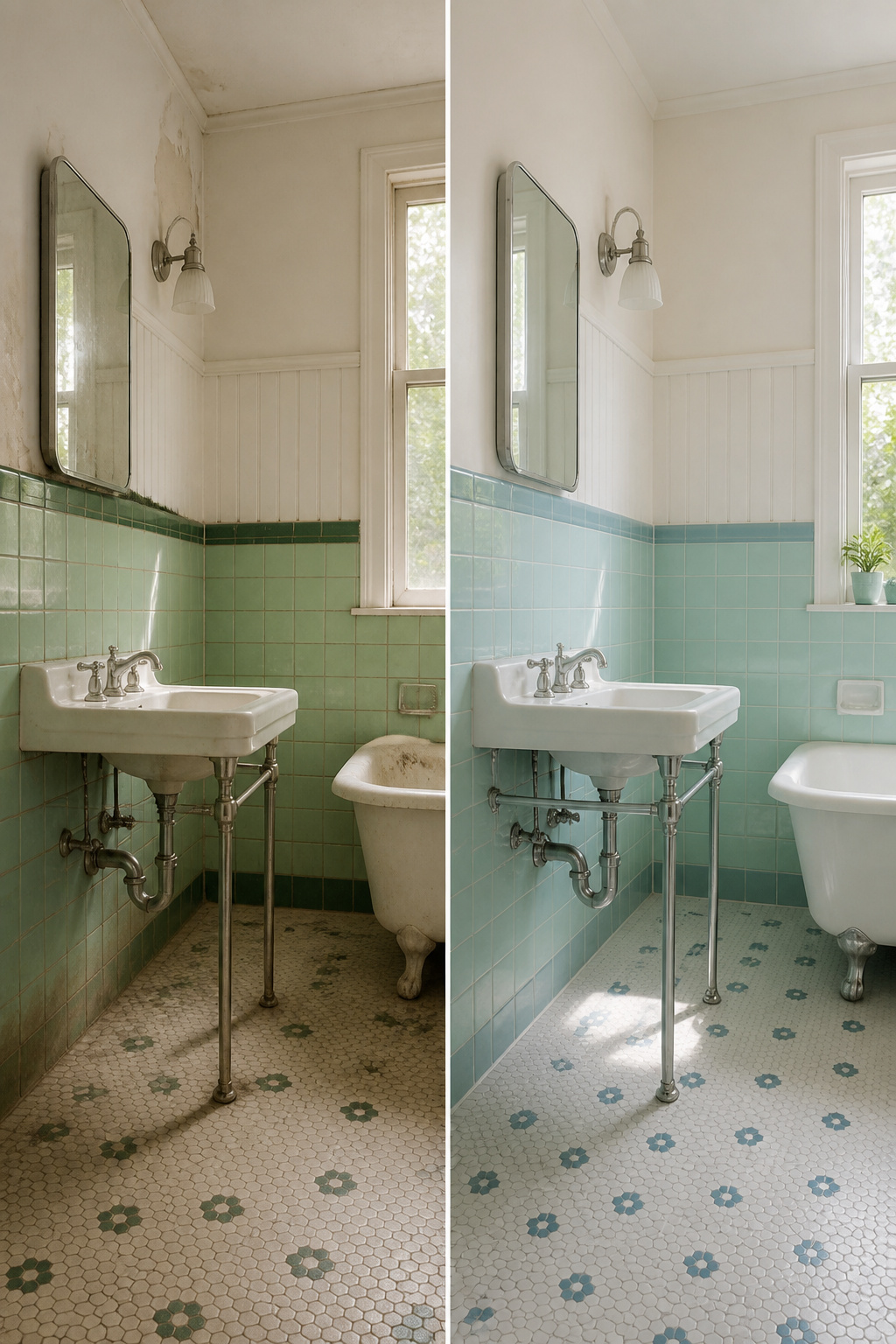
Mint green, baby pink, powder blue, and soft yellow tiles will read 1950s diner fast if you let them spread everywhere. Use them in a single zone, like a shower surround or wainscoting to chair-rail height, and keep the rest white or black. Chrome fixtures help too; they add period flavor without more color.
A friend of a friend tiled her whole four-by-six bathroom in powder blue, floor to ceiling, with matching grout. It felt like a restroom in a seaside restaurant. She fixed it by painting the upper walls white and swapping the blue floor for black penny rounds. The blue stayed on the lower third only, and suddenly it looked intentional.
Cement tile and zellige both carry these pastels well because the colors stay soft, not plastic-bright. Pair either with white trim and a retro-style sink, and you get the vintage mood without the gimmick.
3. Hexagon Tile
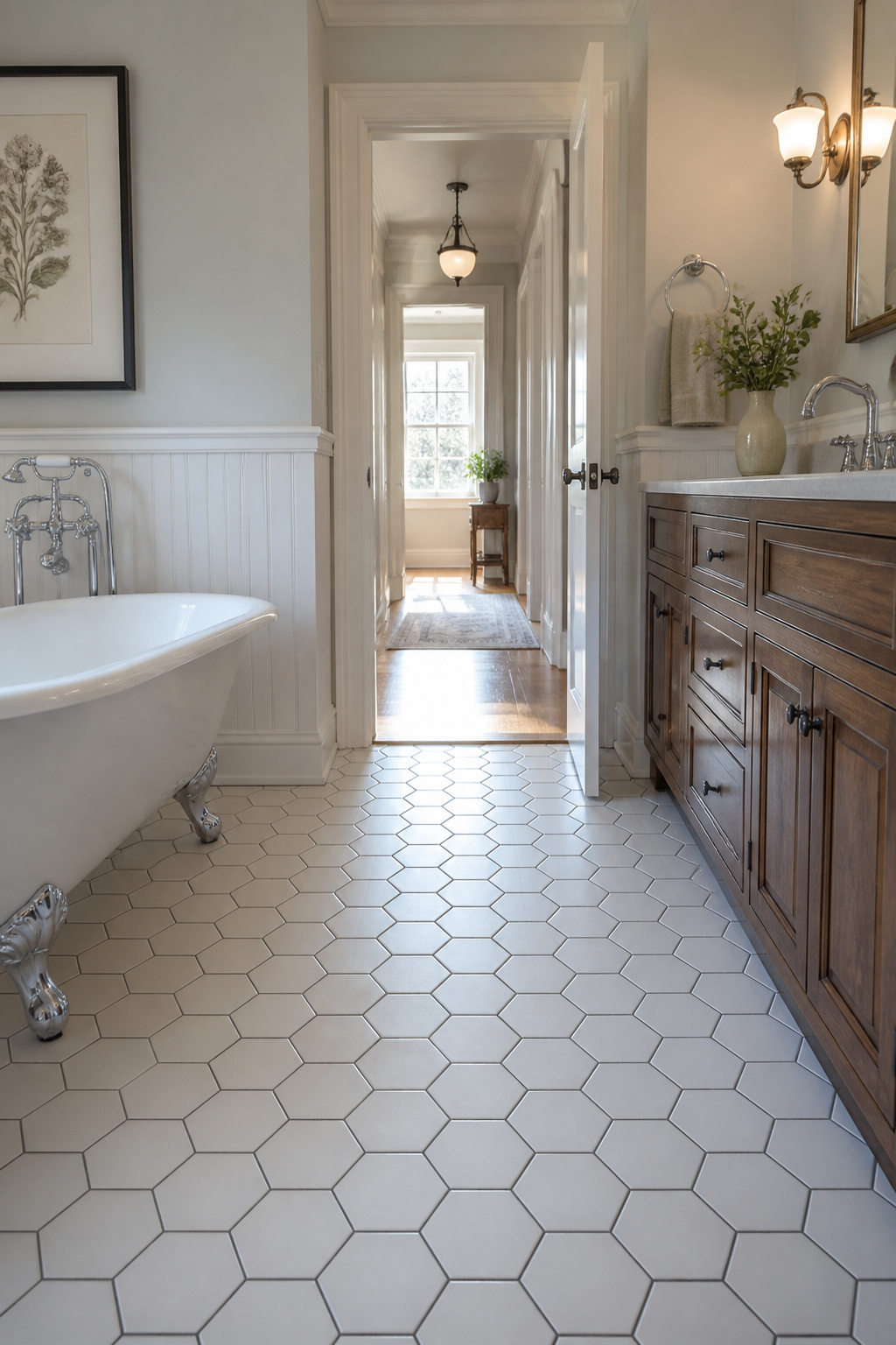
Hexagon tiles showed up in early 20th-century homes and never really left, which is the first sign they are worth considering for a vintage bathroom that needs to survive actual use. You will find them now in sizes from tiny penny-scale mosaics up to 8-inch formats like the Swiss Cross cement tile, and that choice of scale changes the room more than people expect. Small hexagons read busier and more period-specific; large ones feel calmer and work better in tight spaces where you do not want the floor to dominate.
The real mistake with hexagons is ordering the wrong grout color. A light tile with matching light grout dissolves into a soft field, which is what most historical installations aimed for. Dark grout against a light hexagon, like the Studio McGee bathroom with dark-grouted white tile, turns every individual tile into a graphic star. That can be intentional, but if you ordered it by accident because the sample looked different under warehouse lighting, you now live with a floor that feels like a chessboard. Order a physical sample of tile and grout together, then look at them on your actual floor in morning and evening light. Cement, marble, zellige, travertine, and terracotta all come in hexagon formats now, so the material choice is wide, but the grout decision is what makes or breaks the vintage effect.
4. Subway Tile
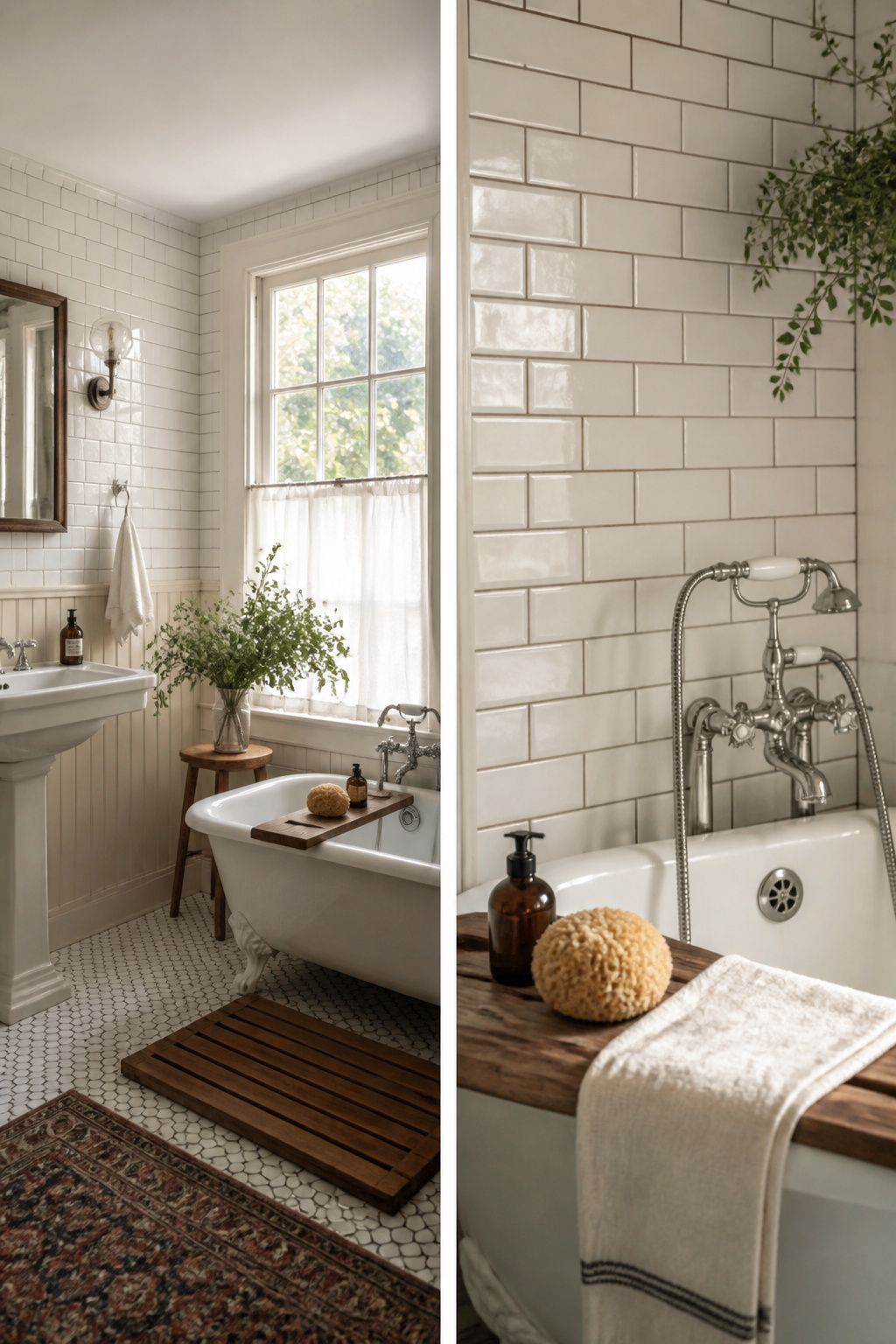
White ceramic subway tiles have been around since the early 1900s, and they still read as vintage because the actual product barely changed. The rectangular, brick-like shape is what you want; the rest is decided by pattern and grout.
The running bond layout, with each row offset by half a tile, feels older and more lived-in. A stacked grid, with edges aligned, looks cleaner and more current even when the tile itself is identical. Grout width pushes the date further. Narrow grout lines read as something installed in the last decade. Wider grout, closer to the original spacing, tilts the same white ceramic toward the early 20th century look you are after.
Here is what convinced me, reading through enough product pages: the subway tile at a big-box store and the specialty version at twice the price often come out of the same production run. The dimensions match, the glaze matches, the difference is the box it ships in. If your budget is a few hundred dollars and a weekend, the cheap one is the right call. Spend the savings on wider grout joints and a running bond pattern; that is where the vintage effect actually lives.
5. Penny Rounds
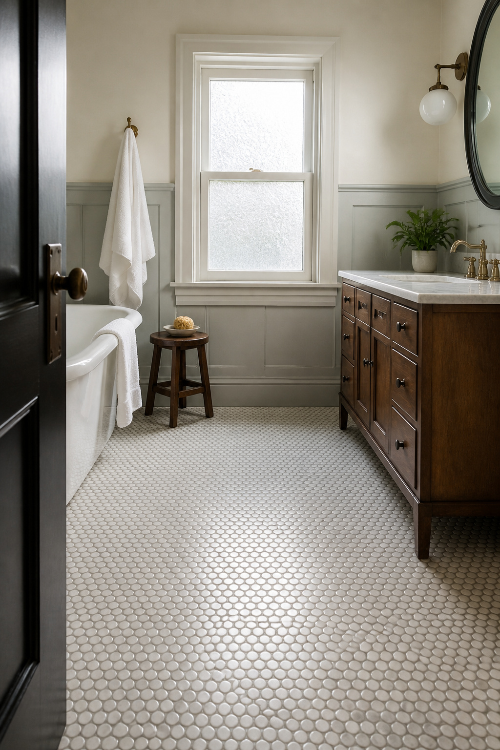
Penny rounds were the standard in early 20th-century bathrooms because their small size let installers curve them around fixtures and pitch floors for drainage without cutting. The finished surface is durable and the texture gives solid footing, which is why you still see originals holding up in old houses.
The catch is the grout. Hundreds of tiny circles means hundreds of tiny grout lines, and that network collects soap film and mildew faster than any larger format. Cleaning between those circles will become a regular chore, not an occasional wipe-down.
If you want the look without the maintenance commitment, penny-look mosaic sheets are the practical alternative. These use larger individual pieces or printed patterns that read as penny rounds from a few feet back, with far fewer actual grout joints to maintain. You get the soft, textured appearance and the vintage reference, but your weekend cleaning time shrinks to match the weekend timeline most of these projects run on.
6. Art Deco Pattern

Art Deco tile brings the geometry and polish of the 1920s and 1930s into a bathroom, but the full treatment reads like a film set rather than a room you actually use. The fan motifs, metallic accents, and high-contrast symmetry work best as a contained accent. A single feature wall behind a clawfoot tub, a shower niche, or a powder room floor gives you the glamour without the museum effect.
Black and gold, emerald and black, or navy and cream carry the look. Pairing two saturated colors of equal weight, like emerald against navy, tends to fight for attention and flatten the pattern. One color needs to dominate, the other to outline.
Cement tiles in hex formats or gold zellige tiles suit this style well. If you are renting or working on a weekend timeline, peel-and-stick decals in fan or chevron patterns over existing subway tile can test the idea before you commit to mortar and grout.
7. Cement Tile

Bold patterned cement tiles carry the Moroccan and early-20th-century look better than almost anything else in a vintage bathroom. The patterns are crisp, the colors stay muted in the right way, and the surface wears to a softer finish over years of use. What you do not see in the showroom is the sealing schedule, and that gap costs people their floors.
Seal cement tile before installation, after grouting, and then once every year. The first seal happens while the tiles are still dry and unlaid; the second waits until grout has fully cured and the haze is off. Skip either one and the tile drinks up everything that hits it. In a bathroom that means hair dye, mouthwash, the citrus cleaner you grabbed for the mirror, the mineral oil from a soap dish, the iron in hard water. Each leaves a mark that sits right at the surface because cement is porous in a way glazed ceramic simply is not.
Annual resealing sounds like a lot until you map it to a Saturday morning. Strip the bath mats, sweep, wash with the mildest cleaner the sealer manufacturer allows, let it dry, brush or roll on the sealer, wait the listed cure time before walking on it. Two hours of work, once a year, against a floor that otherwise becomes a record of every product you ever spilled. The tradeoff is real: these tiles give you pattern no machine-printed porcelain can match, but they ask for attention in return. If you will not calendar that resealing, buy the porcelain imitation and call the look close enough.
8. Terracotta
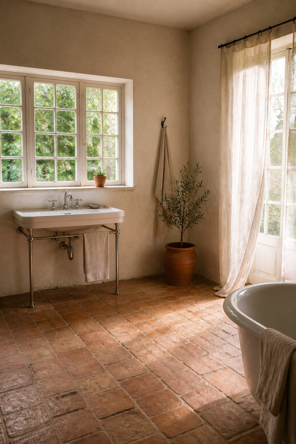
Terracotta tiles bring a warm, rustic vintage look with that Mediterranean or southwestern feel people picture for a 1920s desert bungalow or a sun-washed Greek revival. The clay-based, earthy tones gain character as they age, which is part of the appeal. They work best paired with wood, stone, or metal rather than slick modern fixtures.
The problem is porosity. Even sealed terracotta darkens where water sits, and in a bathroom that means anywhere near the shower base, the tub rim, or a sink splash zone. You will see the color shift within weeks, not years. The sealant buys you time; it does not buy you immunity.
That leaves one corner where terracotta makes sense: the dry zone. Use it on the floor of a powder room, or on a wall opposite the shower where the only moisture is ambient humidity. Keep it out of the wet footprint entirely. If your bathroom is small enough that everywhere gets damp, terracotta is the wrong vintage choice; look to cement tile or sealed subway instead.
9. Brick Tile
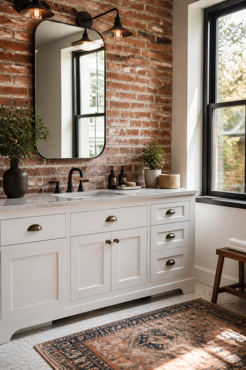
A full brick wall in a bathroom is a structural warning sign you do not need. Thin brick veneer, glued in place on a single accent wall, gives the same weight and texture without asking your floor joists to cooperate. You will find it in shades of red, gray, and white, and the color you pick matters less than the grout you pair it with. A warm, sandy grout reads vintage; crisp white or near-black grout pushes the same tile toward a loft look that is more industrial than retro. Matte black fixtures and reclaimed wood accents finish the vintage side without extra cost. The whole install is a weekend project, and if your lease does not allow it, the veneer peels back off with a heat gun and some patience. Industrial lighting overhead seals the deal; skip it and the wall can feel like a stage set rather than a room with history.
10. Zellige

Moroccan Zellige tiles arrive hand-cut and glazed one by one, which means no two pieces match. That variation is the entire point: light hits each face differently, so a wall of them reads as depth and movement rather than a flat factory finish. The tradeoff is the install. You are setting uneven edges and thicknesses, so lippage is unavoidable unless your tiler budgets extra time to sort and shim. Most people reserve Zellige for a small area where the labor cost stays manageable: a vanity backsplash, a shower niche, or one feature wall. Clé sells them in sizes like 4-by-4 and 2-by-6, and the glaze range runs from cindered olive to indian saffron. Pair them with brass fixtures and wood or stone that can handle the warmth. Budget for the tile and the tiler both, or the irregularity you paid for becomes the flaw you stare at every morning.
Color Schemes by Era

Victorian bathrooms leaned on earth tones and deep reds, heavy colors that matched the era’s woodwork and brass fixtures. Edwardian tastes shifted to soft greens and creams, a lighter palette that still reads as formal. The 1920s brought black and cream with metallics, sharp contrasts that suited the machine-age glamour of the time. By the 1950s, pastels took over: mint green, baby pink, powder blue, and soft yellow paired with chrome details and white or black accents. Early modern bathrooms pushed into brights, saturated colors that signaled a break from everything before them.
The mistake that wastes the budget is mixing two eras in one room. A clawfoot tub with 1950s pastel tile and Art Deco fixtures collapses into visual noise, and no single piece reads as intentional. You do not need every vintage element you love in the same space. Pick one era, match the paint, tile, and metal finishes to that period’s palette, and let the cohesion do the work. If you own a 1920s black-and-cream floor already, commit to the metallics and skip the mint green paint. One consistent story reads as design; two reads as a yard sale.
Pattern Scale in Small Spaces
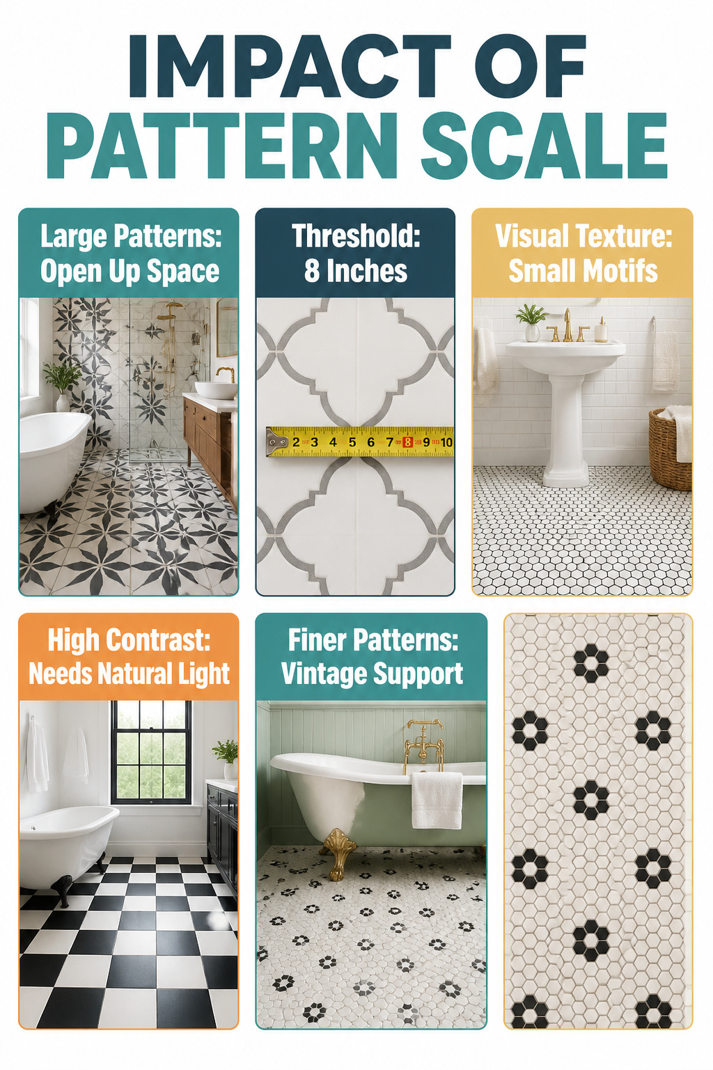
Large patterns open up a small bathroom because they create fewer visual breaks across the floor and walls. Your eye reads the pattern as a single field rather than a repeating grid of interruptions, which makes the perimeter of the room feel farther away. The threshold sits around eight inches: motifs smaller than that tend to read as texture in a compact space, while anything larger starts to feel like a statement that needs room to breathe.
In a bigger bathroom, the same large pattern can flatten out and lose its presence. That is where smaller motifs, penny rounds or compact hex shapes, earn their place. They add texture and period detail without demanding to be the single focal point.
If you are working with a high-contrast design like checkerboard, the room needs enough natural light and simplicity elsewhere to carry it. Without that, the bold layout becomes visual noise instead of a floor you meant to feature. Finer patterns are the safer bet when you want the tile to support vintage fixtures or a painted clawfoot rather than compete with them.
Vintage Vanities from Real Furniture

The best vintage bathroom ideas sometimes start in the dining room, not the bathroom section. A solid wood dresser with the right proportions can become a vanity that no big-box cabinet matches for character, but most antique pieces will not survive the conversion. Depth is the filter that eliminates ninety percent of candidates. A standard bathroom sink plus plumbing needs roughly twenty-one inches of depth front to back, and many beautiful old dressers stop at eighteen. Measure before you fall in love.
If the piece clears that hurdle, you cut the top drawer to make room for the P-trap and supply lines. The remaining drawer fronts stay intact and become fixed panels; only the bottom drawer, if there is one, keeps working storage. For moisture protection, skip the romantic notions about aging gracefully. Marine-grade polyurethane on every surface that faces steam, including the underside and the back, is what keeps the wood from swelling and the joints from failing. Two thin coats beat one thick one that pools in corners.
Renters, take note: this is a project for a landlord who trusts you, because the plumbing moves once and you will not be reversing it Saturday night. First-home owners working with a real plumber should have the dresser on site before the rough-in, not after, so the drain height lands where the drawer cutout actually is. The mismatch there is a Monday you do not want.
Frequently Asked Questions
What are some vintage bathroom tile ideas?
Checkerboard, hexagon, subway, and penny round tiles all define the vintage look. Checkerboard floors in black and white bring instant 1920s and 1950s character, while hexagon tiles carry early 20th-century roots and remain practical for modern use. Subway tiles in a running bond layout with wider grout joints read as older and more authentic, and penny rounds add soft texture that curves easily around fixtures.
How can I create a vintage bathroom look?
Pick one era and match paint, tile, and metal finishes to that period’s palette rather than mixing decades. Victorian bathrooms leaned on earth tones and deep reds, Edwardian spaces used soft greens and creams, the 1920s favored black and cream with metallics, and the 1950s went for pastels with chrome. A clawfoot tub with 1950s pastel tile and Art Deco fixtures collapses into visual noise; one consistent story reads as design, two reads as a yard sale.
What color schemes work for a vintage bathroom?
Popular vintage palettes include black and white checkerboard, soft 1950s pastels like mint green and powder blue, and earthy 1920s tones such as black and cream with metallic accents. Victorian bathrooms used deep reds and earth tones, while early modern spaces pushed into saturated brights. The key is keeping one era’s palette intact: pair pastels with chrome and white or black accents, or commit to 1920s black-and-cream floors with metallics throughout.