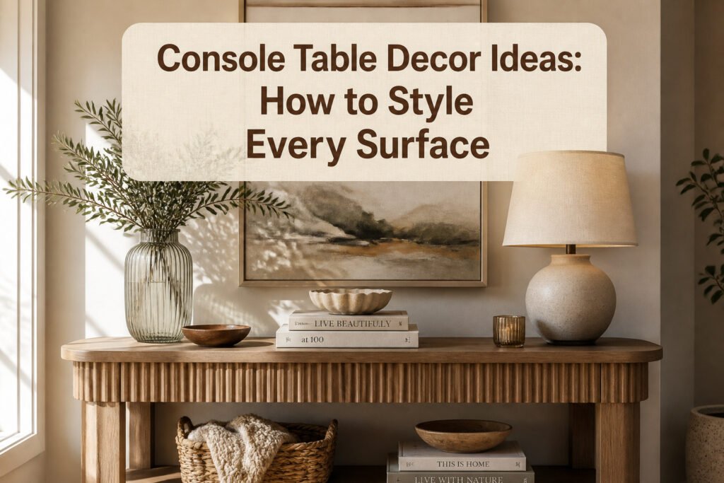
A console table can run from a $25 ribbed glass vase to a full mirror-and-lamp setup, and the single thing that decides which approach is yours is the wall space above it. No art hung wide enough, and even expensive pieces read as clutter; get the width to two-thirds the table’s span, and a single anchor organizes everything else for free. The trick most people miss is starting with that vertical piece before touching the surface at all.
1. Establish Your Visual Anchor
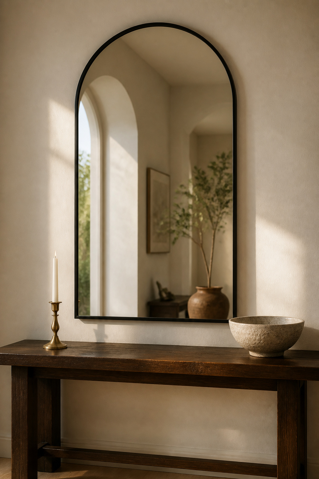
Start with one piece that owns the wall. An oversized arched mirror or a single extra-large textured canvas gives your eye somewhere to land before it reads everything else on the console. Without that anchor, a collection of small frames and candlesticks just reads as clutter.
Art hung above a console should run between two-thirds and three-quarters the width of the table below it. Much narrower and the piece floats; much wider and it swallows the furniture. If you have a long console and one piece won’t cover that span, layer two or three smaller mirrors instead. The overlap catches light at different angles and builds a depth a single flat surface can’t match.
For a cleaner look, a thin-framed black mirror keeps things minimal. If you lean warmer, a heavy weathered wood frame hits that "organic modern" note US designers are favoring right now. Either way, the anchor sets the scale. Everything else arranges itself around it.
2. Master the High-Low Layering
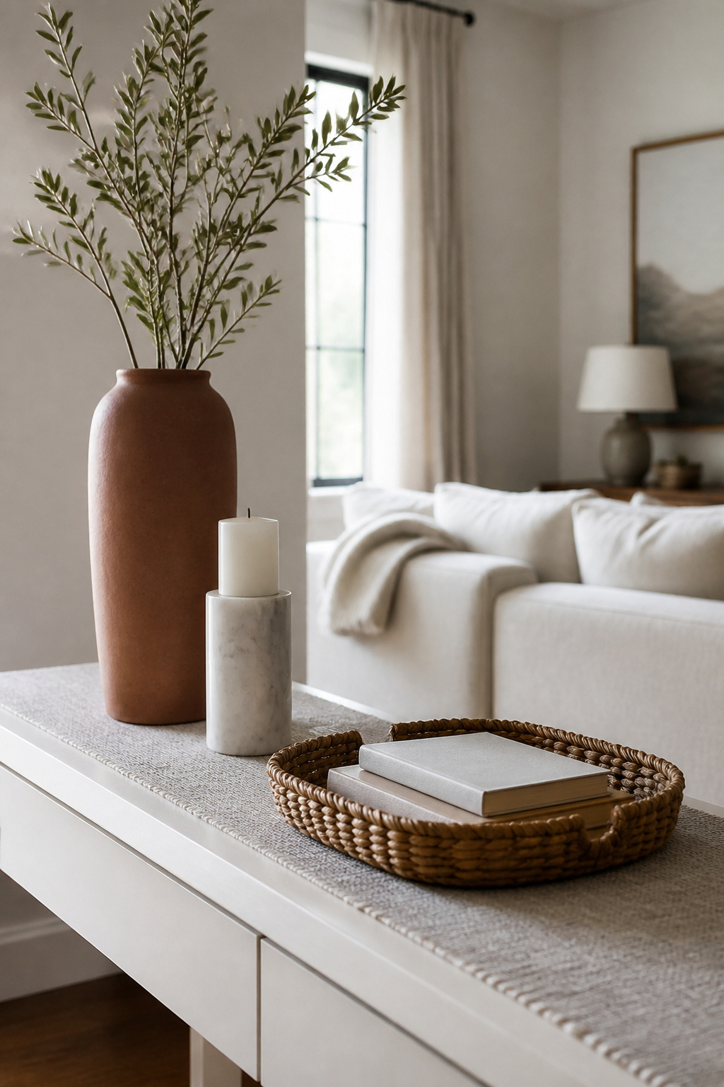
A flat line of matching heights reads like a store display, not a home. What fixes it is the Triangle Rule: arrange your tallest, medium, and shortest pieces so an invisible triangle forms between their peaks, pulling the eye across the whole surface.
Start with height. A tapered ceramic vase gives you the high point. Drop the medium piece beside it, maybe a marble candle holder. The low piece, a sculptural bowl or a short stack of books, anchors the near corner. The three peaks sketch a triangle, and the arrangement stops feeling staged.
Books are the practical tool here. Two stacked under a candle holder lift it to a better height, or use them raw as the low layer themselves. Keep the spines in similar shades if you want cohesion, or wrap a few in simple fabric covers for color without buying new objects. No sewing needed, just fold and tuck.
The rhythm matters more than the objects. Tall left, medium right, low center works. So does tall center, low flanking. What breaks the rule is lining up tops. When every item hits the same level, the eye rests nowhere and moves on.
3. Incorporate Lighting
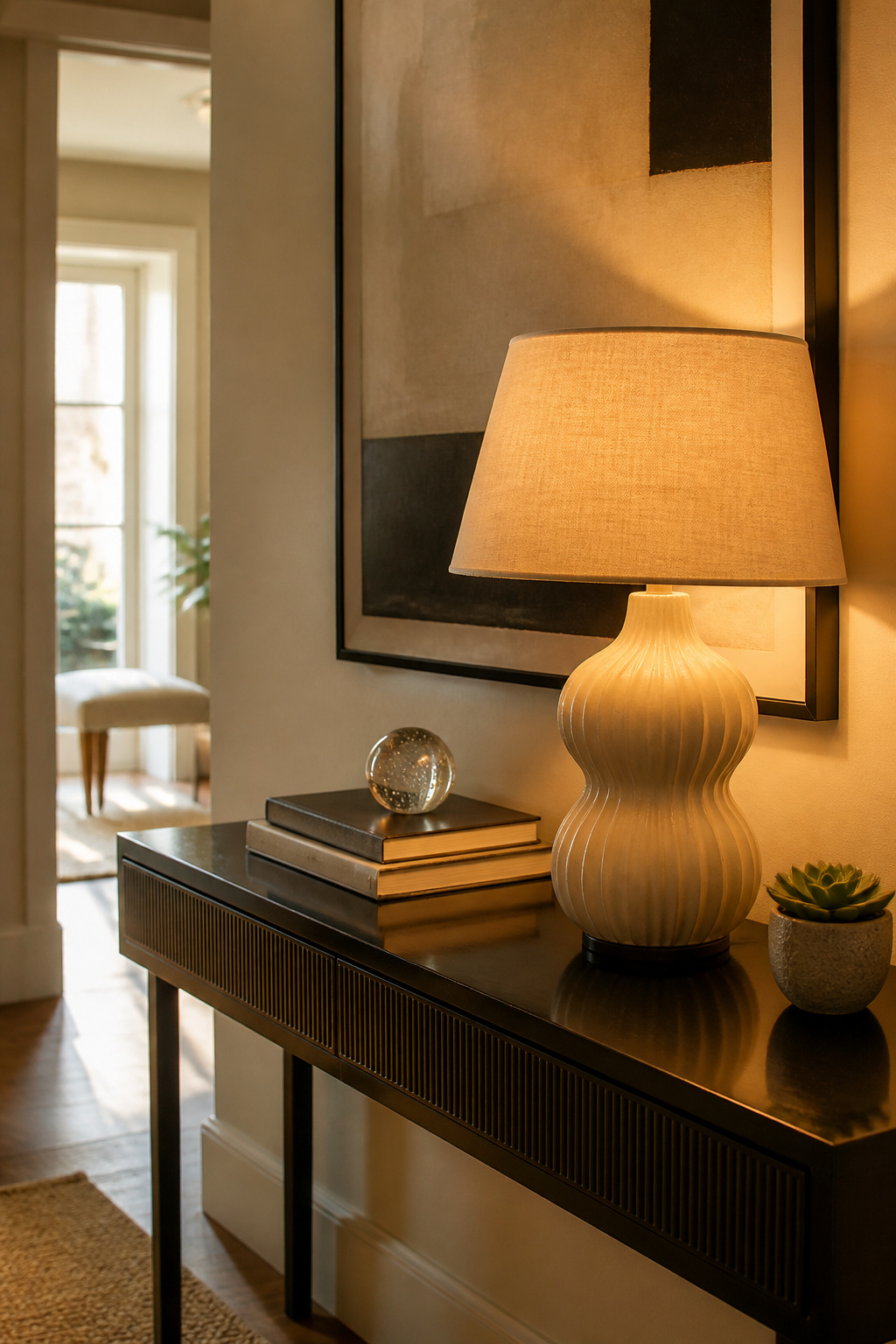
A console table lamp is not a reading lamp, and buying one as if it were is the easiest way to hate it later. You want a soft, diffused glow that pools on the wall behind it, not a cone of light you could work under. Dimmable bulbs fix this, letting you drop the brightness until the lamp becomes atmosphere instead of task lighting.
Height matters more than style. The shade should sit roughly at eye level when you are standing, which for most console tables means a lamp between 26 and 32 inches tall. Much shorter and it disappears behind your objects; much taller and the bulb shows bare from across the room. If you are working with a shallow table, under 12 inches deep, test the base footprint in the store or check the dimensions twice online. A heavy marble base that looks compact in the photo can overhang by two inches and catch a hip every time you pass.
Cords on a shallow table are a visible problem. Run the cord behind the table leg straight down to the floor, then along the baseboard to the outlet. A cord cover painted to match the wall costs a few dollars and takes ten minutes to install. Wall sconces skip the cord entirely and frame a mirror or art piece symmetrically, though they need an electrician or a battery-operated unit with its own compromises on brightness. Two sconces flanking a mirror give you that hotel lobby balance without sacrificing the table surface to lamps at all.
4. Introduce Tactile Textures
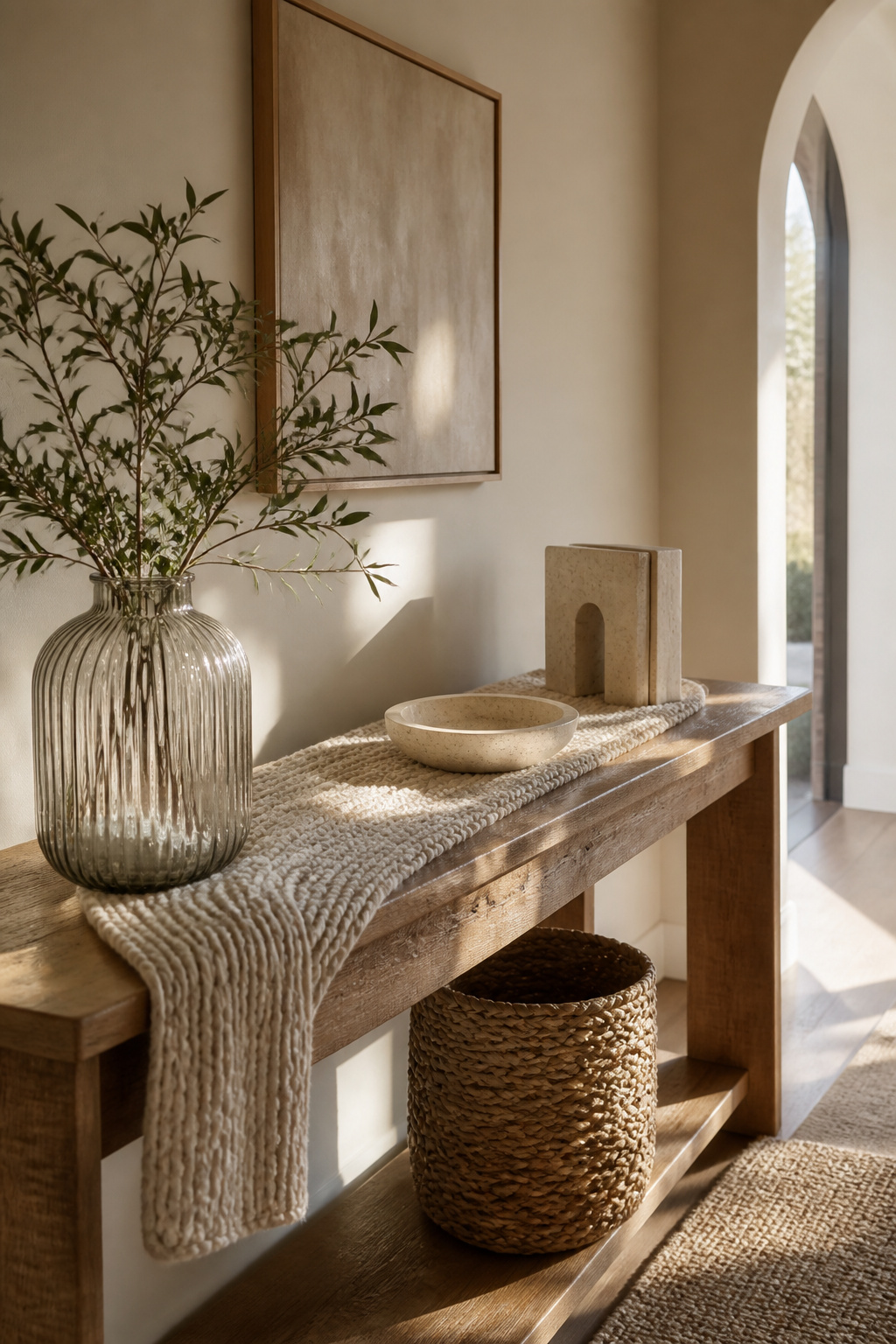
Ribbed glass catches light in a way flat glass never does, and it costs about the same. A ribbed glass vase or tray from Target or IKEA, usually under $25, gives the surface something your eye wants to touch without adding clutter. Pair it with travertine stone, which you can find as bookends or small coasters at HomeGoods or similar stores for roughly $15–30, and you have two textures that talk to each other without shouting.
The mistake is putting too many tactile pieces in one spot. Limit yourself to two distinct textures on the surface, then let negative space do the rest. A chunky knit runner, maybe $20–40 from a place like H&M Home or a craft fair, works best as the single soft layer against harder materials. If the table already has a wood grain or metal frame, that counts as your third texture; skip the runner and use a smaller woven element instead, like a seagrass basket tucked underneath for storage.
Weight matters here. A heavy travertine piece anchors one end; a ribbed glass object at the other keeps the eye moving. The knit or woven item bridges them. If everything is the same visual weight, the surface flattens into noise. If one texture dominates, the table reads as a theme party. You are aiming for a conversation, not a speech.
5. The Talk of the Town Centerpiece
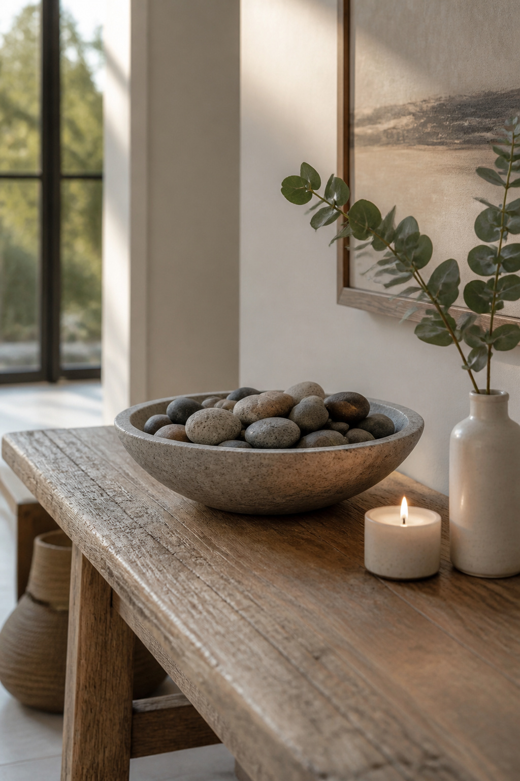
A single bold piece on a console table draws the eye faster than a cluster of small items fighting for space. One strong centerpiece beats five little ones every time. A wide, shallow bowl filled with polished river stones or dark moss spheres can anchor the whole surface without asking for much else.
Scale matters more than people expect. A large bowl on a narrow table will shove everything else to the edges and make the whole arrangement feel crowded. A tiny cloche on a long table looks like a lost toy. The piece should sit comfortably inside the table’s footprint, leaving breathing room on both sides.
The cloche route works if you want something more atmospheric. Vintage brass bells under glass, or a single high-end candle with a "firewood" scent, adds a sensory layer that hits when someone walks through the door. The glass keeps it from feeling like clutter.
That is the line to watch. A burl wood tray with matches and crystals inside stays intentional because the tray corrals it. Loose crystals and a candle and a bowl and a stack of books stops reading as styled and starts reading as whatever was left on the way out the door. When you cannot name the single purpose of the grouping, it has become clutter.
6. Bring the Outdoors In
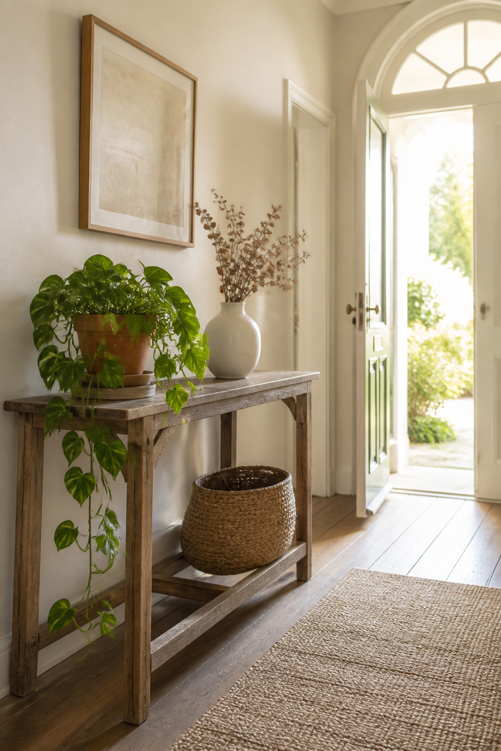
A trailing pothos or snake plant can soften the hard lines of a console table without asking for much light, which matters when your table sits in a hallway far from windows. A saucer or felt pad under the pot saves the finish from water rings; skip this and you will lift the planter to find a pale circle that does not wipe off. For anyone who travels or simply forgets, dried eucalyptus or magnolia branches give the same organic shape with no drainage to manage. Rotate in fresh stems when you remember, and the dried ones wait without drama. Slow-growth plants, the kind that stay structured even as they wither, bridge the gap if you want living material but not a weekly chore. A distressed terracotta planter and a worn wood coaster underneath hit a balance between gallery display and the mess of real use.
7. Symmetry vs. Balanced Asymmetry
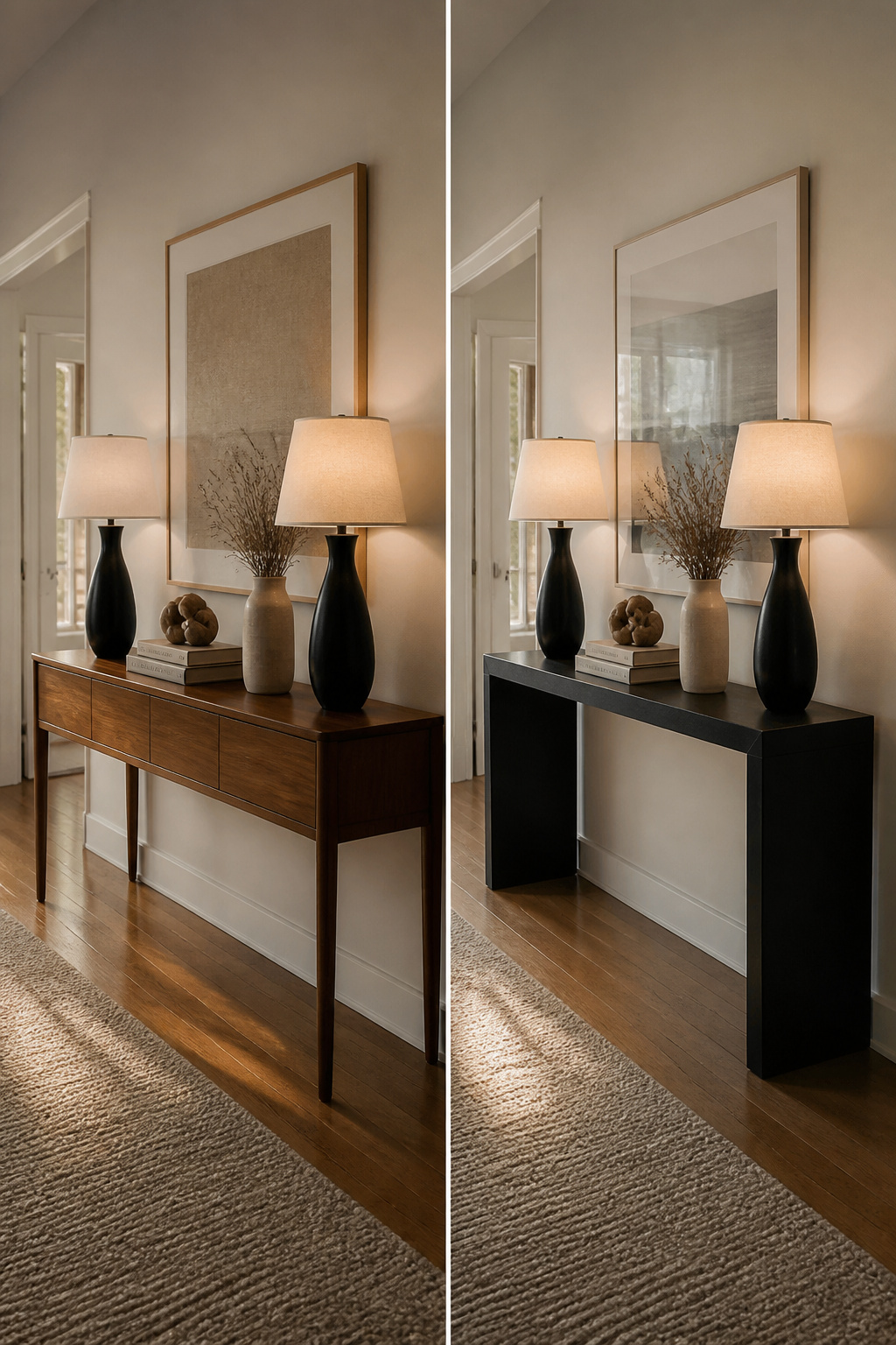
Arranging items on a console table starts with a decision: do you want the space to feel settled or to keep the eye moving. A symmetrical layout, with matching lamps flanking each end, reads as intentional and calm, the kind of look that works when your table sits in a narrow entryway where you want the room to feel wider than it is. Two identical table lamps on either side will ground the whole arrangement and give you even light.
Balanced asymmetry is the move when you want something less formal but not messy. The trick is weight, not mirroring. A heavy lamp on the left asks for something with equal visual mass on the right: a stack of thick books topped by a small sculptural object, a tall vase with branches, anything that draws the eye upward and holds its own. The common mistake is stopping too soon. One heavy piece alone looks like you set it down and forgot the rest. You need the counterweight, and you need the heights to relate. A single sculptural lamp can carry one side if it is interesting enough to deserve the stage, but then the other side needs at least two elements layered to build comparable presence.
If your table is against a wall with art above it, asymmetry usually wins because the artwork already breaks any possible mirror effect. In a wide hallway with nothing overhead, symmetry tends to feel more welcoming.
8. The Power of Negative Space
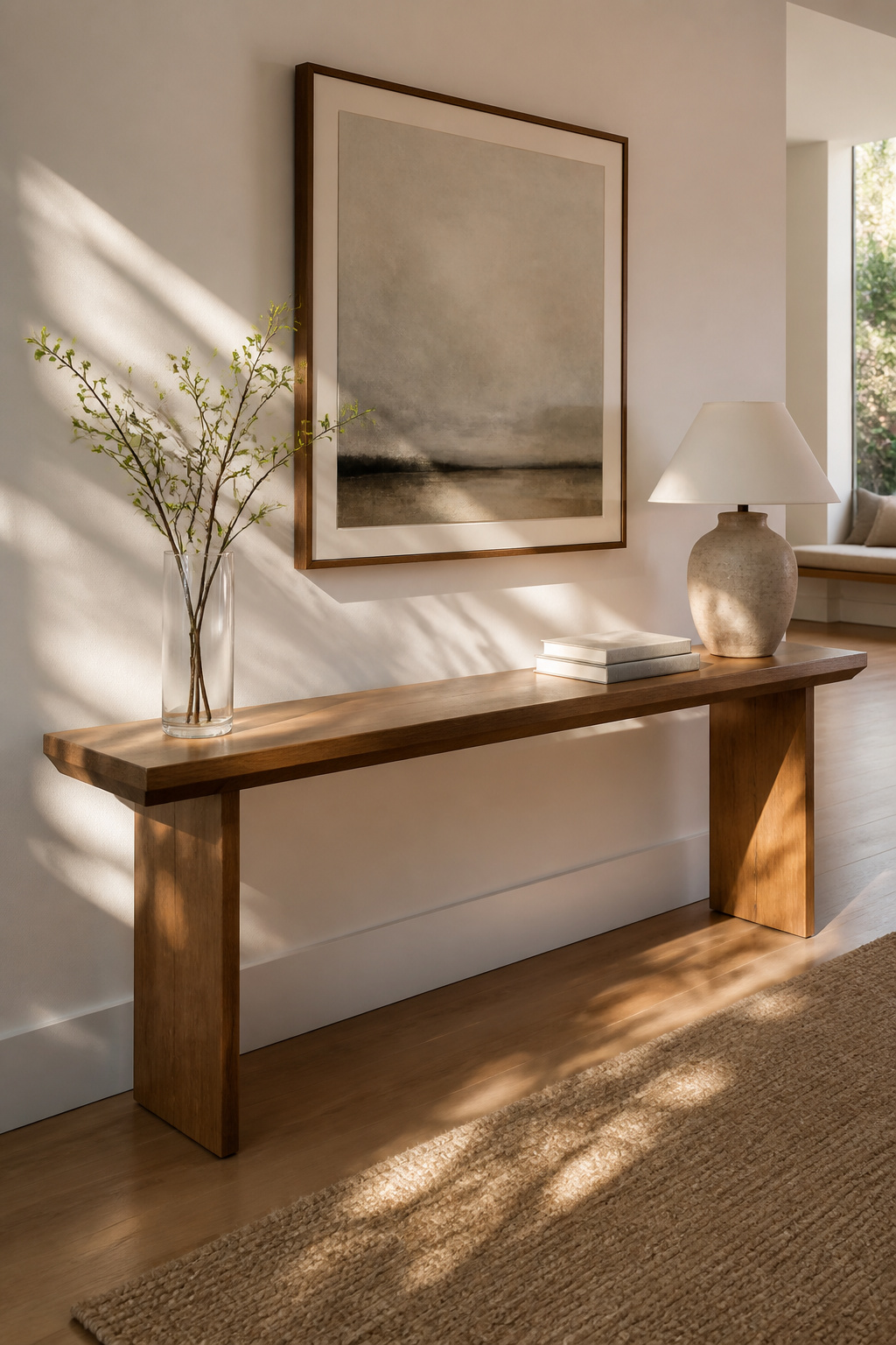
A console table is already narrow. Crowd it, and the whole hallway starts to feel like a storage aisle. Negative space is the untouched tabletop between your objects, and on a surface this slim, you need more of it than you think. Aim for the empty stretch to equal at least one grouping in width; if your lamp and books take ten inches, leave another ten clear.
The mistake is always the same: you add one more piece, and instead of finished, the table looks cluttered. A glass or acrylic top can help the eye travel past the surface itself, but it will not save you from too many objects sitting on it. Edit like the table is a gallery, not a shelf. The last thing you place is usually the thing that ruins it.
9. Choosing Decor That Fits Your Table’s DNA
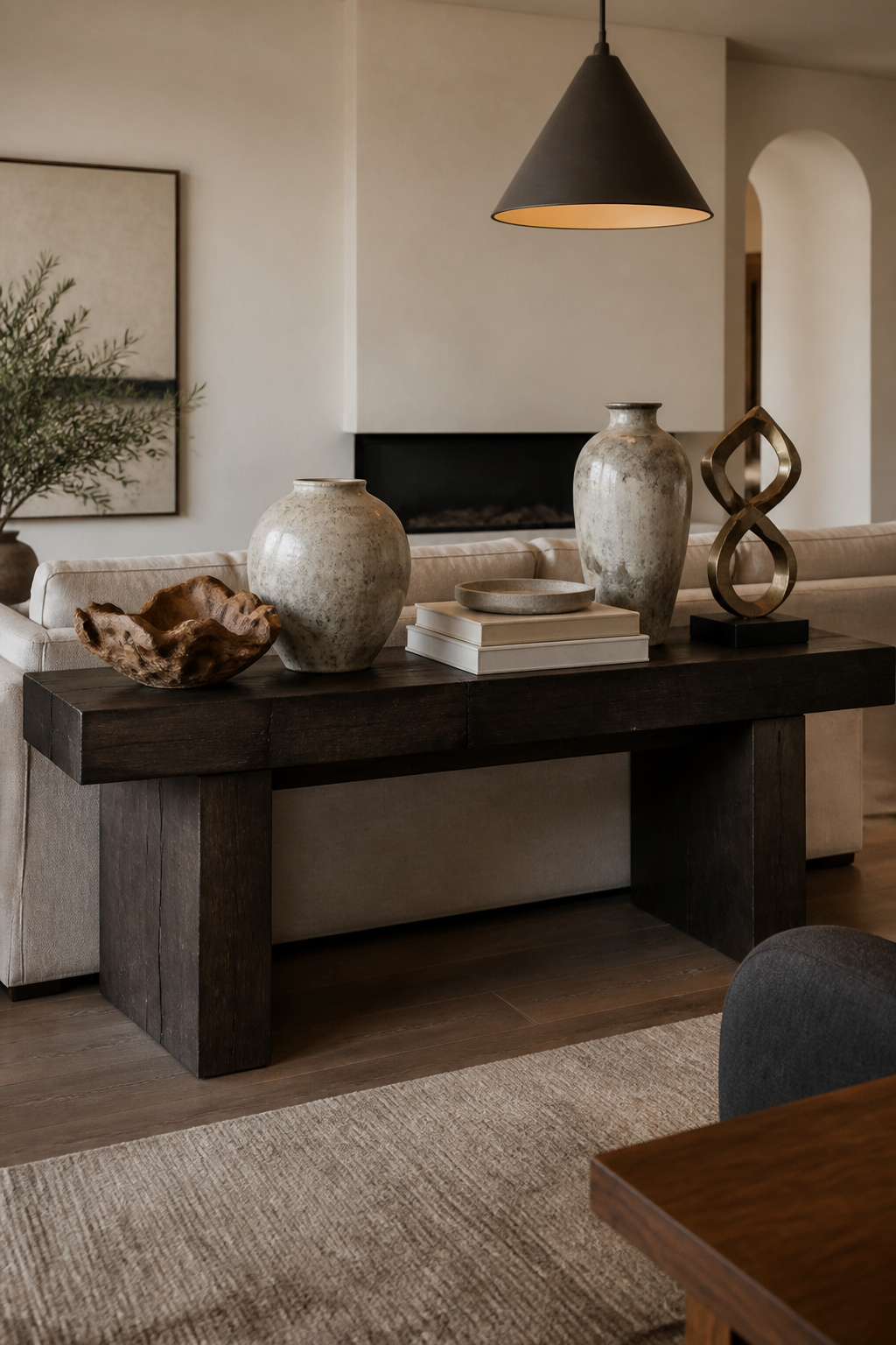
Heavy, dark wood or rustic trestle tables carry enough visual weight that lightweight decor gets swallowed whole. Pair them with chunky stoneware, thick coffee table books, and oversized iron lanterns so the top layer holds its own against the base. A glass or acrylic "ghost" console works the opposite way: heavy objects read clunky and kill the floating effect. Stick to delicate crystal vases, thin metallic trays, and minimalist line art that keeps the airy silhouette intact.
Modern metal-and-glass consoles with clean lines call for sculptural objects or a statement lamp rather than fussy arrangements. Bold artwork hung above extends the same vertical confidence.
Ignore the material rules entirely when you want deliberate contrast, like parking a rough reclaimed-wood bowl on a polished steel frame to keep the table from feeling like showroom furniture. The tension reads as lived-in, not mismatched, when one piece is clearly the rebel.
10. Playing with Color and Contrast
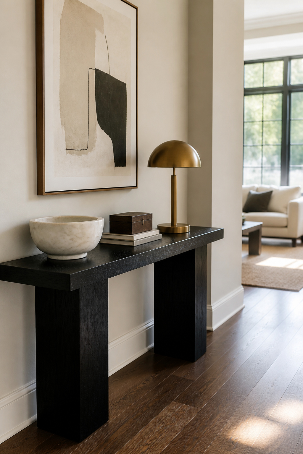
Color works best on a console table when you treat the surface itself as one voice in a small chorus, not as a blank stage for every bright object you own. Stick to two or three colors total, counting the table’s own tone as the first. A black console already owns that slot, so your decor should pull from the remaining two: white marble, cream ceramic, or brushed gold will read as deliberate against that darkness instead of disappearing into it. Light oak or bleached wood calls for a different restraint. Layer beiges, tans, and sage greens for the second color, then add one matte black lamp as your third. Without that single dark anchor, the whole arrangement washes out into something you stop seeing.
The mistake is giving every piece equal volume. When the lamp, the bowl, the books, and the frame all demand attention, none of them get it. The eye skates across and moves on. A working combination: black metal frame, one cream ceramic vessel, one warm wood object. The metal provides the structure, the cream catches light, the wood keeps it from feeling cold. Three colors, one job each.
Function First
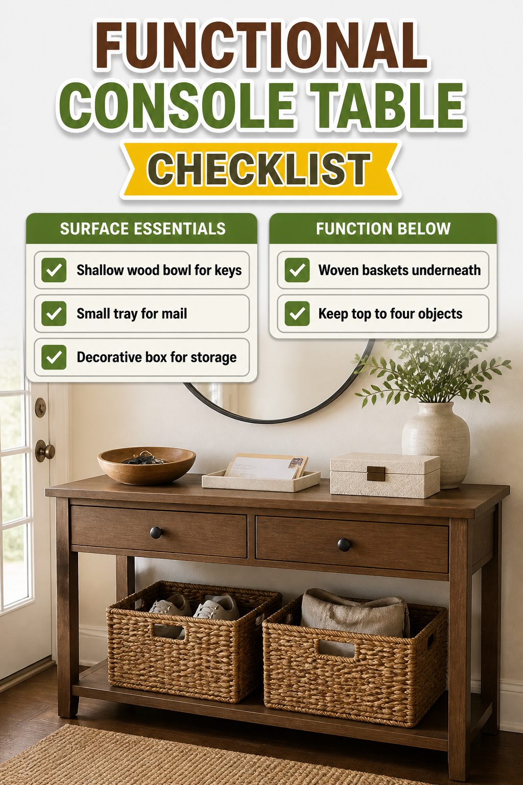
A console table in an entryway collects everything you carry through the door, so the styling has to work harder than it looks. A shallow wood bowl for keys or a small tray for mail keeps daily essentials from spreading across the surface, and a decorative box on the same plane can hide stamps, extra keys, or coasters without breaking the visual line.
The lower shelf is where function pays rent. Woven baskets tucked underneath handle shoes, reusable grocery bags, or toys if the table sits near the front door. They also ground the whole piece so it does not feel top-heavy. If your console is open underneath, this is the easiest storage you will add.
The difference between styled clutter and actual function is whether you reach for the thing daily. A bowl of glass beads looks collected; a bowl of sunglasses you grab every morning is working. In a high-traffic spot, keep the top to four objects or fewer. Anything more becomes an obstacle when two people come through at once, and you will start dropping mail on the nearest chair instead.
Seasonal Refresh
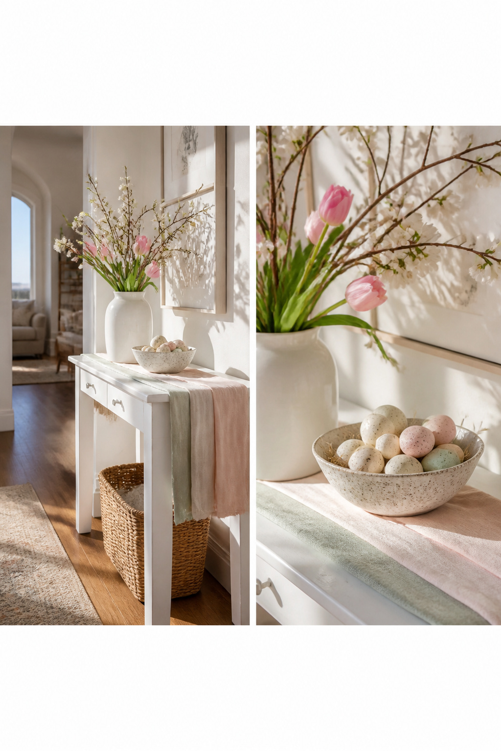
A console table is the one surface in your home where a full redo actually makes sense. You walk past it daily, and swapping a few pieces takes ten minutes, not a weekend. The trick is knowing how much to change at once.
Change one anchor and one texture each season, and leave everything else alone. In spring, that means trading last winter’s heavy runner for a lighter linen one and adding a tall vase of whatever is blooming. Come summer, keep the vase but swap the linen for something even lighter, or lose the runner entirely and let the wood surface read cooler. Fall is when branches and gourds work best, a single heavy branch in a ceramic vessel and one small gourd on a stack of books. Winter calls for the chunky knit or a heavy seagrass basket tucked underneath, the kind of texture that reads as warmth the moment you walk in.
Timing matters less than consistency. Mark the change when you finally turn the heat on, or when the daylight shifts enough that you notice it. Do not swap the mirror, the lamp, or the frame arrangement. Those are your constant, and without them the table becomes a stage set rather than a room that lives with you. The baskets underneath can rotate on the same schedule, brimmed hats for sun scarves, then back to gloves and the dog’s spare leash. That is the whole system: one anchor, one texture, and the storage below. Everything else stays.
Making It Yours
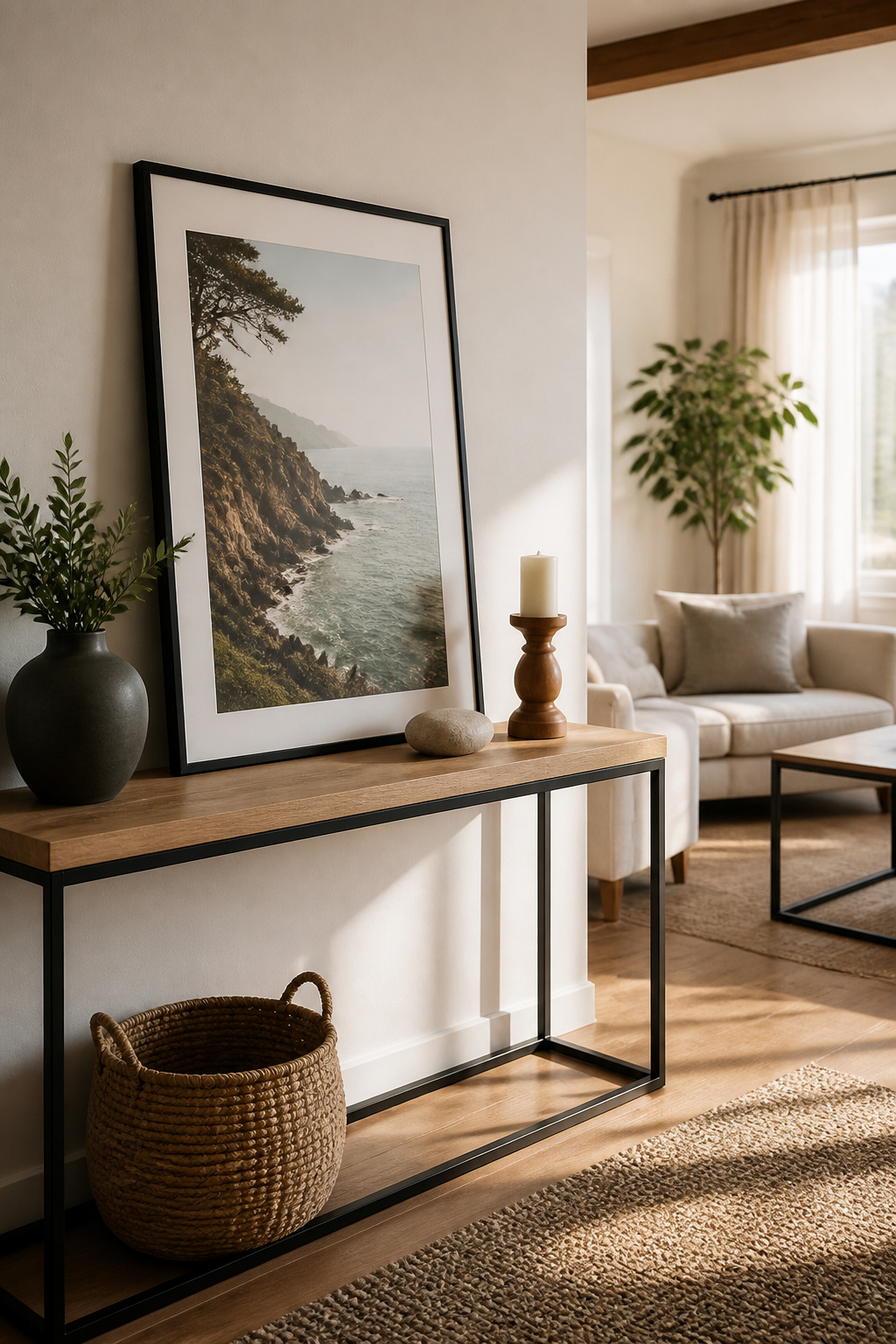
Personal items turn a styled table into a room that actually looks lived in. The risk is crossing into shrine territory, which usually happens when everything is small, framed, and arranged in a straight line. One strong piece beats six sentimental ones. A single large-format travel print in a thin black frame, or a weathered wood frame holding one landscape, can anchor the whole surface the way oversized arched mirrors do for minimalist entryways. Scale matters more than subject. A 5-by-7 family photo gets lost on a long console; print it at 11-by-14 or larger, or keep it off the table entirely. Small frames cluster too easily into what reads as clutter, not curation. The dated pieces are usually the ones that were gifts or commemorate specific years: wedding favors, graduation tassels in shadowboxes, anything with a engraved plate. If the object itself is not visually interesting without the backstory, it belongs in a drawer or a bedroom, not on display. The test is whether you would pick it up at a flea market for its shape or color alone. If yes, it can hold its own. If no, it is relying on sentiment to do the visual work, and the table will feel like a memorial instead of a space that moves with you through the day.
Frequently Asked Questions
What do you put on a console table?
Common items include lamps, mirrors, decorative bowls, plants, books, and sculptural objects. The article recommends starting with a visual anchor like an oversized mirror or large artwork, then layering in pieces of varying heights using the Triangle Rule. Keep the surface functional with a shallow bowl for keys or a small tray for mail, and limit the top to four objects or fewer in high-traffic areas.
How do you style a console table?
Start with a visual anchor above the table, like an arched mirror or large canvas, sized at two-thirds to three-quarters the table’s width. On the surface, arrange tall, medium, and short pieces so their peaks form a triangle, and limit yourself to two distinct textures with negative space between groupings. Stick to two or three colors total, and edit ruthlessly; the last piece you add is usually the one that ruins it.
What should I put on the bottom shelf of a console table?
Woven baskets are the most practical choice, handling shoes, reusable grocery bags, or toys while grounding the piece so it does not feel top-heavy. Large coffee table books also work, as do small ottomans or stools if you need extra seating. The lower shelf is where function matters most, so choose items you reach for daily rather than purely decorative objects.