
The right blue living room idea depends on whether you rent or own, because the same navy wall that transforms a space for a homeowner means a Saturday of repainting for someone with a landlord. Peel-and-stick Monstera wallpaper and an 8-by-10-foot flatweave rug you can roll up solve half the entries on this list; painted floorboards and glued MDF paneling solve the other half, but only if the lease allows. Farrow & Ball’s 100ml sample pots exist for exactly this calculation: two days of moving a brushed poster board around a room before you commit to gallons.
1. Layer Shades for Depth

A single blue tone across a living room reads flat faster than you would expect, even when the color itself is strong. The fix is layering: start with navy walls, add a sofa in a brighter, more saturated blue, then anchor the floor with a patterned rug that picks up both shades plus a neutral. The walls absorb light, the sofa pushes back against them, and the rug does the work of tying the two together without your having to match anything exactly.
This is the same logic as dressing in tonal layers, just scaled to a room. The navy recedes, the vibrant blue advances, and the pattern in the rug keeps the eye moving so no single plane dominates. You do not need custom anything; every piece can come off the shelf or out of a paint can labeled Payne’s Grey by Craig & Rose, the shade used in one of the more striking examples that pulled this off. Light wood flooring underneath keeps the stack from going too heavy, and a single piece of abstract art on the navy wall gives the eye somewhere specific to rest.
The risk is choosing blues too close in value, which collapses the layers back into one note. Hold paint chips and fabric swatches together in the actual room light; if you have to squint to tell them apart, separate them further.
2. Contrast Blue with Yellow

Blue and yellow sit opposite each other on the color wheel, which means they push each other to look brighter than either would alone. That contrast is what makes the pairing feel intentional rather than accidental.
A mustard throw against a denim sofa is the most forgiving way to test this. The yellow reads as warm against the cool blue, which is the exact dynamic color psychology calls a warm-tone contrast. You get energy without the punch-in-the-face effect of a bright yellow sofa against an indigo wall. The sources split on which version works: one shows a bold indigo wall with a bright yellow sofa, another suggests mustard and denim as the quieter entry point. For a weekend project on a few hundred dollars, the throw is the smarter risk. You can move it if the balance feels off, and you have not committed to a sofa you might tire of in a year.
3. Tropical Monstera Wallpaper
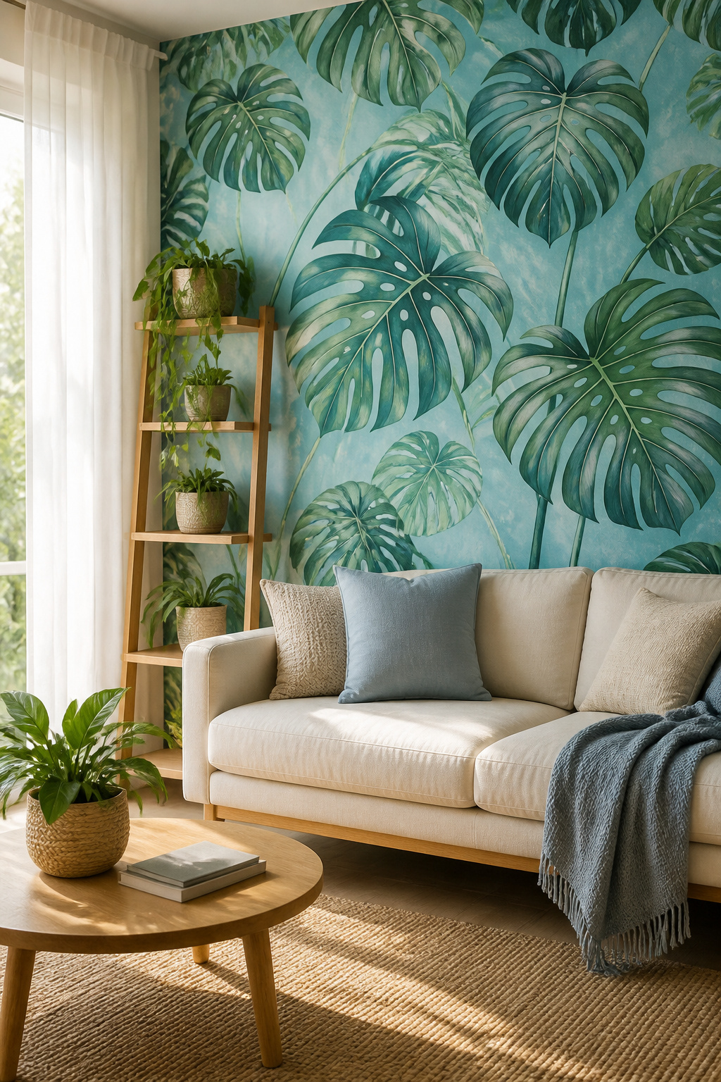
A single wall of Monstera wallpaper against a deep navy base reads tropical; against a soft sky blue, it shifts straight to coastal. That flexibility is what makes this one of the bolder pattern-on-pattern moves in the list, and it works because the leaves themselves carry enough visual weight to anchor the room without extra layers.
Peel-and-stick versions have improved to where the repeat lines nearly disappear, which matters more than you’d think with a large-scale motif. For renters, this is the critical detail: you get the impact of permanent wallpaper without the landlord conversation or the scraping session later. Budget about two to three rolls for one feature wall in a standard living room, and order from the same dye lot if you can; batch variation shows up as a faint stripe in strong daylight.
The risk is overloading the rest of the space. Keep upholstery solid and let the wall do the one loud thing. A cream linen sofa and natural wood tones give the eye somewhere to rest, which is what keeps the room from feeling like a themed restaurant.
4. Rich Tones for Drama

Deep blues like Hague Blue No. 30 or Railings No. 31 read almost black once the sun drops, which is exactly what makes them useful for a room where you want the walls to disappear. The color wraps the space instead of bouncing light back at you, so the ceiling feels lower and the room smaller in the best way, like a booth at a restaurant where nobody wants to leave.
The catch is that same density. In morning light these shades open up and show their actual color; by evening they flatten to near-black. You need to test on more than one wall, because the wall across from your window will behave completely differently from the one beside it. Farrow & Ball sells 100ml sample pots for exactly this reason, and the cost is worth absorbing before you commit to gallons. A sample brushed on poster board that you move around the room for two days beats a chip held up at arm’s length every time.
If you rent, this is still workable. A single accent wall in Railings behind a sofa gives you the mood without the commitment of four enclosed surfaces, and you will repaint less square footage when the lease ends.
5. Mix and Match for Charm

A living room built from mismatched blues, gathered over years of estate sales and hand-me-downs, reads as collected rather than staged. The risk is always the same: without something holding it together, the room looks like a clearance rack. One unifying element fixes this, and it does not have to be complicated.
Consistent wood tones do the heavy lifting in many of the spaces that pull this off. A slate-toned fireplace mantel, warm oak shelving, and worn-in wood furniture can each host a different blue without the eye fighting to rest. Repeated metal finishes work the same way: brass lamp bases on a navy side table, a brushed nickel frame above a powder blue sofa, and the thread holds.
The blues themselves can range far. A smoky wall, a powder blue sofa, dark chinoiserie ginger jars, and a cheerful light blue console table have all appeared in rooms that feel intentional rather than chaotic. The difference is that each piece also answers to the wood or metal running underneath.
This approach costs nothing extra and takes no extra weekend. It simply means pausing before you buy the cheap brass lamp because the table you already own is nickel, or leaving the cool gray-washed frame at the thrift store when your shelves are all honey oak. The discipline feels small. The result does not.
6. Patterned Wallpaper Interest

Geometric or abstract blue wallpaper lives or dies by scale. Smaller repeats read as texture from across the room, which means you can paper all four walls without the pattern shouting for attention. Larger motifs work the opposite way: they flatten to visual noise at distance and only resolve themselves up close, so commit to a single feature wall or risk the room feeling busy and broken.
If you want the paper to do the heavy lifting, line just the bottom or top half of the wall and paint the rest in a neutral that picks up one of its quieter tones. This two-tone approach costs no more than full coverage but reads as intentional architecture rather than leftover paint.
The real mistake is forgetting sight lines. You notice wallpaper first where you pause: the wall facing the entry, the rectangle behind the sofa. Place the pattern there and let the other walls go quiet.
7. Bold Blues with Fiery Accents

Saturated blue against a warm accent hits harder than pairing it with yellow, and the margin for error is thinner. One rust pillow on a cobalt sofa, or a single terracotta vase on a navy shelf, does the work of three accessories because the contrast is already doing so much. Add a second warm piece and you are curating a palette; add a fourth and the room starts shouting.
The safer path is to keep the walls quiet and let the objects carry the heat. Craig & Rose pairs Swedish Blue with Steel Pole, then cuts the two with a stripe of Troubadour, a flame red. That is a committed look, nostalgic and sharp, but it takes a steady hand and a room that can handle the saturation. For a weekend project with a few hundred dollars, you are better off buying the rust pillow and seeing how it lives in your light for a week before you paint anything.
If the seventies reference appeals, dusky orange reads warmer and less aggressive than true red, and it ages better in a space you use daily. Metallic accents keep the combination from feeling like a period set. A brass lamp or a thin chrome frame beside the terracotta gives the eye somewhere neutral to rest.
Start with one accent and live with it before you add a second. That is the difference between a room that feels considered and one that feels like a color wheel exploded.
8. Dark Blue for Cosiness

Midnight blue in a small or north-facing room reads as sheltering, not heavy, when you let the light do the work. Inchyra Blue No.289 shifts between blue and green as the day changes, so the walls never sit still the way a flat navy would. That movement keeps the room from feeling boxed in.
The cosiness comes from what you pair it with. Warm mustard on a sofa or a wooden frame breaks the coolness before it turns cold. A few leafy plants add enough living green that the room feels tended, not decorated. The result is a space you actually want to walk into at the end of the day, not one that impresses and then exhausts.
9. Historical Charm
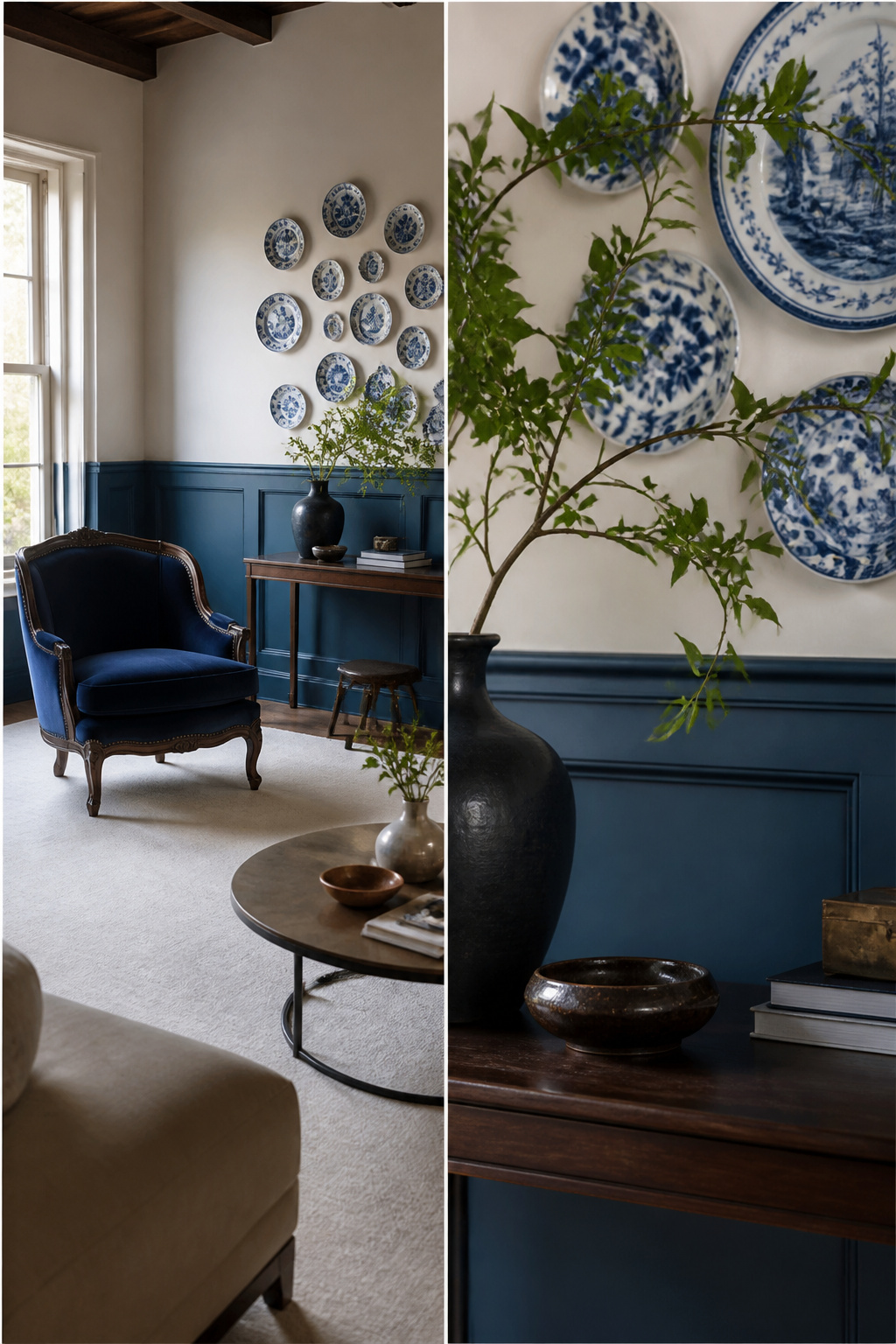
Blue has anchored living rooms since long before paint chips existed. In 18th-century New England, soft indigo wainscoting ran waist-high beneath plaster walls; Dutch colonial kitchens leaned on delft tile backsplashes that read as patterned blue-and-white panels. You do not need a museum house to borrow either effect.
Paint the lower third of your walls in a quiet slate blue and cap it with a simple chair rail. The proportion does the historical work, not the trim detail. For a single piece with weight, hunt estate sales or Facebook Marketplace for a Victorian-style accent chair: velvet or tufted, in navy or dusty teal. Pair it with a clean-lined sofa and a plain rug. The chair reads as found, the room reads as now.
Delft references work best as one concentrated moment. A cluster of blue-and-white plates over a console, or a single framed tile propped on a shelf, nods at the tradition without staging a reenactment. The pitfall is collecting too many: one more plate and your living room becomes a gift shop. Stop at three pieces in view at once.
10. Bold Ceiling
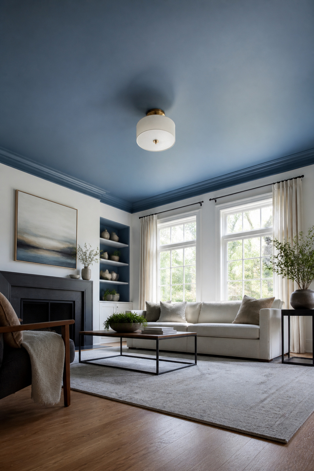
Painting the ceiling blue turns it into a fifth wall that pulls the eye upward, and suddenly white walls look like a choice instead of a default you never got around to changing. The color overhead also softens the boxy feeling of a standard living room without adding a single piece of furniture or taking up floor space you do not have.
Flat or matte finishes hide imperfections far better than eggshell overhead, and ceilings almost always have them: joint lines, patched spots, the odd roller mark from the last paint job. Eggshell catches light just enough to telegraph every flaw, which is fine at eye level where no one is looking hard, but overhead the angle is unforgiving. Matte paint absorbs that light and lets the color do the work instead of the texture.
Keep the blue a shade or two lighter than you would use on a wall. Ceiling planes read darker because less light hits them directly, and a navy that looks rich on a feature wall can turn oppressive overhead. A dusty medium blue or a softened slate usually lands right. If you are renting, this is still a weekend project, but budget for a second coat and a sturdy extension pole; cutting in around the ceiling edge with a brush on a ladder is where most people quit halfway through.
11. Vibrant Florals

A single oversized floral in deep indigo on a cream ground will do more for a room than a dozen small prints scattered around. Large-scale florals on soft goods let you take the look with you when the lease ends, which is why they beat wallpaper for anyone still renting. Choose a heavyweight linen or cotton for curtains if the windows face south; the fabric filters light without turning the room into a cave. For upholstery, a sofa covered in a blowsy blue peony or hydrangea print becomes the room’s anchor and removes the need for much else on the walls. The risk is busyness. Pair the print with solid paint in a quieter blue-gray or warm white, and keep surrounding patterns small or absent. If the print starts to feel like too much after a year, curtains can move to a bedroom and a throw-covered ottoman can go to the guest room. That flexibility is the point.
12. Ground the Space in Blue Bliss
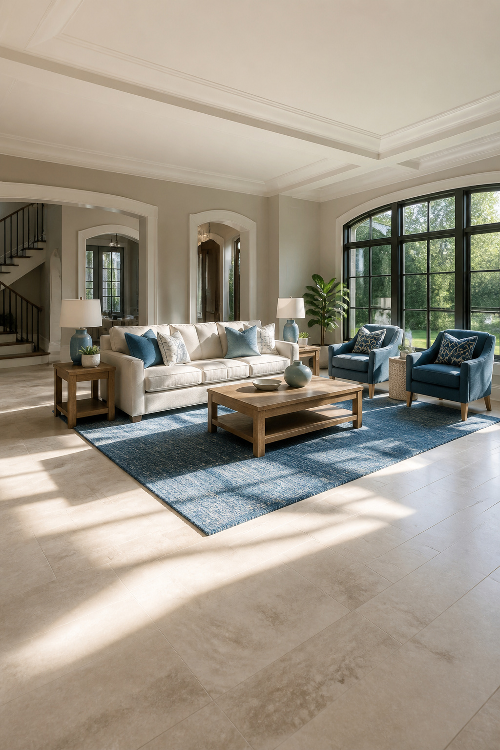
The fastest way to make blue the ruling color in a living room is to let the floor carry it. A blue rug over your existing neutral flooring gives you a saturated base you can roll up and take with you when the lease ends, which makes it the safer bet for renters. Woven flatweaves and low-pile wool rugs run a few hundred dollars for an 8-by-10-foot size, enough to anchor a seating area without wall-to-wall commitment.
Painted floors are the other path, and they hit harder because nothing around the edges interrupts the color. You will need to scuff-sand the existing finish, lay down a bonding primer, and build color in two or three coats of porch-and-floor enamel. The materials cost less than a quality rug, but the labor is serious, and landlords rarely let it stand. If you own the place and the boards are in rough shape already, painted blue can disguise a lot of wear while giving the room an intentional, almost glazed look that rugs cannot replicate.
13. Bring the Sunshine Indoors

Amber and honey tones against blue do something yellow alone cannot. They carry the warmth of late afternoon light rather than the flatness of a primary color block, and the pairing shifts with the seasons in a way that keeps the room alive.
In summer, the combination reads crisp: think pale sky walls with straw-colored linen and raw oak. The blue stays cool, the amber stays quiet, and the whole thing feels like a screened porch even in a city apartment. Come winter, the same palette deepens without any change but the light outside. Swap to mustard velvet or aged brass, let the blue go toward slate or indigo, and the room gathers richness that reads as intentional coziness rather than gloom.
The practical move is to keep the blue fixed on the walls or a large sofa, then move the warm tones through smaller pieces you can layer: a throw, a lampshade, a stack of books. That way the seasonal shift costs nothing but storage space, and you are not repainting in October to chase the feeling you had in July.
14. Wrap Yourself in Blue Serenity

If you are not ready to paint a wall, textiles let you test blue without the commitment. A set of light blue curtains against white walls already shifts the mood of a room, and you can take them with you when the lease ends.
Layer from there. Add throw pillows in a slightly deeper blue than the curtains, then a soft blanket across the sofa arm. The goal is enough pieces that the color reads as intentional, not accidental. Two or three blue textiles usually do it; more than five starts to look like you are avoiding a decision.
Upholstery is the bigger step, but still reversible. A slipcovered chair in washed denim or pale chambray anchors the scheme without a paint can in sight. Renters in small spaces should note that solid blues read calmer than patterns in the same shade. Patterns fight for attention in tight quarters; solids let the eye rest.
Cost stays low if you build slowly. Start with curtains and a throw, live with it a month, then decide if the room wants more. That pause saves you from the common mistake of buying everything at once and realizing the blues clash in daylight.
15. Soft Blue for Small Spaces
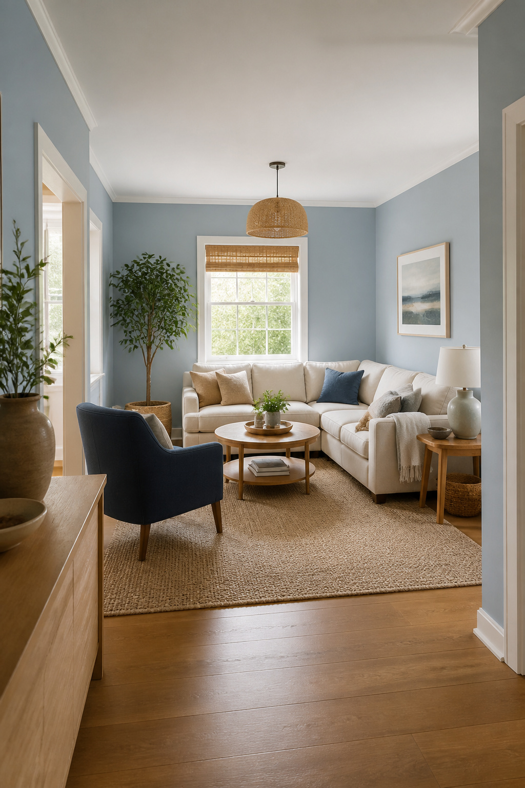
Pale blue walls can push the walls of a small living room outward visually, but the wrong shade under the wrong light turns the space clinical fast. Lulworth Blue No.89 hits the balance: light enough to reflect daylight around the room, saturated enough to read as intentional color rather than primer. The catch is the window situation. In a north-facing room or one with heavy tree cover, that same pale blue flattens and chills. You will need to warm it with honey-toned wood, cream textiles, or brass hardware. South- and west-facing rooms give you more margin. The sources that hold up best pair this blue with light furniture and a few darker anchors, a navy throw or a slate lamp base, so the room does not float away entirely. If your natural light is thin, skip the pale blue altogether and steer toward the warmer end of the soft spectrum.
16. Floral Wallpaper Drama

Dark-ground floral wallpaper reads as a solid neutral from across the room and only reveals its pattern once you are standing in it. That is the point: you get the mood of a dark wall without the flatness of a single color. A navy or charcoal base with muted botanicals in dusty blue, sage, or cream keeps the tone cohesive with other blue living room ideas without shouting for attention.
Hang it on one wall and paint the remaining three in a tone pulled from the paper itself. The wallpaper becomes the room’s quiet anchor, not a feature that fights your furniture. Renters can look for peelable options, which have improved enough now to survive a few years without the corners curling.
The risk is choosing a pattern too large or too high-contrast. From ten feet away it turns into visual noise instead of depth. Order a full panel sample and live with it for a day, viewing it in morning light and lamplight, before you commit. Small-scale prints with scattered foliage tend to wear better than dense, oversized blooms.
17. Subtle Feature Wall

A mid-tone blue like Dulux Indigo Shade reads as color without shouting for attention. It sits in the range where wall and shadow start to blur, so the eye registers depth before it registers paint.
Choose the wall that needs the help. The one with the ugly TV cable run, the off-center window, the patch the landlord spackled poorly. Indigo Shade swallows those flaws; light blues throw them forward. The wall you want people to notice, the one with built-in shelves or a fireplace, gets nothing. Let the architecture carry that one. Mid-tone blue does its best work as a quiet frame, not the subject.
Test it on the wall that catches afternoon light, not morning. Mid-tones flatten in dim corners and can turn murky where the sun never reaches. Two coats over a gray primer keeps the color from drifting purple. Skip the ceiling line if your tape skills are uncertain; cutting in at the trim level is forgiving, but a wavy ceiling edge reads as a mistake you meant to make.
18. Blue Panelling

Painted paneling turns a flat wall into architecture without tearing anything out. For renters, thin MDF strips glued over existing drywall read as real board-and-batten until you look close; peel them off when you leave, spackle the glue spots, and paint the wall back to landlord beige. Owners can nail actual boards to studs and sleep soundly. Either way, blue reads differently on trim than on flat paint. A mid-tone slate or dusty navy catches shadow in the recesses and looks almost black by evening lamp light, which is the point. The grid breaks up the color so you can go darker than you would on an unbroken wall without the room feeling like a cave. Vertical strips stretch ceiling height; horizontal runs widen a narrow room. Paint the boards and the wall between them the same blue, not two colors, or the effect gets busy fast. One coat of primer, two of finish, and the MDF edges drink paint like a sponge so budget for a third gallon. Real wood is more forgiving but costs more and takes longer. What you save in skipping a full wall build you spend on patience during install.
19. Animal Prints with Blue

Blue and animal print pair best when you treat the print as a tension move, not a theme. A single leopard or zebra pillow against a navy sofa reads like someone with confidence; a matching ottoman, curtains, and rug reads like a safari lodge. Keep the scale small or the quantity to one piece if you want the room to feel edited rather than theatrical. The blue should lead, and the print should flicker against it. A tight zebra stripe on a lumbar pillow works on a steel-blue sectional because your eye registers pattern before it registers motif. Wider animal spots or full hides tend to dominate, which is where renters usually trip up, buying a statement piece they tire of in a season. If you are testing the pairing, start with something you can swap: a tray, a small rug at the hearth, a lampshade liner. Costs run low, and the commitment stays low with it.
20. Daring Color Contrasts
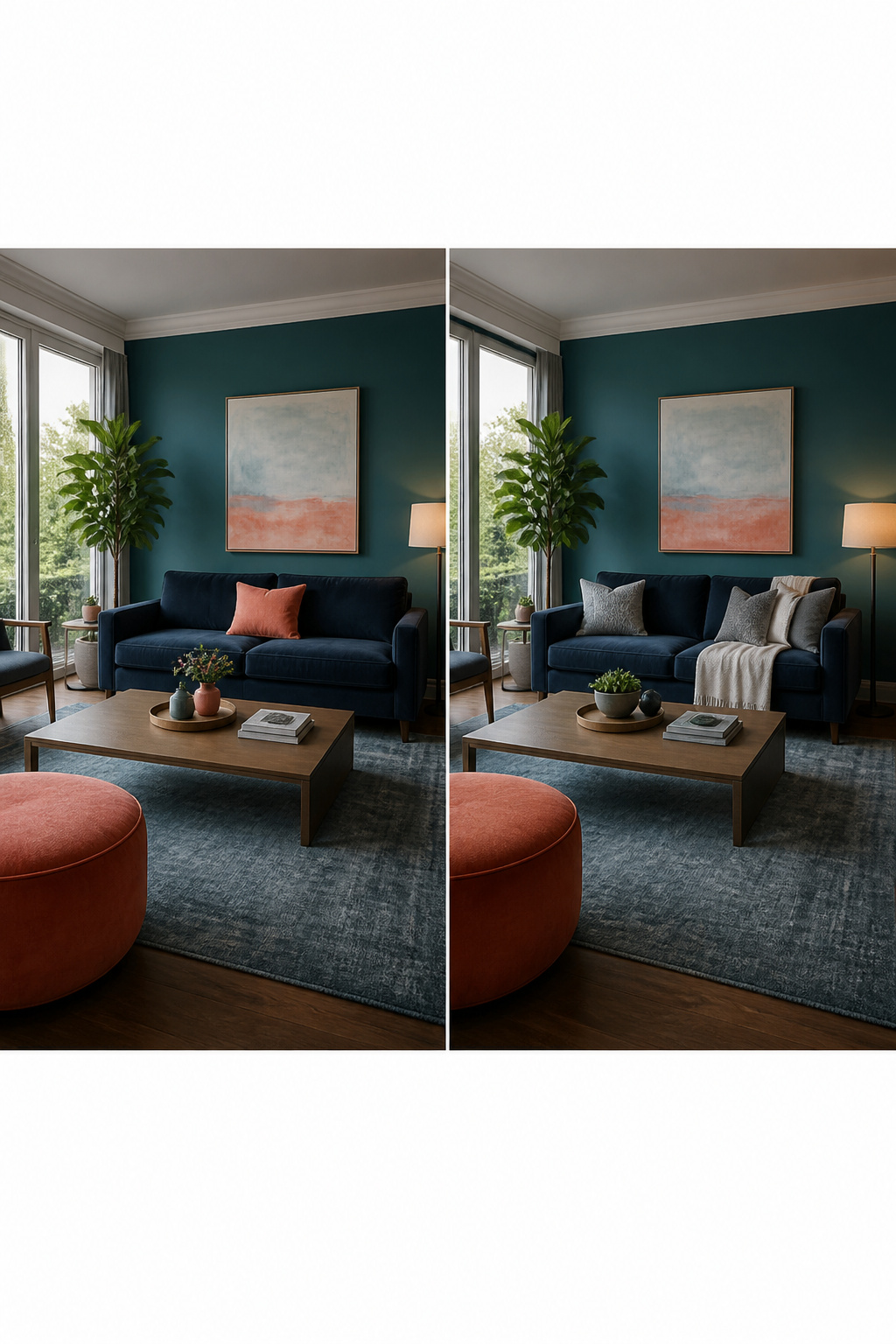
Pairing blue with its near-opposites on the color wheel runs hotter than the standard yellow route. Coral against teal is the combination that keeps showing up in rooms that actually get finished, not just pinned. Start with a teal base on one wall or a solid sofa, then bring coral in at about a third of the visual weight: one large linen pillow, a ceramic lamp, a single framed print. Reverse the ratio and the room starts to feel like a nursery.
Slate blue with sage works if you want the contrast quieter. The two share enough gray to keep from competing, but the warmth in sage still pushes back against blue’s chill. It reads as intentional rather than matchy because the undertones diverge.
Pink is the riskier move. Powder blue with hibiscus pink can look coastal and polished, but the same pink against navy goes theatrical fast. Keep pink to small, textured pieces: a worn velvet pillow, a watercolor, a single bloom in a vase. Floral wallpaper that mixes fuchsia, olive, and teal on navy is one way to get all three tensions at once, though it locks you into that palette for years. Renters should test with removable panels above a mantel or behind a bookcase before committing to the full wall.
21. Indulge in Navy

Navy works harder than almost any other blue on your walls. Where sky blue limits you to whites and pale woods, navy sits back like a near-neutral and lets you bring in ochre, rust, even soft pink without the room feeling like a flag. Farrow & Ball’s Stiffkey Blue No.281 is the shade that keeps coming up in this conversation. It reads as grounded and adult without the default move of black or gray, and it holds enough green in its base that it never looks like a stage curtain.
Sarah Keady, style and interiors director at House Beautiful, puts the shift plainly: "Gone are the days when blues were seen as too cold to use. Dark, inky hues are now the go-to for communal areas like living rooms and kitchens – its cocooning but also wonderfully dramatic."
That drama is the point. You get the depth of a dark room without the flatness that charcoal often gives, and you still have a color that responds to morning light and lamp light differently through the day. For a weekend project on a few hundred dollars, a single navy wall behind your sofa changes the whole room’s weight. The paint goes on in two coats Saturday, furniture back by Sunday evening.
22. Everything but the Walls

Most blue living room ideas start with paint, but flipping the order keeps your security deposit safe and your options open. Keep the walls white or in a warm neutral, then load the color into the pieces you can carry out.
A sofa in navy or a pair of denim-upholstered armchairs anchors the room without a single drop of primer. Layer in navy throws, a patterned rug with blue notes, and wall art that pulls the shade upward. The sources that rank for this approach call out dark blue lamp stands and matching throw pillows against warm foundations of soft yellow, muted green, or light brown, the blue providing the contrast that keeps the palette from going flat.
For renters, the lease-friendly move is painting doors, window frames, or crown molding while leaving the wall surface untouched. Mylands Walpole No.42 is one specific paint that shows up in this context, a vivid blue confined to architectural edges so the color reads as intentional, not accidental. If even that feels like too much commitment, a pale blue ceiling paired with crisp white walls and pale blue furniture pieces creates a serene envelope without touching a vertical wall surface.
The slow approach has its own advantage. Live with the blue for a season through textiles and movable pieces. If you still want more, the walls will wait. If the mood passes, you are not scheduling a repaint.
23. Let Furniture Steal the Show
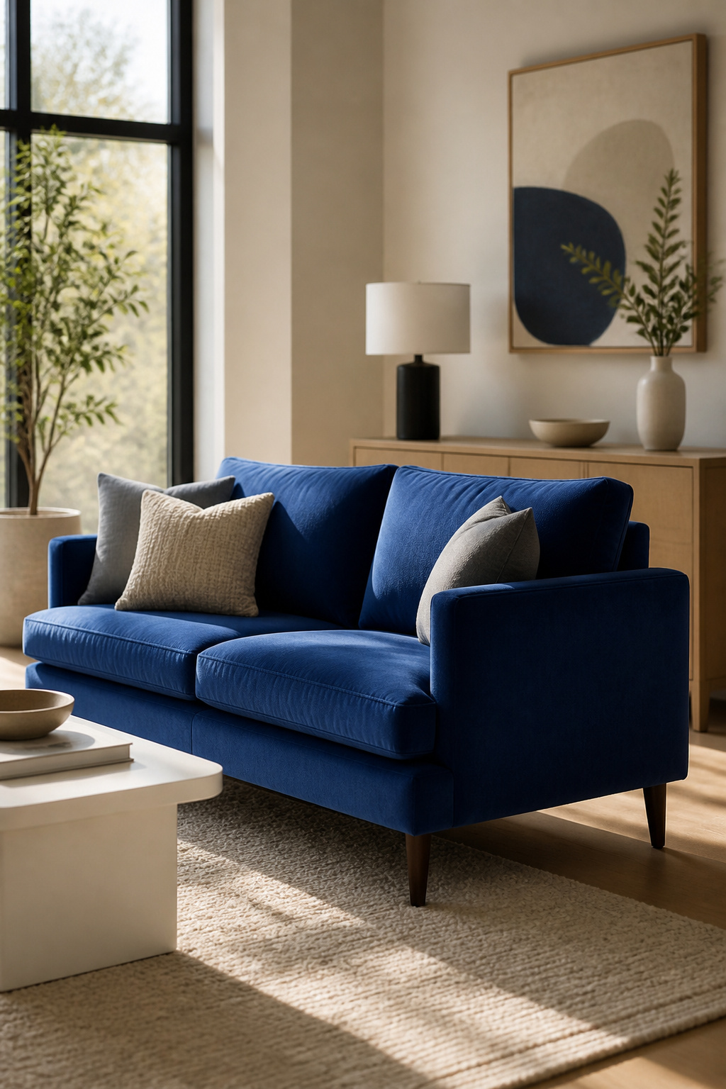
A single blue sofa can carry a whole room if you give it space to breathe. Pull it six inches farther from the wall than your old couch sat, and the color reads as intentional rather than apologetic. Brass side tables or a textured rug underneath help it settle in, but the breathing room matters more than the accessories.
A small blue chair plays by the opposite rules. Without enough visual quiet around it, the piece shrinks to accent-furniture status and the room loses its anchor. Keep the surrounding palette soft white or cream, and let the chair be the one place your eye lands. Add competing artwork or a second bright piece and the color fractures into noise.
Two ways to play this: one bold piece with room around it, or one smaller piece on a deliberately muted stage. The large sofa wins if you have the floor space and want the drama without rethinking the walls. The quiet-stage approach wins for renters who cannot paint, or for anyone furnishing a room where the architecture already talks too much.
24. Upcycle with Blue Furniture Paint
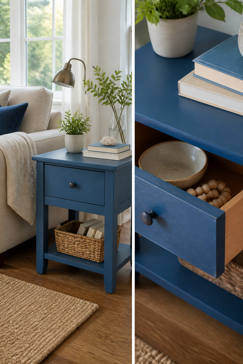
Chalk paint and milk paint both turn a thrifted wood piece blue without stripping the old finish first, but they behave differently once on. Chalk paint dries fast and matte, and it will chip if you skip the wax or topcoat. Milk paint is thinner, sometimes streaky, and can flake away in patches unless you add bonding agent to the first coat. Either way, prep matters more than the brand you buy: wash the piece with dish soap to get the grime off, scuff any glossy spots with sandpaper, and fill holes so they do not telegraph through.
A test patch on the underside of a drawer or the back of a leg will tell you which problem you are dealing with: poor adhesion, the wrong blue, or a bleed-through stain that needs shellac. That patch takes ten minutes and saves a ruined Saturday. Two coats of paint plus drying time already pushes you close to Sunday evening; you do not want to discover on coat three that the color goes purple in your light.
25. Luxe Modern Blues

A navy sofa against pale walls reads as investment furniture even when the frame is entry-level. The trick is keeping the palette tight: one blue, one warm metal, one neutral stone. Brass lamps or a slim chandelier pick up the glow without competing, and a marble-look side table from a big-box store passes at conversation distance because the surrounding colors are already speaking the same restrained language.
Slate or light blue chairs layered in soften the formality. Gold frames on the wall, a glass coffee table with thin edges, and drapery in a muted tone keep the eye moving without clutter. The restraint is what sells the look. Leopard print or a bright blue floor can work if you treat them as the single surprise in an otherwise disciplined room, but two risks and the budget shows.
Brass darkens to a quieter bronze over years of handling; that patina is part of the appeal, not a flaw to polish away.
26. Breezy Coastal Blues

Breezy coastal blues live in the texture, not just the tint. You want linen, jute, and weathered wood carrying pale sky blue and creamy white, not a flat wash of color on smooth walls. The drifted, sun-bleached feeling comes from material choice first.
White cotton curtains frame the light. Linen pillows and upholstery soften the edges. A weathered wood coffee table or exposed beam adds the grit that keeps pale blue from floating away entirely. This is where coastal parts from the soft blue small-space trick; that approach relies on color value alone to push walls back, while coastal needs the full material mix to read as beach rather than just airy.
Sand and deeper navy can anchor the palette if everything starts feeling too washed out. Gold-framed art above a fireplace, or warm metallics slipped into shelving, does the grounding without killing the breeze. Patterned armchairs in a small repeat add just enough movement; the room stays relaxed but not bare.
The risk is over-polishing. Keep the wood visibly worn, the linen slightly rumpled, the jute coarse underfoot. Coastal done well feels like a house that has actually seen salt air, not one that ordered it from a catalogue.
27. Moody Modern Blue
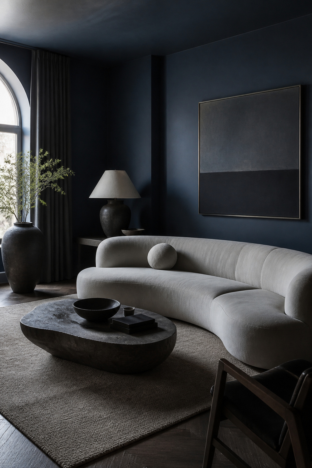
Matte dark blue reads as contemporary because it refuses to catch light the way gloss does. On walls, a flat navy or midnight finish absorbs the room instead of reflecting it, which sculptural furniture then pushes against: a curved sofa, a weighty ceramic floor lamp, a low table with one thick, irregular leg. The absence of crown molding, baseboard detail, or wainscoting matters here. Where historical rooms layer period trim, this approach strips back to planes and volume.
Keep ornament to near-zero and let the shapes do the work. A single matte black vase on a navy console, no picture frames clustered behind it. The restraint costs nothing extra, but it fails if you slip in one scrolling metal accent or a traditional rug with border patterns. That piece will read as accidental, not eclectic. Renters can achieve the wall effect with quality matte paint and a careful edge against the ceiling; the furniture is where you spend, because the shapes must hold the room without decorative help.
28. Midnight Elegance

The deepest blue living rooms rely on restraint more than splurge. Paint the walls, trim, and ceiling in a single midnight tone so the room wraps continuous, then introduce gold in thin strips only: picture frames, a slim light fixture rail, the edge of a mirror. A matte finish on the walls reads flat without something metallic to catch lamplight; the gilt does the work of bouncing brightness back into the corners.
Velvet on the main seating piece anchors the formality, but keep the shape clean. A tight-back sofa in navy velvet holds the line between dressed-up and dated; add a second rolled-arm piece and the room starts collecting dust. Symmetry is what sells the look: two matching side tables, two lamps of identical height, art centered and level. One mismatched element breaks the tension entirely and the room tips toward stuffy.
The real test is editing. If a piece does not serve the symmetry or the metallic thread, it does not stay. That rule is what keeps midnight blue from collapsing under its own weight.
29. Soft Coastal Blues

The palest coastal blue reads as white until the afternoon light hits it, and that is the whole point. You are not building a beach house fantasy for guests to notice. You are toning down the walls so the room feels like a held breath.
Breezy coastal leans on saturated navy and rope accents to shout its theme. Soft coastal whispers. Choose a blue with enough gray in it that your eye has to work to name the color. Pair it with bleached oak, unbleached linen, and nothing that says "nautical" in a store display. The mistake is adding one anchor-print pillow too many and watching the room tip into theme-park territory. If you cannot tell whether the wall is blue or just a cool white, you have the right shade. Live with it for a week before you decide. The color shifts from morning to evening, and buying in a hurry based on a noon sample is how you end up repainting by Saturday.
Why Blue Works in Living Rooms

Blue has been scientifically proven to be the world’s most popular color, and that popularity is not just a preference. Color psychology ties blue to stability, harmony, and peace, which is exactly what you want in a room built for unwinding after a long day.
The real advantage is how wide the spectrum runs. Pale sky blues pair with crisp whites for a cooling effect, while deep inky grey-blues create something moody and cocooning. Muted blues complement more colors and create a more soothing mood; deeper, richer blues add drama if that is what the room needs.
This range means blue adapts to how you actually use the space. A cerulean tone supports relaxation; a bold cobalt makes a statement. Either way, the underlying psychology holds: the color signals calm, and your living room becomes a place where that signal matters.
Colors That Pair with Blue

Warm yellow and orange wake a cool blue right up, but the blue you start with decides whether the pairing sings or shouts. A bright lemon against an electric blue sofa reads carnival-ride; the same yellow against a deep navy turns into something you actually want to live with. Mustard and rust hit that same note for less risk.
Neutrals do the opposite job. White and dove gray let a dark navy sofa become the center of the room without any competition, and the blue ends up looking richer for the quiet around it. Sandy browns and soft creams work the same way with mid-tone blues.
Then there are the pairings that catch you off guard. A light blue upholstery with soft pink florals, like in a corner that mixes brass and a crisp mantel, feels personal rather than themed. Emerald and hot pink can step in too, though they need a high-saturation blue to match their weight.
The specific blue tone is what determines which pairing actually works. A pastel blue sinks under black; a midnight blue drowns in more pastels. Match the saturation and temperature, not just the color wheel position.
Techniques for Adding Blue

Think of adding blue as a ladder of commitment, with an easy exit at every rung.
- Small accents — cushions, a vase, a stack of books — cost the least and travel with you. Swap them out when the mood shifts; they are the renter’s best friend.
- Textiles layer in more blue without touching a wall. A large rug anchors the room, and curtains draw the eye toward window light. These cost more than accents but still move to your next place.
- Painted furniture refreshes what you already own. A side table in blue renovation paint becomes a focal point for the price of a quart. The piece stays behind if you leave, but the labor is sunk cost either way.
- Painted architecture — doors, window frames, crown mouldings — commits you to the room itself. Keep the walls white and frame them in blue, and you get the color without overwhelm. This is where you climb to when you own the walls and can live with the work.
- Full walls sit at the top. The budget is paint and time, but the reversal is paint and time again. Do not start here unless you know you will stay.
Blue Across Design Styles
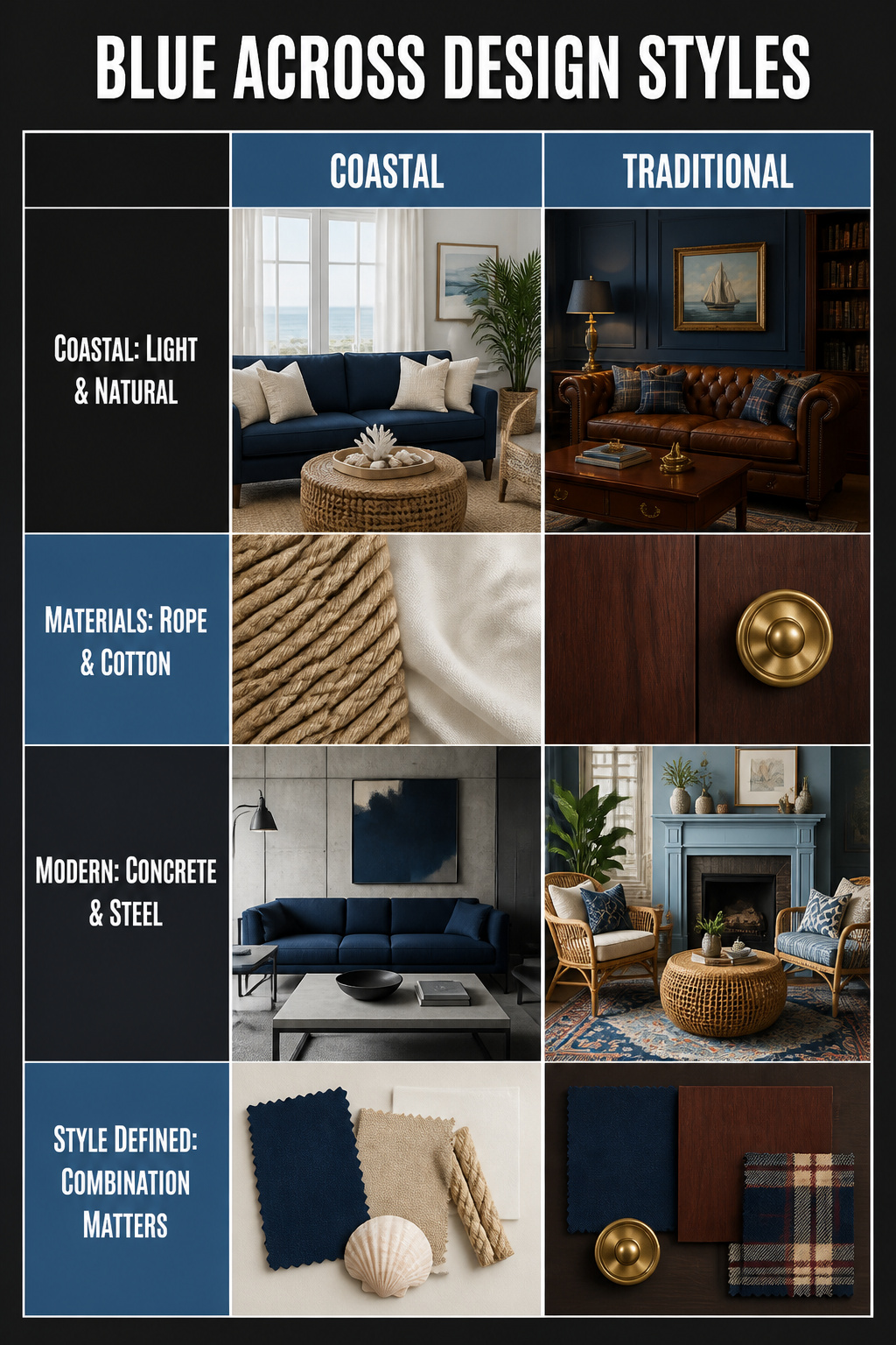
The same navy can read coastal, traditional, modern, or eclectic depending on what you set it against. In a coastal room, pair that navy with rope textures, white cotton curtains, and sandy linen pillows. The blue stays soft against all that light, and the natural materials keep it from feeling like a marina gift shop. For traditional, swap the rope for mahogany and brass. Navy against deep wood tones feels anchored and formal in a way that reads inherited rather than bought all at once. Modern asks for concrete, steel, and clean edges. Here navy becomes graphic and intentional rather than atmospheric. The eclectic route mixes these freely, though from what I’ve seen, it works best when you commit to one tension rather than collecting all of them. A powder-blue fireplace with rattan and layered patterns reads as a single moody coastal idea. Navy stripes with sand and white is another coherent take. Where people slip is treating blue as the whole story. It is the combination that names the style, not the shade itself. If your navy living room is not landing the way you pictured, the fix is usually in the second color and the material beside it, not a different blue.
Frequently Asked Questions
Is blue a good color for a living room?
Yes. Blue is the most popular color worldwide, and its broad range of tones lets you shape the mood of a room without changing anything else. A cooling cerulean reads relaxing, a warm cobalt makes a statement, and muted blues play well with more colors than saturated ones do.
What colors go with blue in a living room?
Yellow, amber, honey, rust, terracotta, and warm wood tones all pair with blue, though the exact match depends on your shade. Mustard and denim is the safest entry point for a weekend test; amber and honey shift with the seasons in a way primary yellow cannot. Keep warm accents to one or two pieces so the room stays edited rather than loud.
How can I incorporate blue into my living room decor?
Start with textiles if you want to test without commitment: light blue curtains against white walls already shifts the mood, and you can take them when you leave. Layer in throw pillows and a blanket in a slightly deeper blue. For more permanence, paint a single feature wall, paper one wall with peel-and-stick, or lay down a blue rug that anchors the seating area and rolls up when the lease ends.